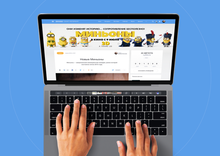
2do2go is an online service that helps the people in the country – residents and visitors alike to explore the most interesting parts of the country. From the points of interest to entertaining events to fascinating blogs, 2do2go is a self updating explorer service free and available to everyone.
Revamp the 2do2go website to create a more efficient leisure guide service.
Product Design, Design syste
Overview
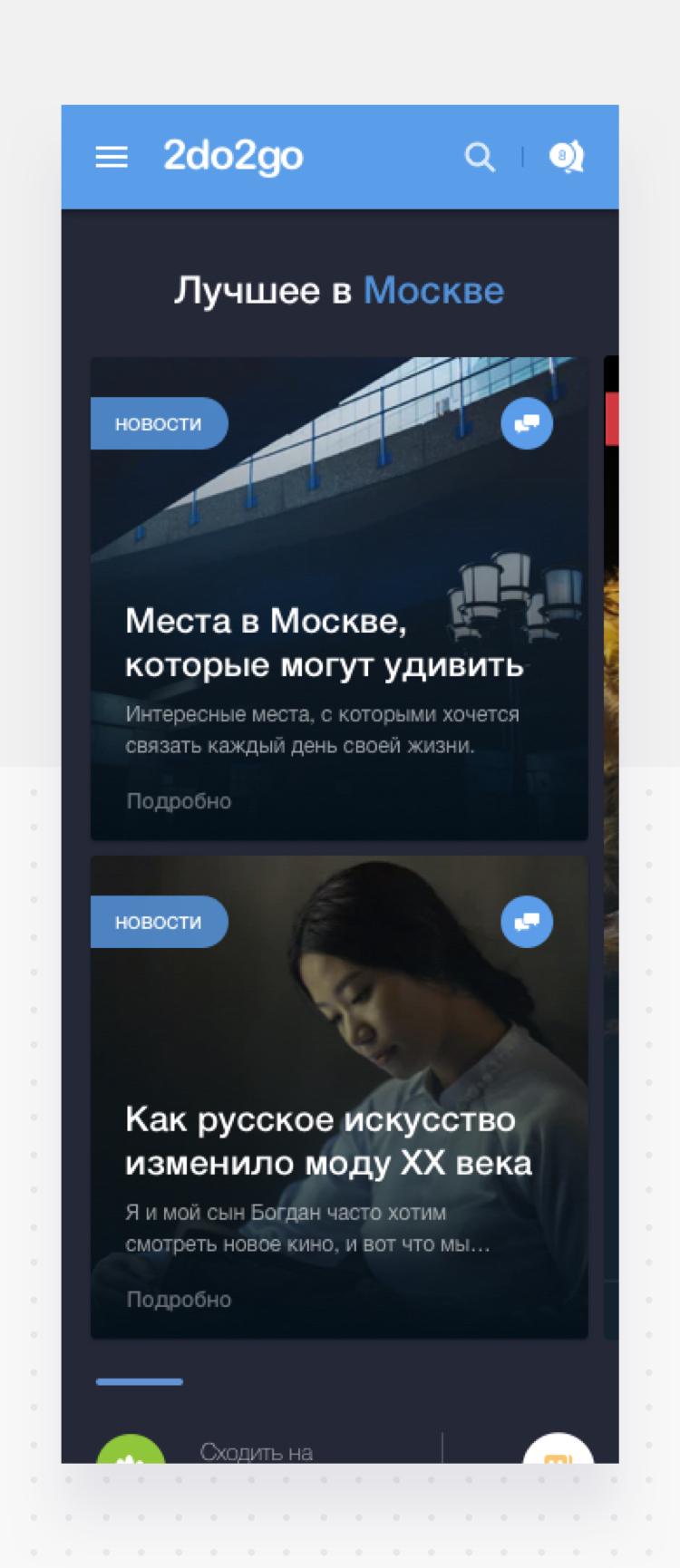
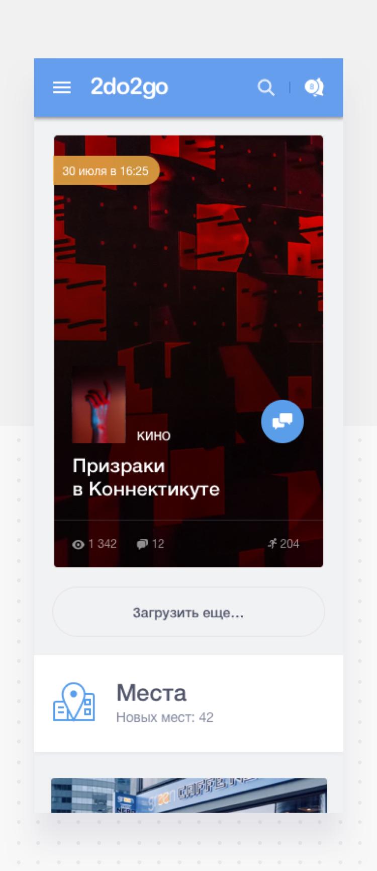
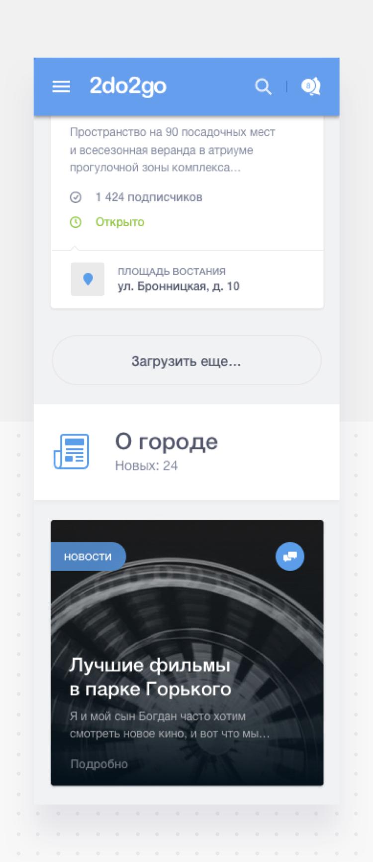
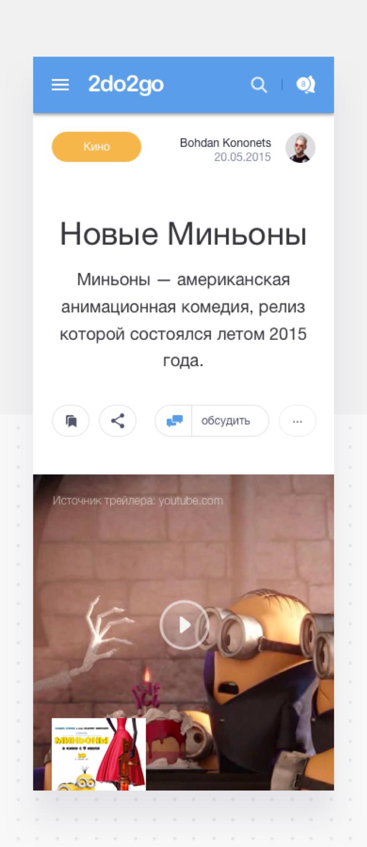
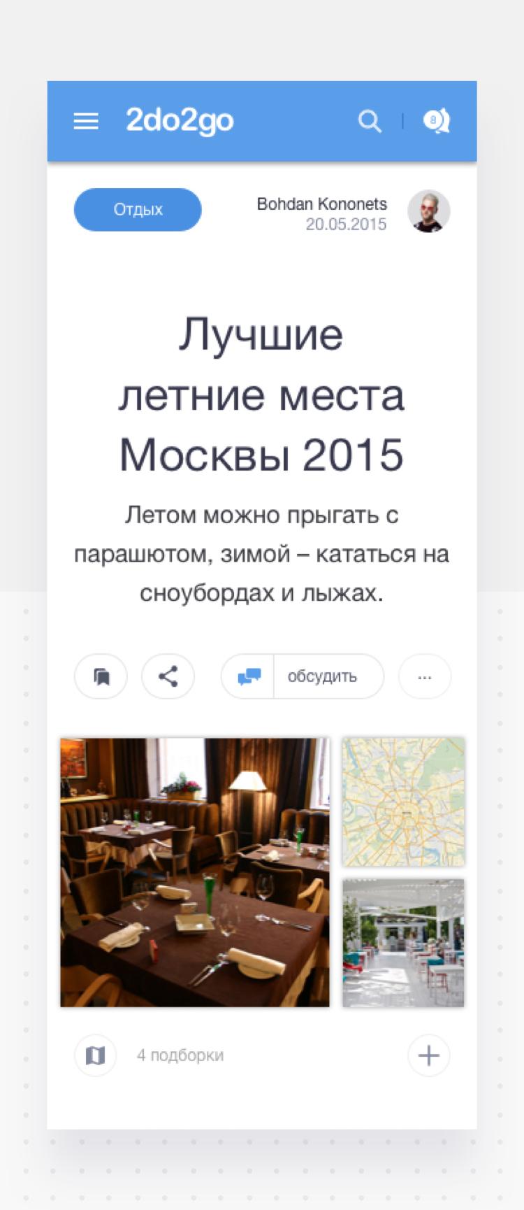
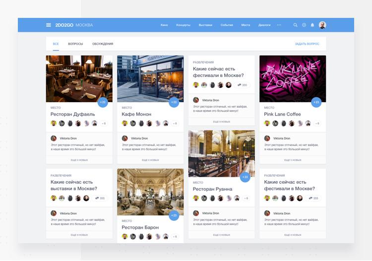
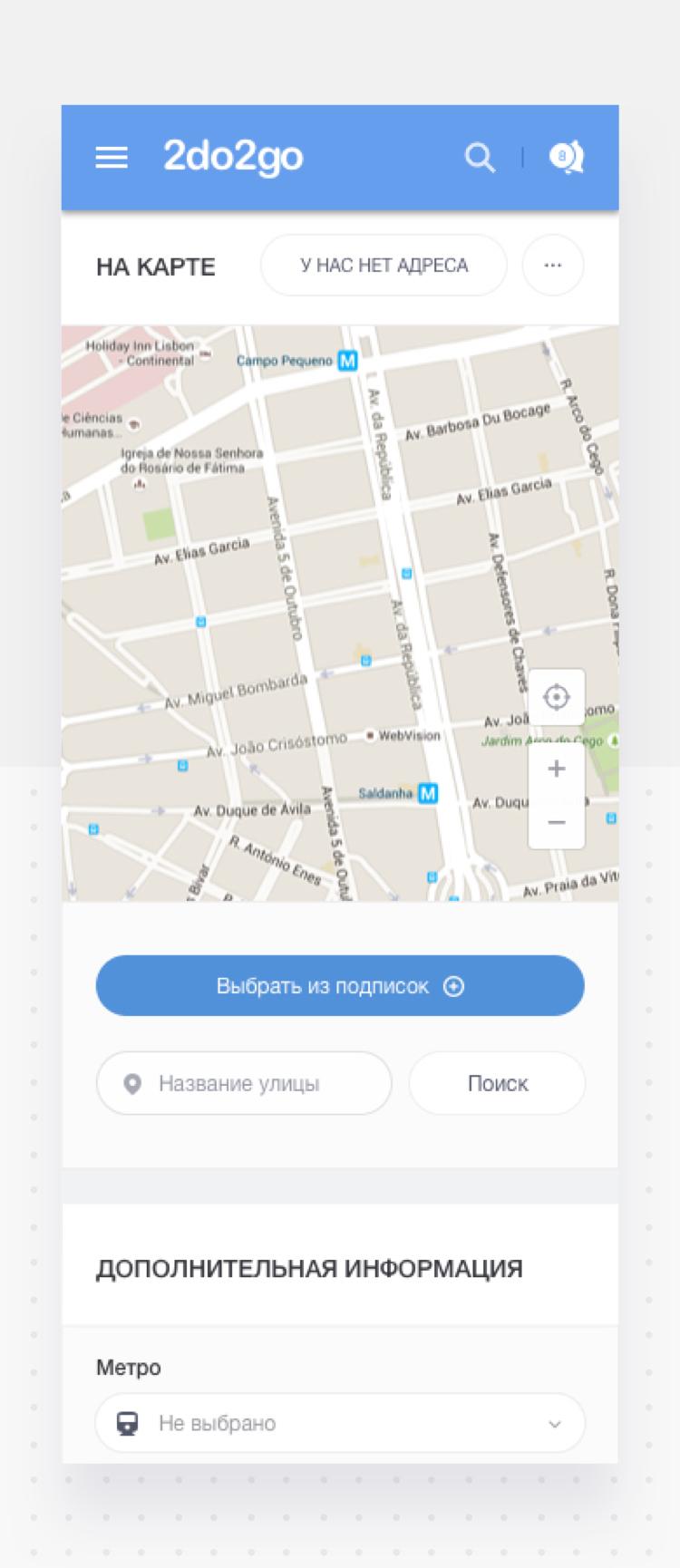
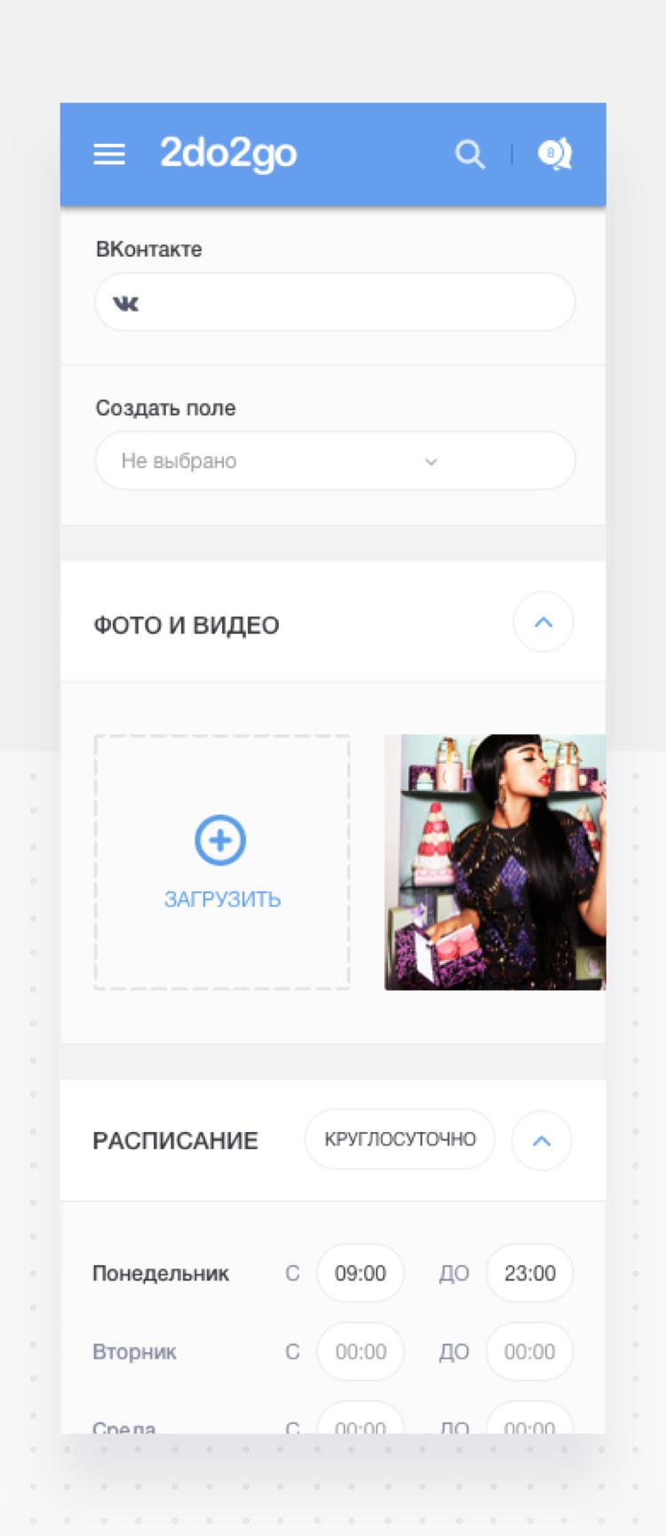
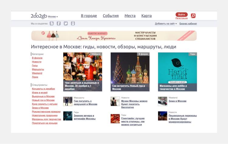
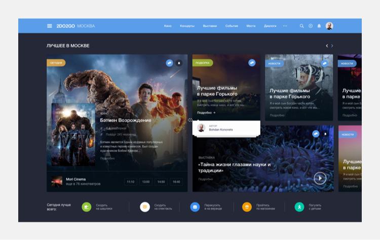
We worked with the 2do2go team to completely overhaul the old website to create a simplified and more responsive version with a better layout and more functionalities adapted for every device.
-
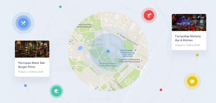
 events near youWith 2do2go you can discover all the best events in your city.
 -
 places to visitThere are more than enough interesting places you can visit.
 -
 user as a creatorUnleash your inner innovator, create and add your own contents.
Newer, better and simpler.
To understand what improvements 2do2go users needed, we conducted a thorough research and based our design on it. We also introduced new features that the company wanted to integrate into the new version of the project.
-
02 — Main page
![]()
-
03 — adaptive page
![]()
-
![]()
-
![]()
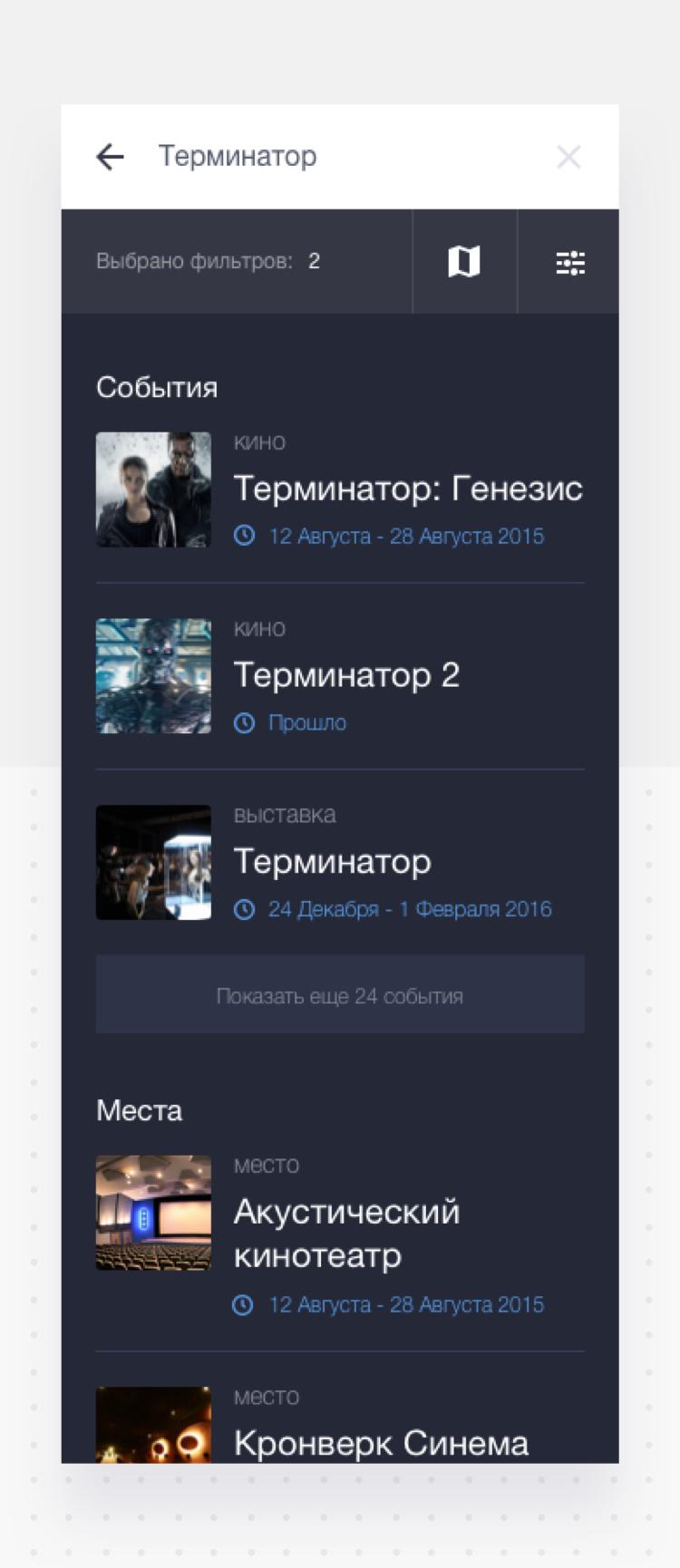
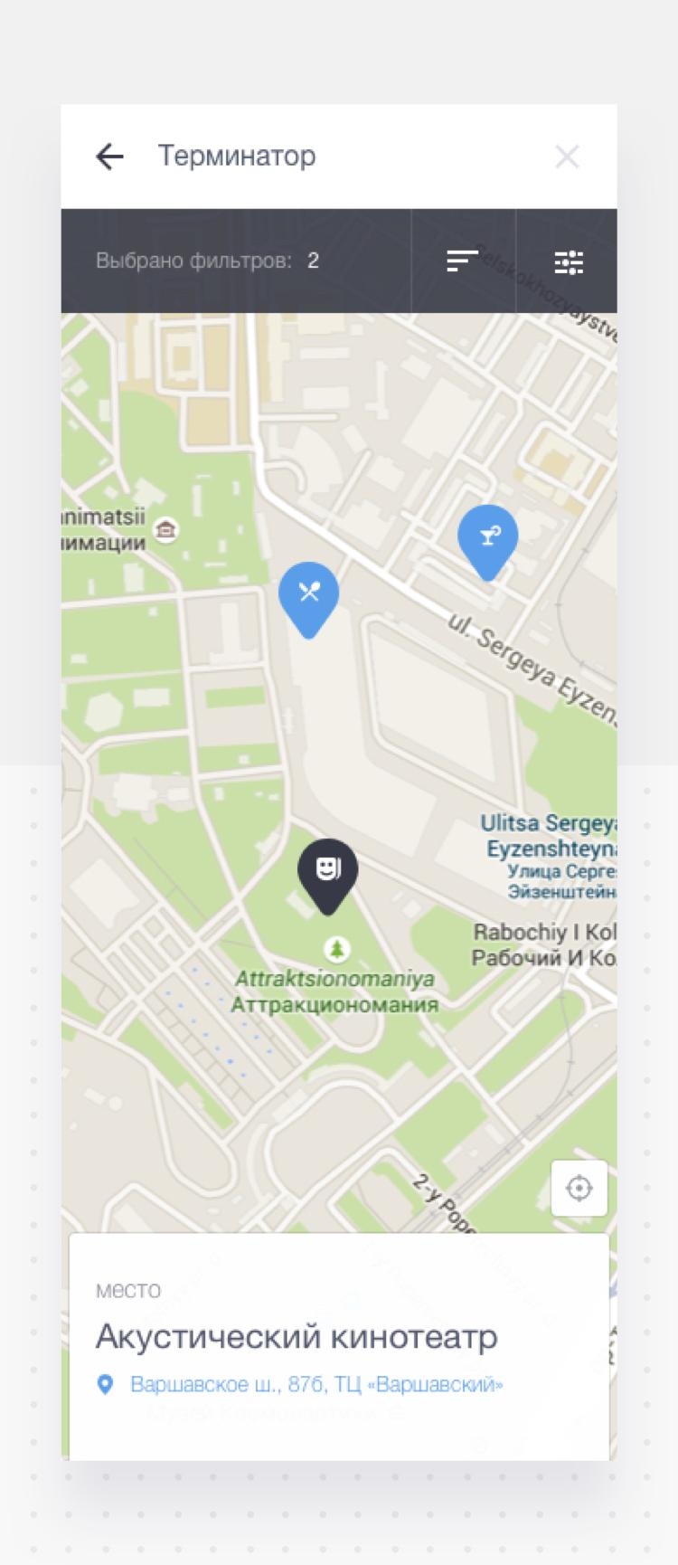
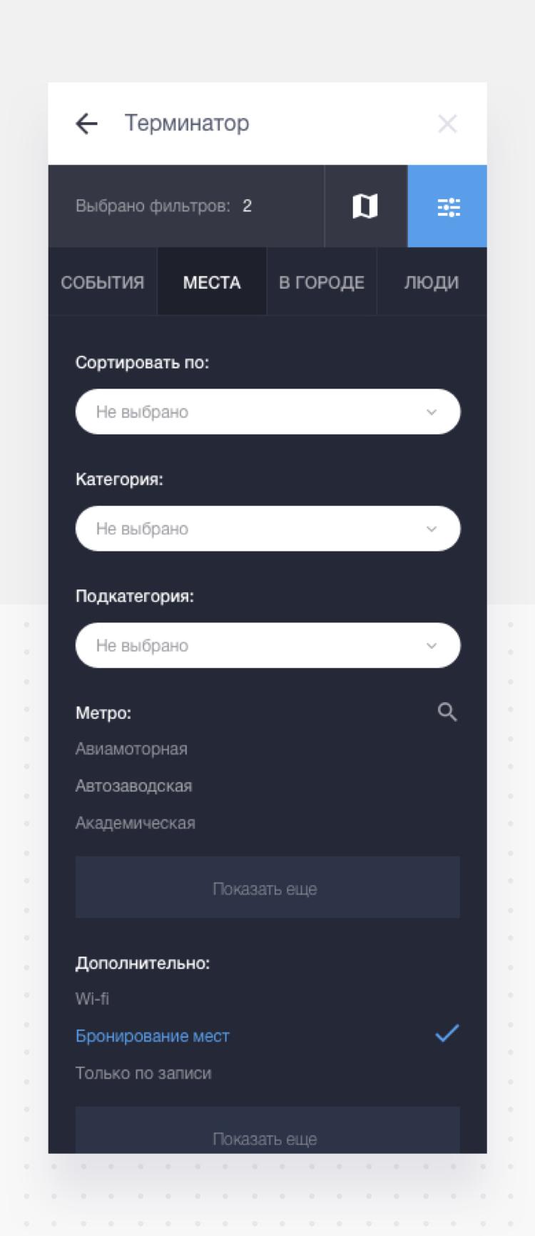
Smart search with smart map.
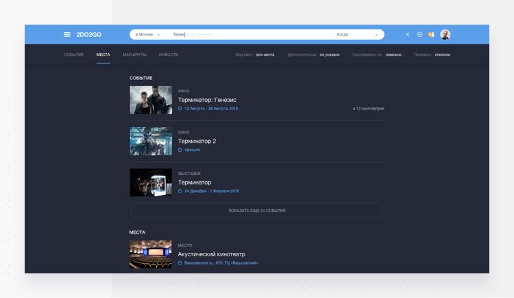
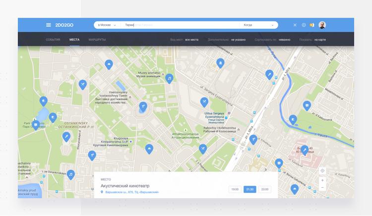
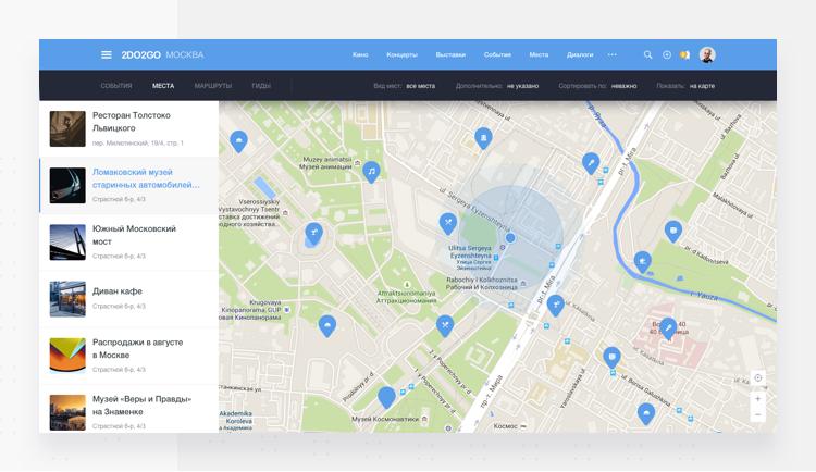
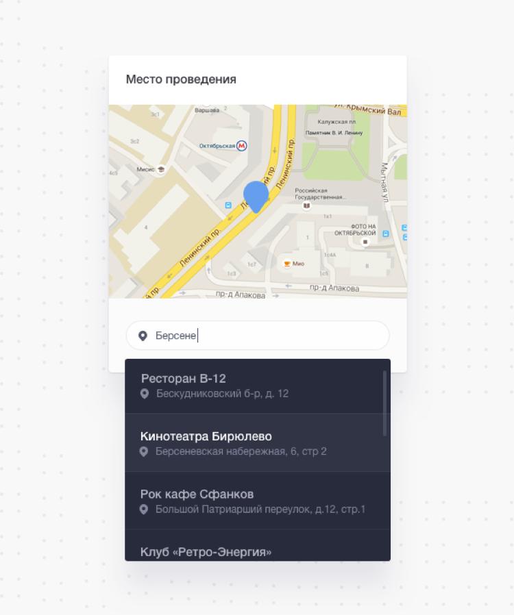
Now you can find whatever you need with the new smart search feature. We included a map navigation function with advanced search tools to ensure that even the most of intricate of search queries turn up useful results.
-
01 — Search
![]()
-
02 — search suggestions
![]()
-
03 — Search Map
![]()
-
04 — places on the map
![]()
-
05 — adaptive page
![]()
-
![]()
-
![]()
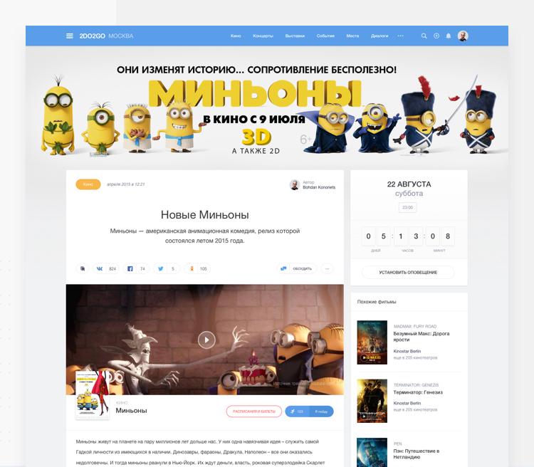
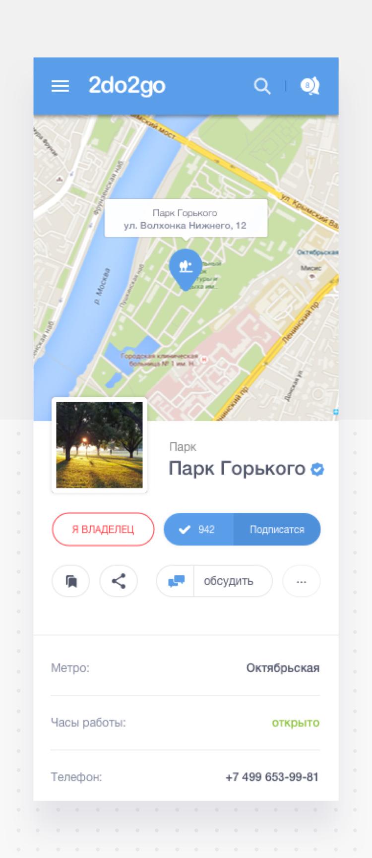
All inclusive layout for events and places.
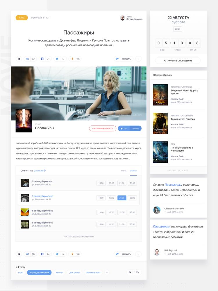
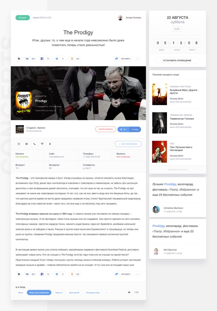
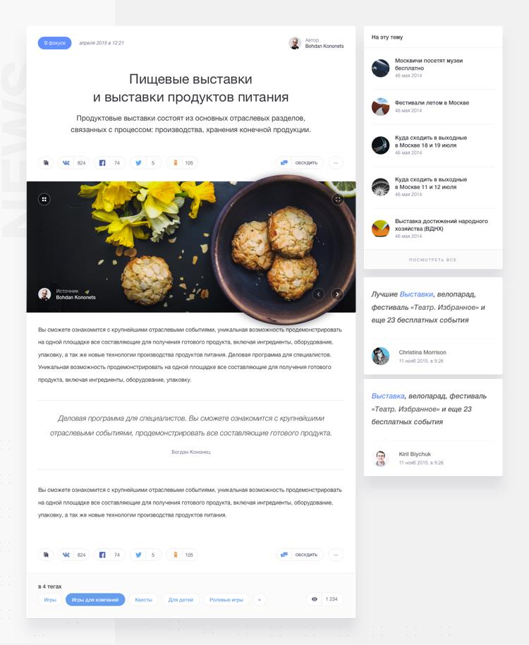
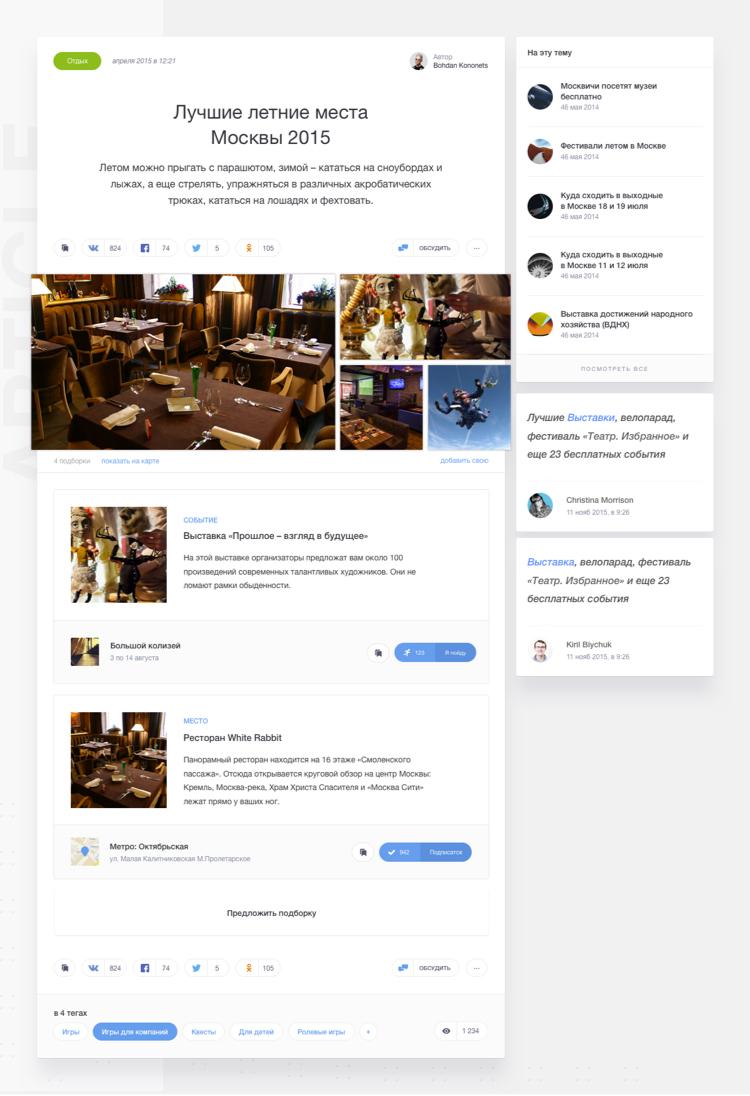
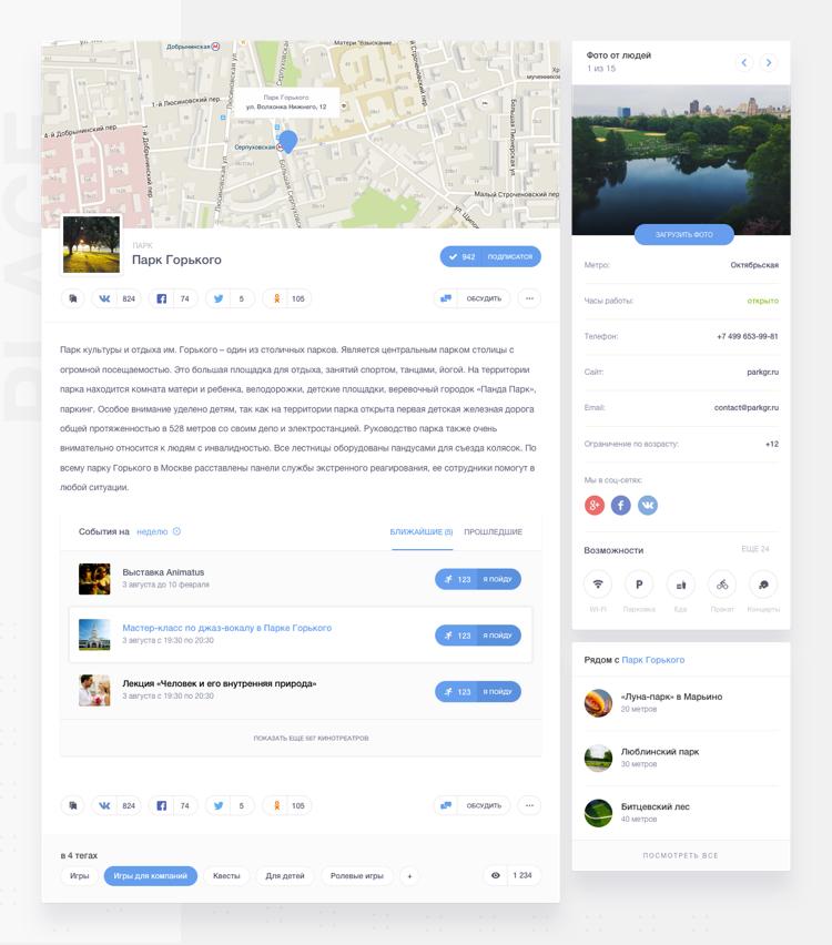
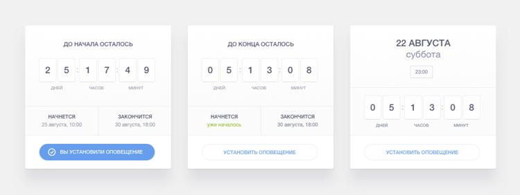
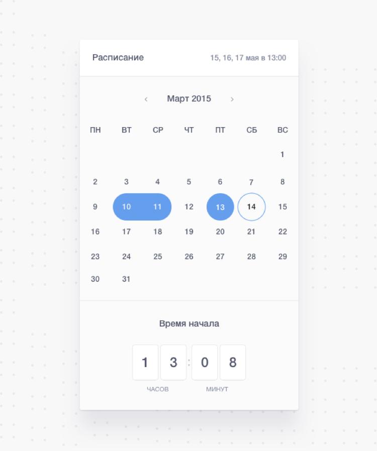
We redesigned the events page such that the various sections are now properly categorised with six different themes and new features to enhance the display and improve user experience.
-
01 — Branded event
![]()
-
02 — movie and trailers
![]()
-
03 — concerts and events
![]()
-
04 — news page
![]()
-
05 — article page
![]()
-
06 — company & place profile
![]()
-
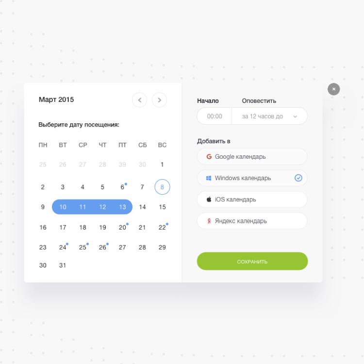
07 — event date
![]()
-
08 — calendar
![]()
-
09 — venue
![]()
-
10 — adaptive page
![]()
-
![]()
-
![]()
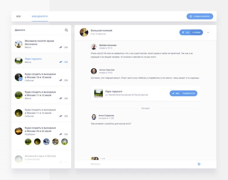
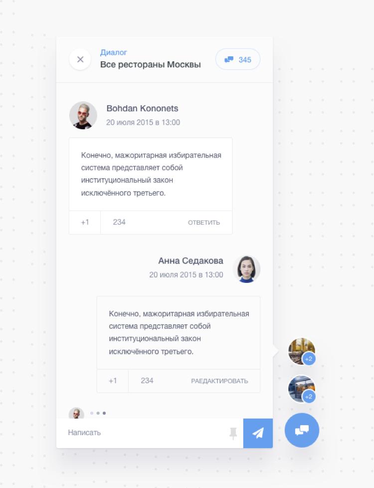
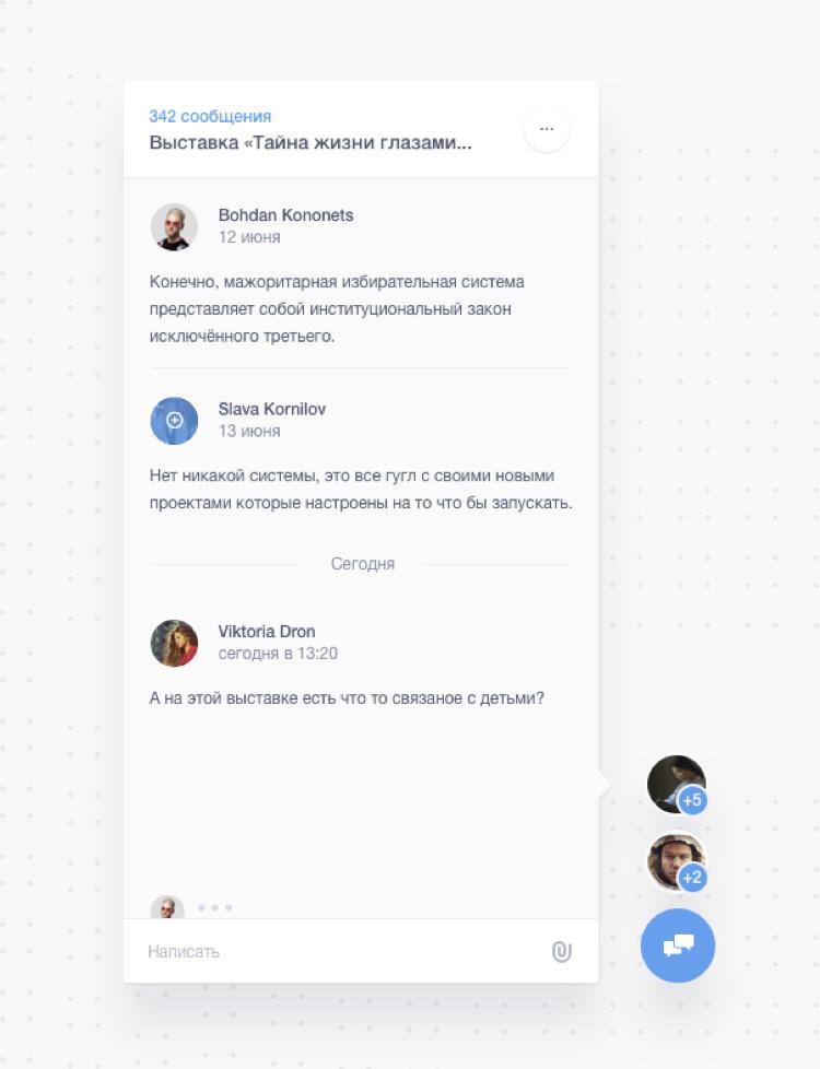
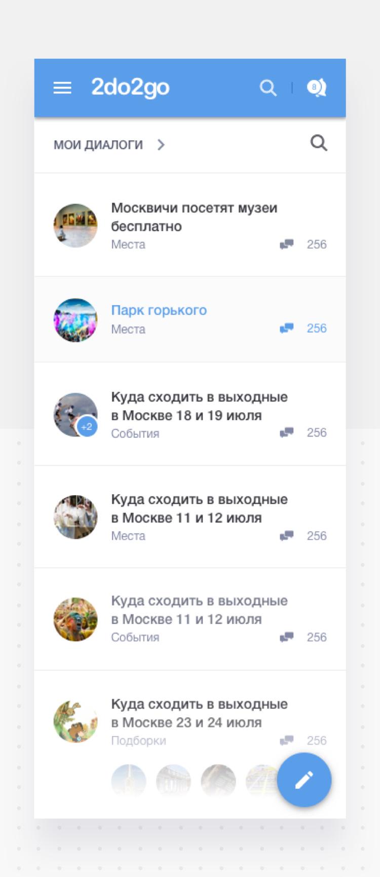
Join the discussion, or begin one.
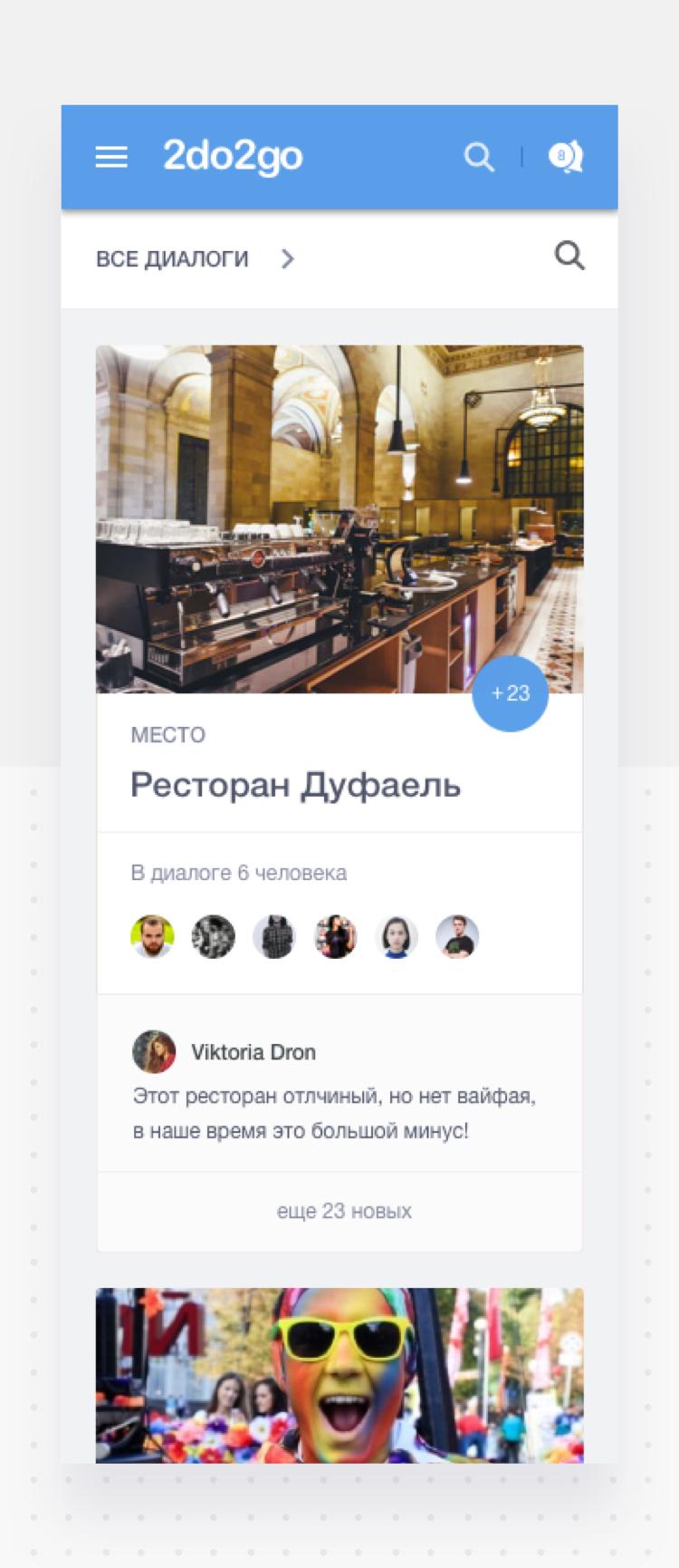
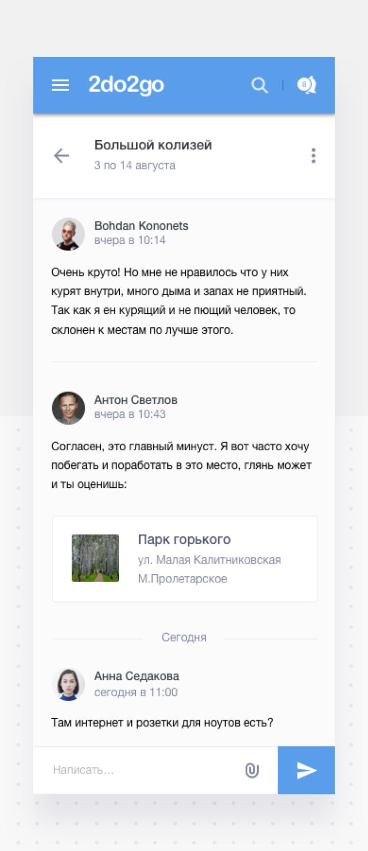
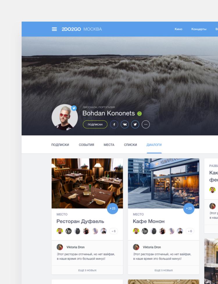
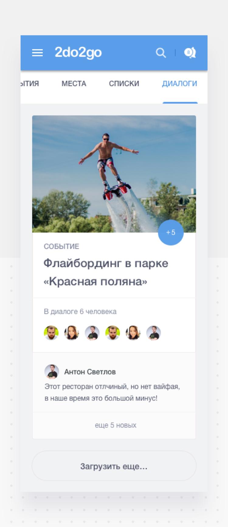
While designing the website, we made improvements to the chat and feedback system by combining them into the Discussions section. Now you can easily find and engage in a conversations that interest you.
-
01 — all discussions
![]()
-
02 — expanded discussion
![]()
-
03 — send a message
![]()
-
04 — View the message
![]()
-
05 — adaptive page
![]()
-
![]()
-
![]()
New and improved user profile page.
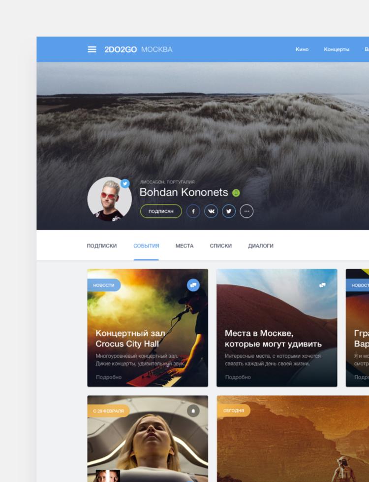
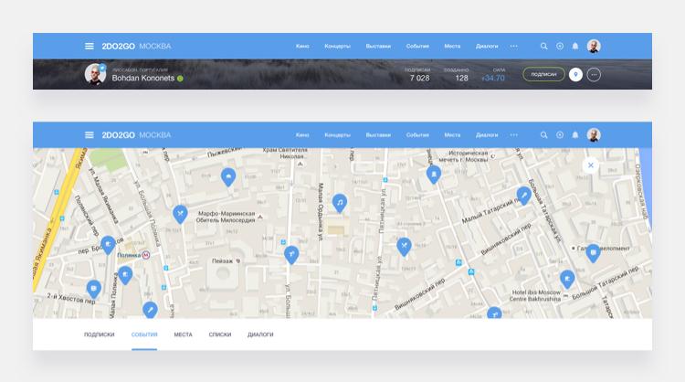
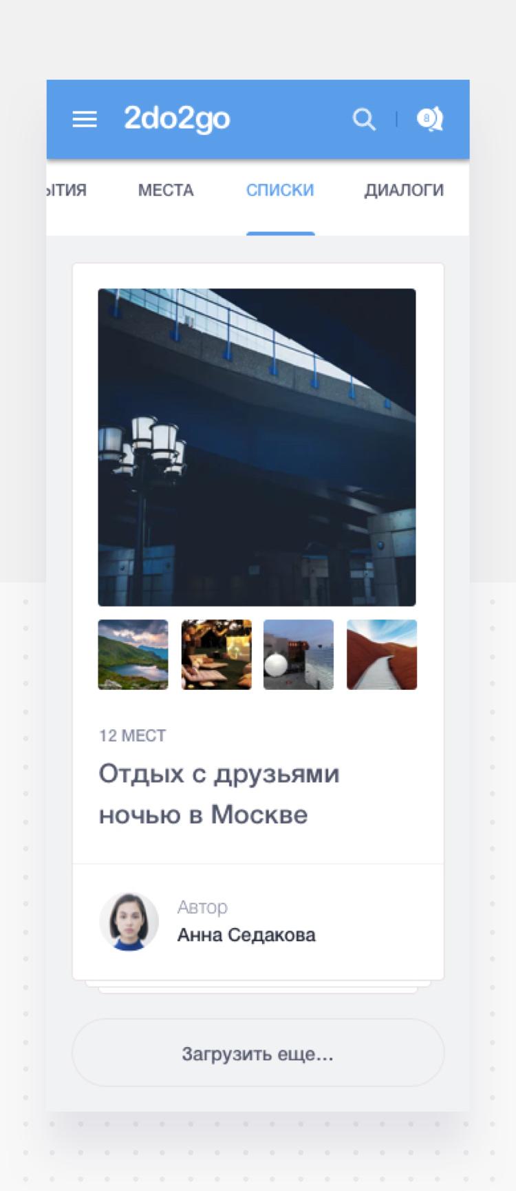
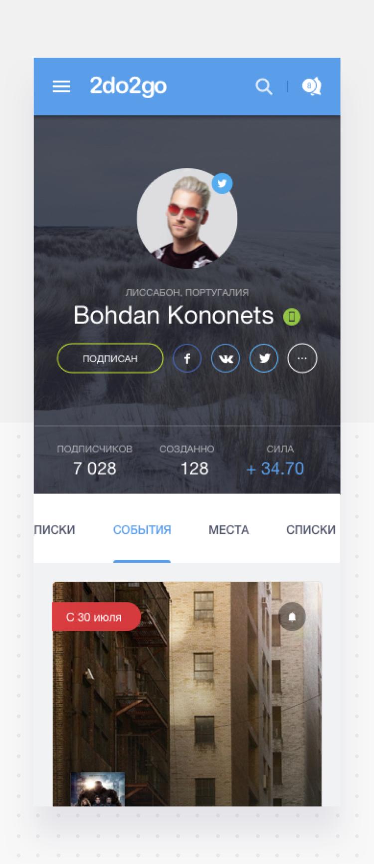
We redesigned the user profile page with a more flexible and navigable layout. Improved its structure and added new features. Now users can follow subscriptions of their friends and the events they are planning to attend, view their favourite places and also create lists and discussion boards to engage with other users.
-
01 — user profile: events
![]()
-
02 — user profile: discussions
![]()
-
03 — fixed header & map expanded
![]()
-
04 — adaptive page
![]()
-
![]()
-
![]()
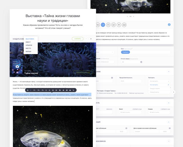
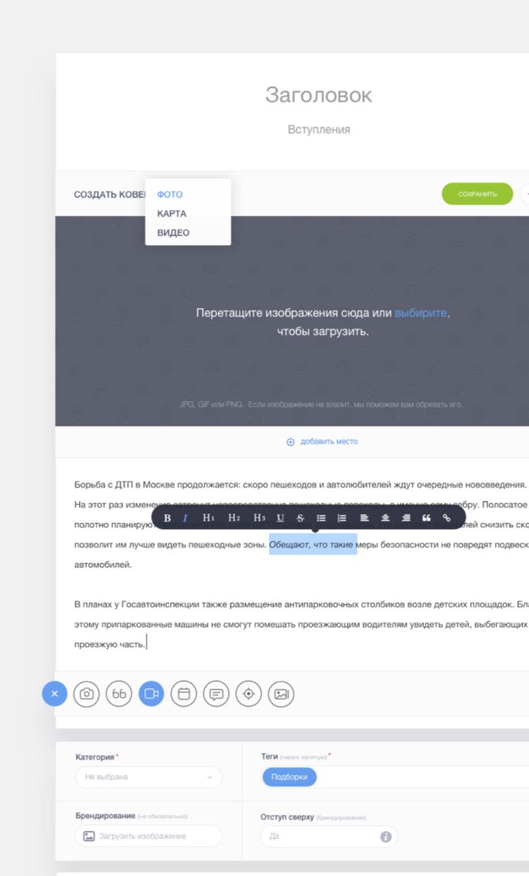
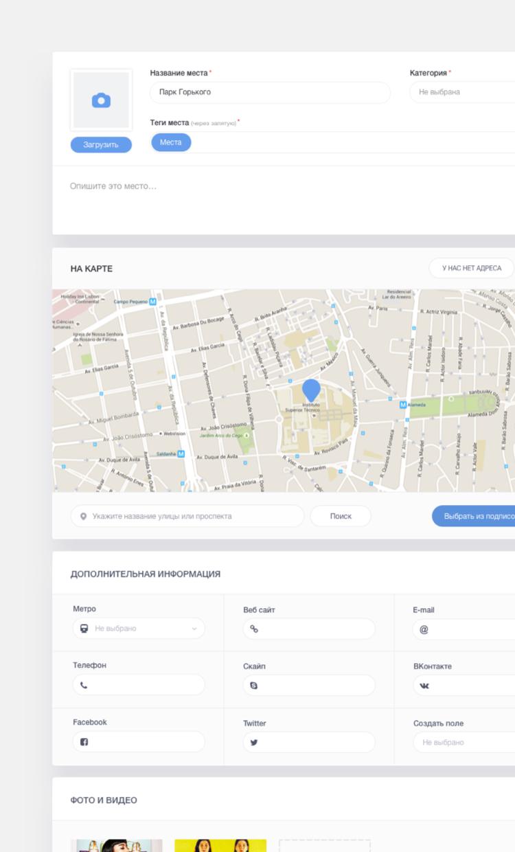
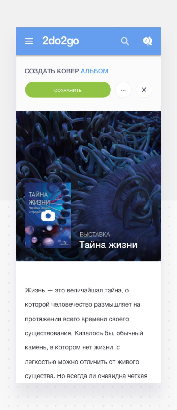
You have the power, create, edit, repeat.
All the content of old 2do2go.ru was generated by copywriters of places and companies, nowadays it became more user centered and more interesting to interact with. New form of adding content changed it all.
-
01 — event creation
![]()
-
02 — add places on the map
![]()
-
03 — add company profile page
![]()
-
04 — adaptive page
![]()
-
![]()
-
![]()
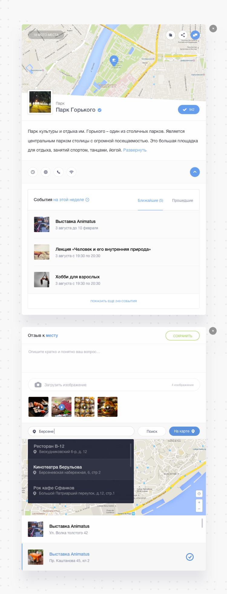
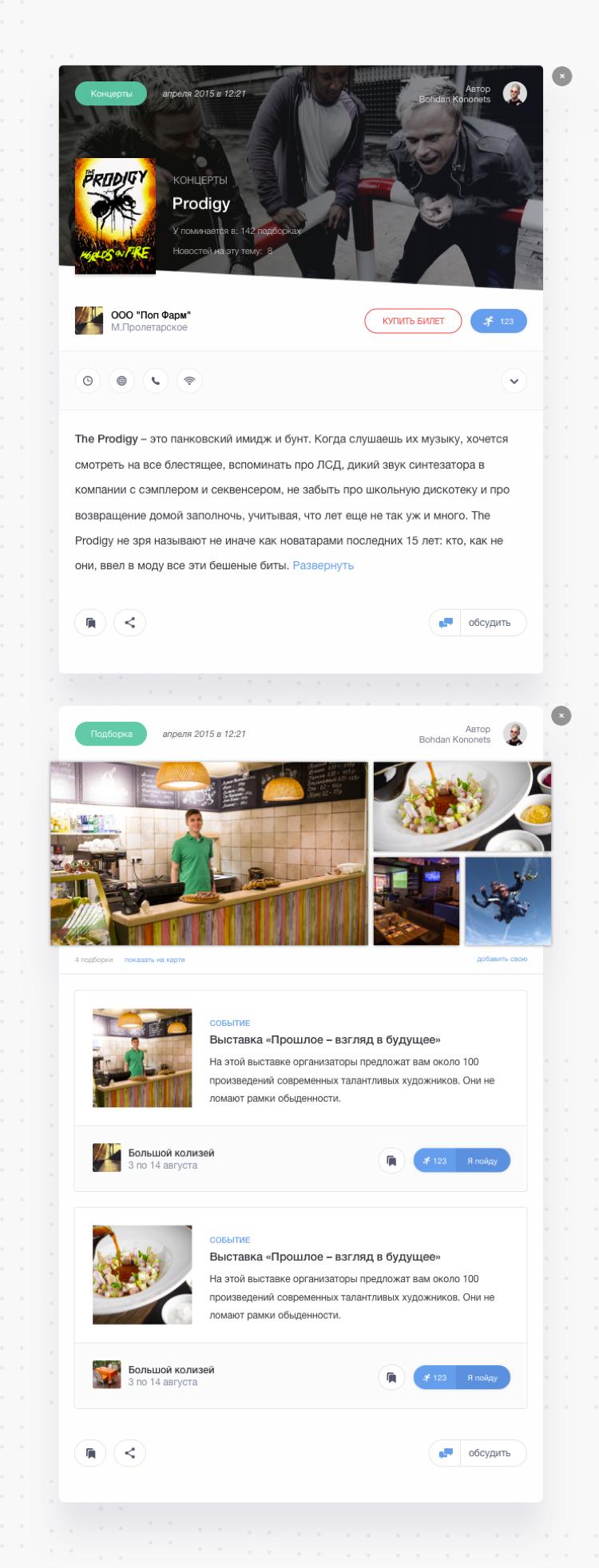
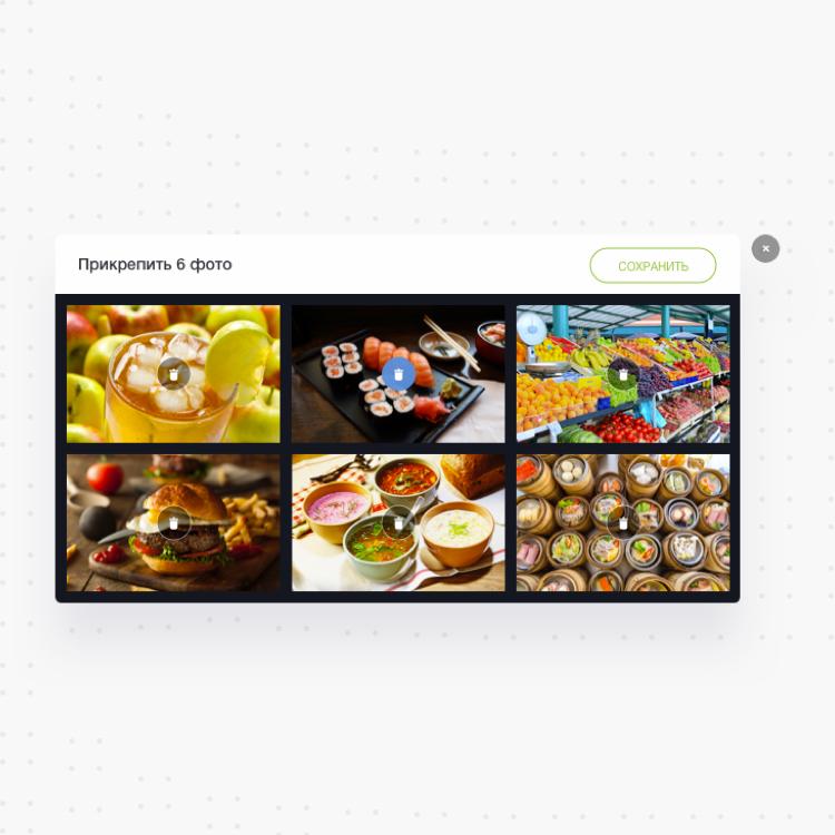
Modal windows.
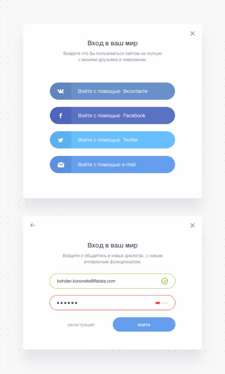
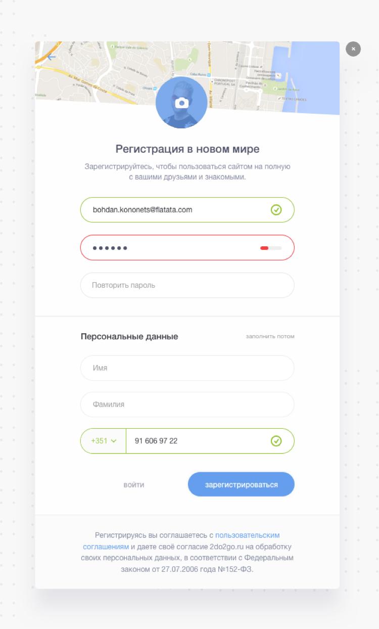
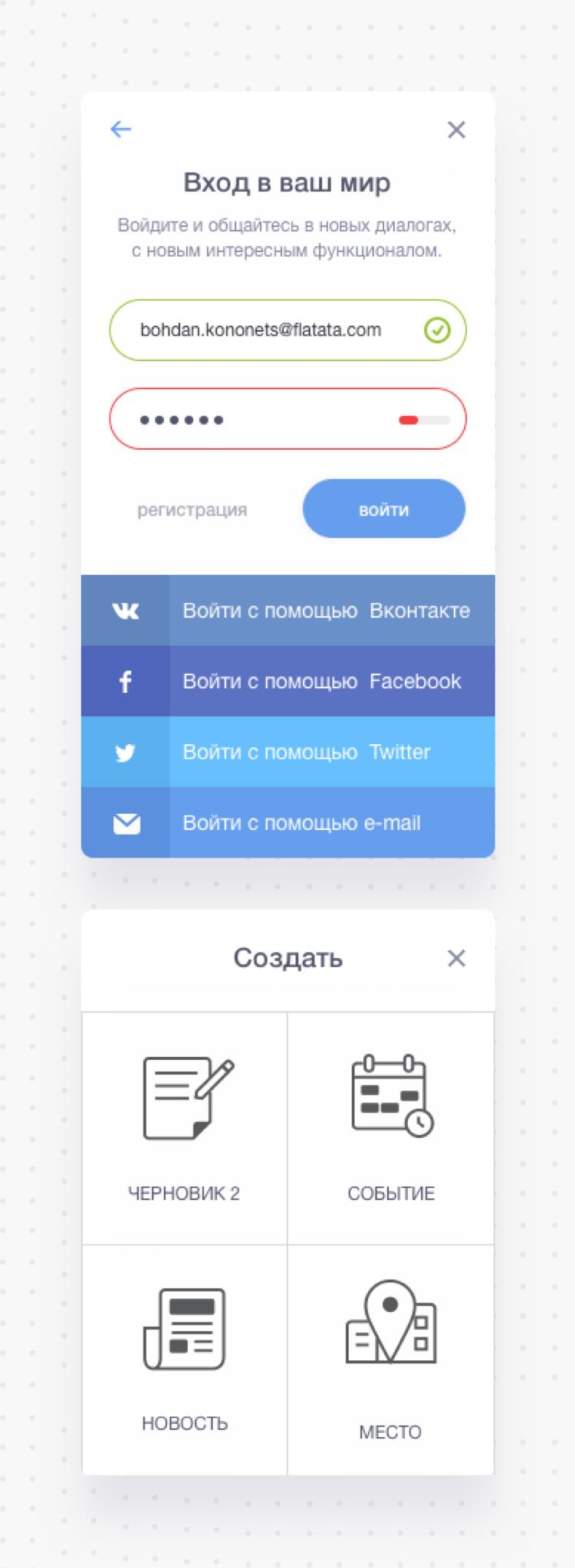
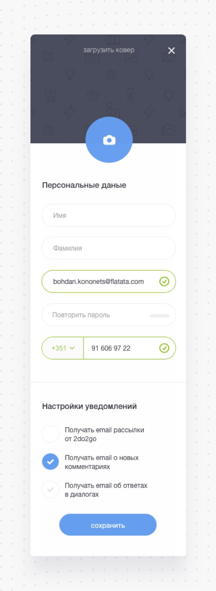
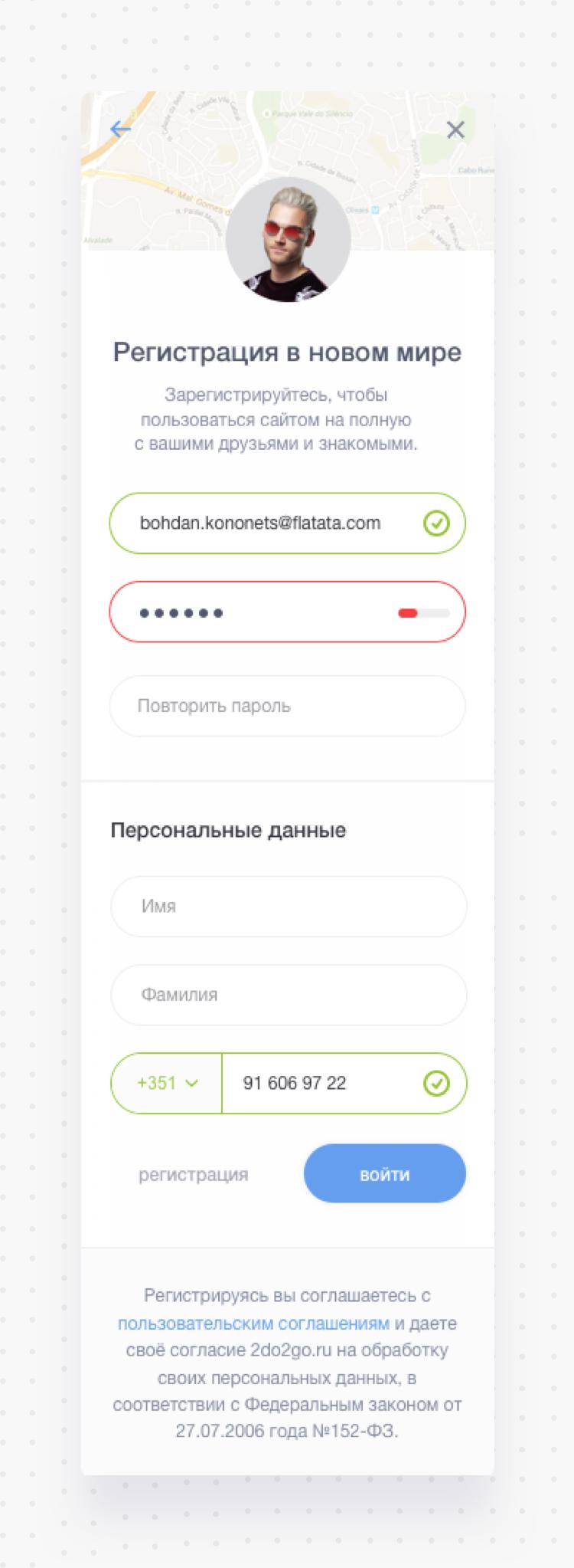
Modal windows boost the efficiency of a website and enhance the browsing experience for the end user.
-
01 — Registration and login modal windows
![]()
-
![]()
-
02 — place or company profile
![]()
-
03 — Event, topic or list modal
![]()
-
04 — Notification
![]()
-
05 — Add album
![]()
-
06 — adaptive modal
![]()
-
![]()
-
![]()
2do2go icons.
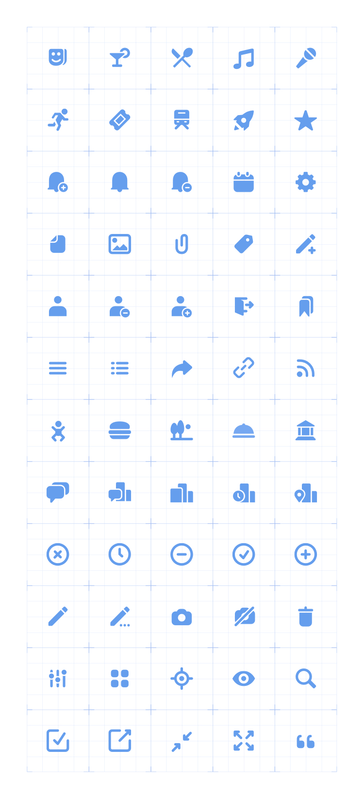
We created over 68 basic and complex icons specially designed for the 2do2go platform. Now navigation is a lot more intuitive and finding what you want couldn't be easier and quicker.
-
01 — basic icons
![]()
-
02 — complex icons
![]()
