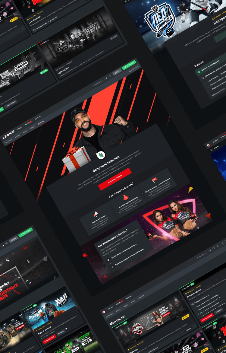
Leon is one of the top 10 bookmakers in Russia and CIS countries that successfully operates online for more than 13 years now and has a good and strong reputation and brand.
Create a home for all the brand activations and promotions that Leon offers to its users.
Art direction, Ui-Ux design, Motion
A Shop or a Gallery?
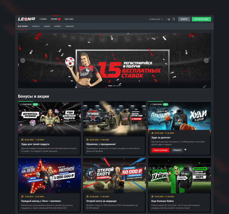
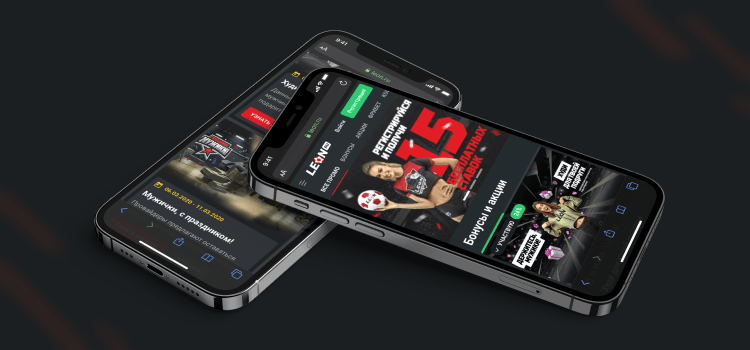
Leon’s promo campaigns are diversified and often related to specific celebrations or themes. That is emphasized by graphics and covers – so why not showing them in the best possible way? That is why the home page is more like a gallery than a library or a shop.
-
01 — home page
![]()
-
02 — mobile home page
![]()
Full House
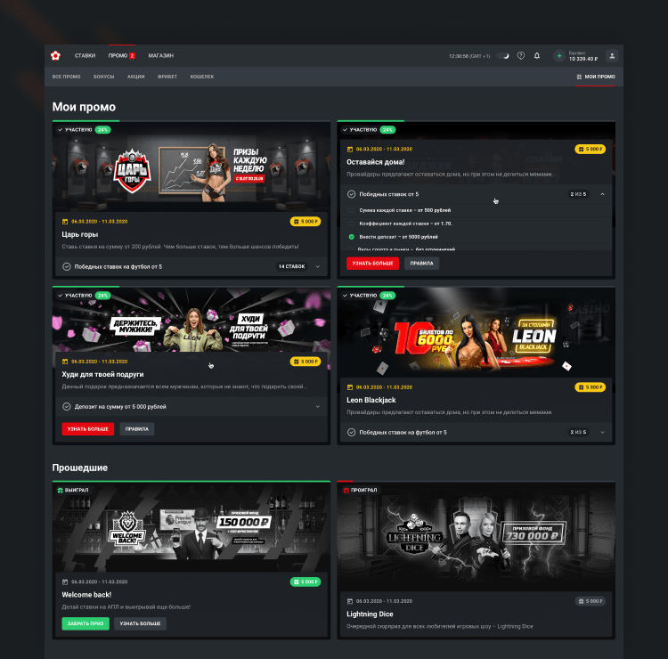
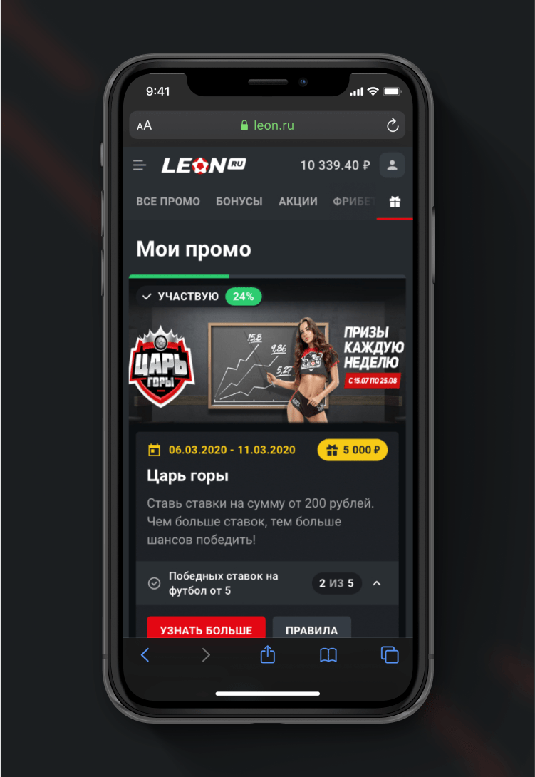
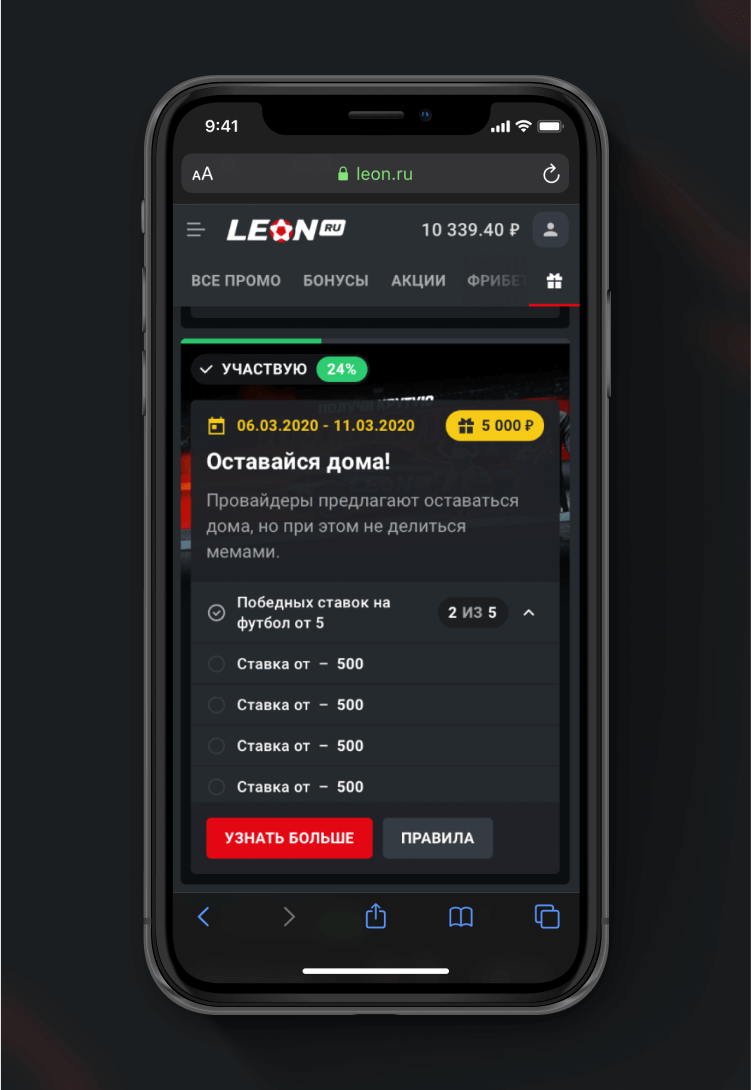
Those who are used to take part in several activations at the same time know that it is important to track them all. Ideally, within one page to be able to act quickly. To make it easier, we’ve used hovers on desktop and “dropups” on mobile to show more without losing users’ focus.
-
01 — joined promotion
![]()
-
02 — Joined promos – mobile
![]()
-
![]()
No Pitfalls
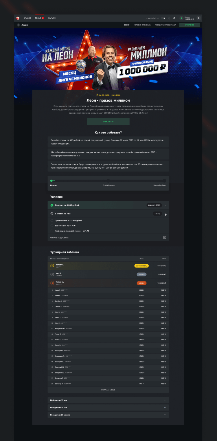
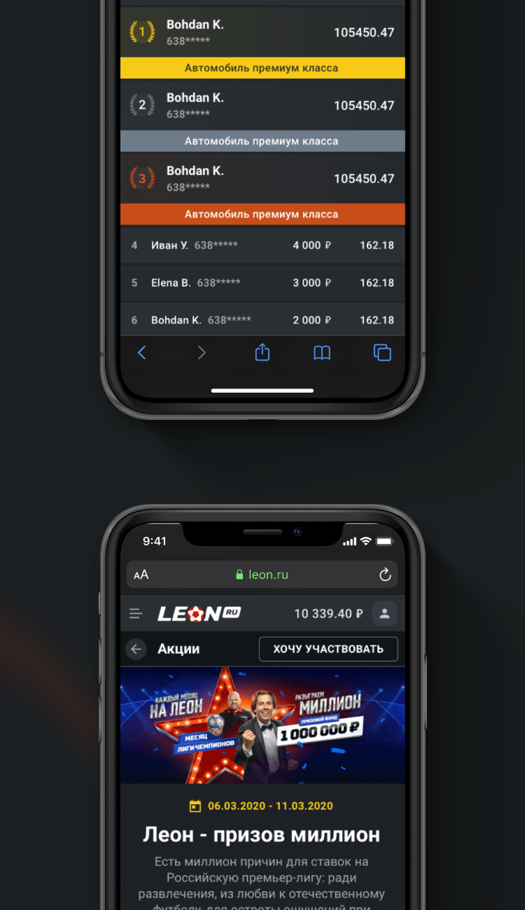
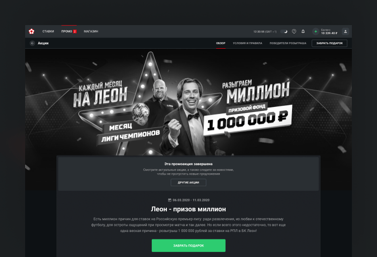
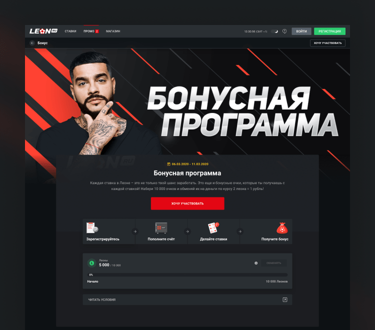
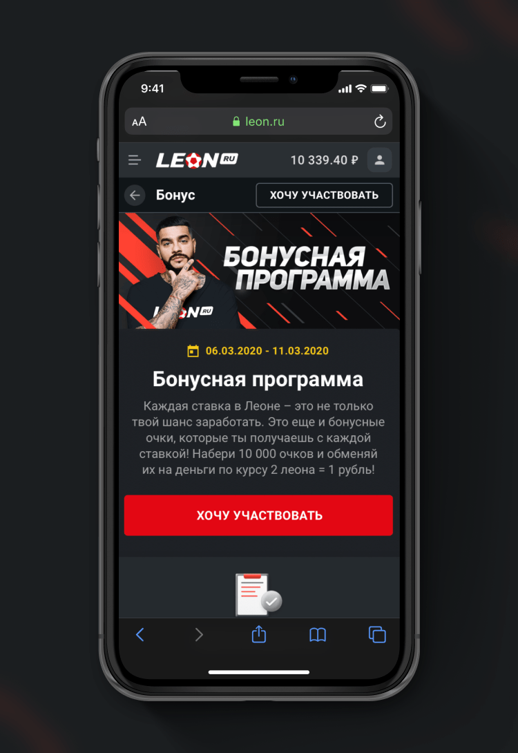
It would be dishonest to conceal one of the major fears related to promo campaigns – the anxiety of a possibility to miss some details or get fooled. Luckily, Leon’s promo doesn’t need to hide any details so we were able to create an easy-to-understand and clear page with all the rules.
-
01 — promo details
![]()
-
02 — promo details mobile
![]()
-
03 — finished promo details
![]()
Follow the Progress
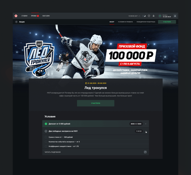
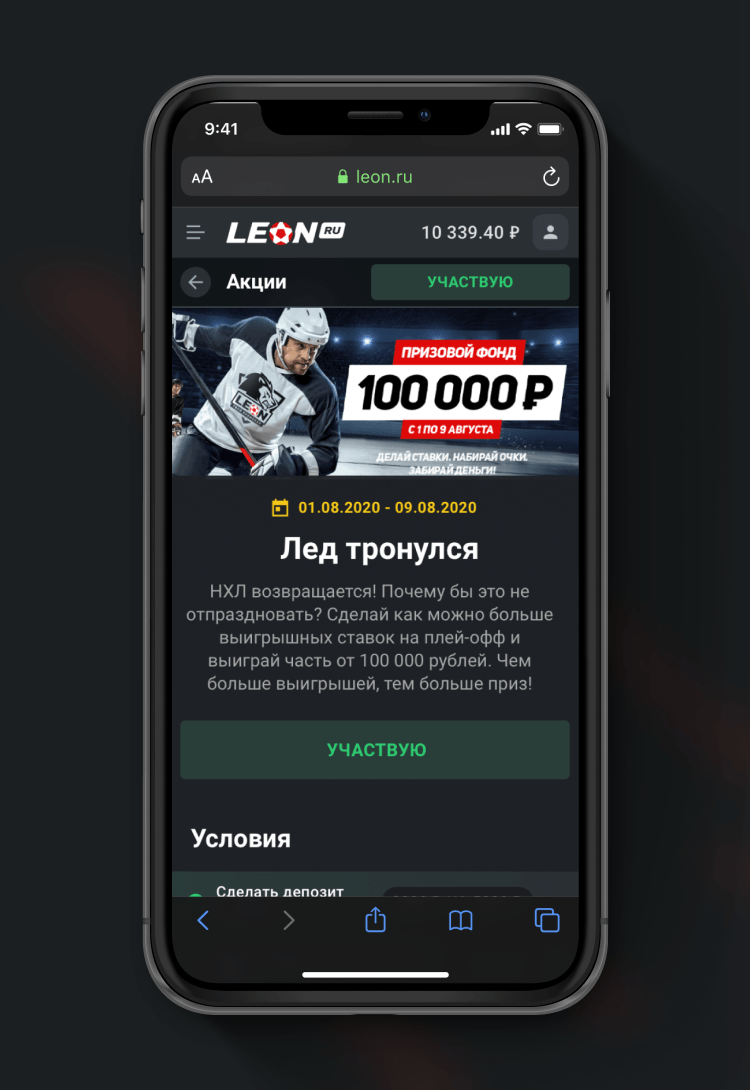
Most of the promo campaigns are not just “another bonus” but something complex and interesting to follow (and take part in). That’s why a user should be able to keep track of the progress and always see more details.
-
01 — Progress promotion
![]()
-
02 — Progress promotion on mobile
![]()
-
![]()
Loyalty Rewarded
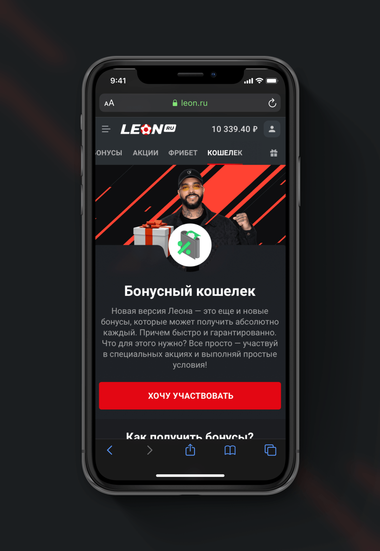
Last, but not least. Leon developed a reward system to thank its loyal users – a kind of cashback that goes separately from all of the other promo campaigns and is permanent. Gain, exchange, have fun – that's the motto!
-
01 — Promotion Wallet
![]()
-
02 — loyalty bonuses
![]()
-
03 — WALLET MOBILE
![]()
-
04 — WALLET EXPLAINED MOBILE
![]()
