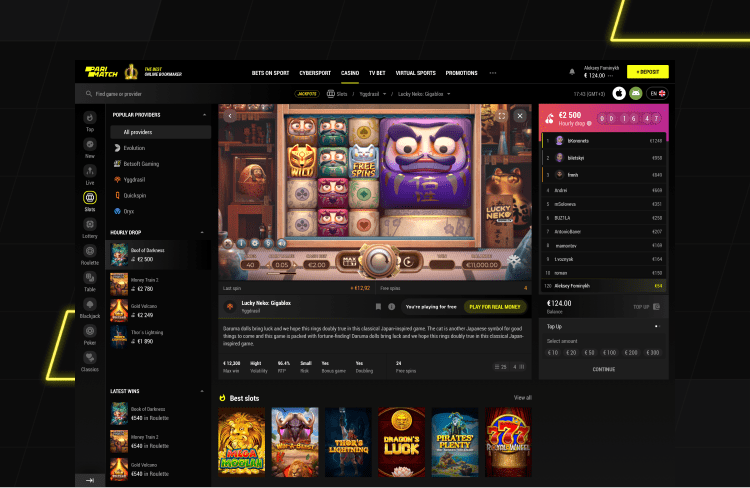
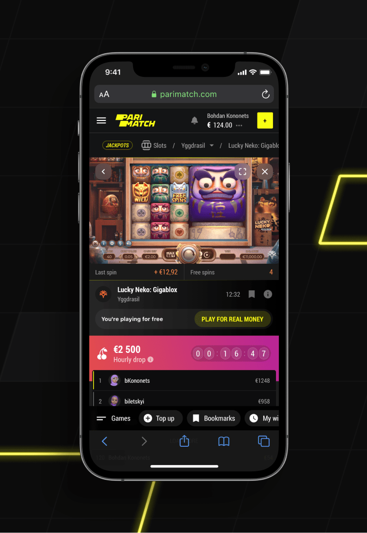
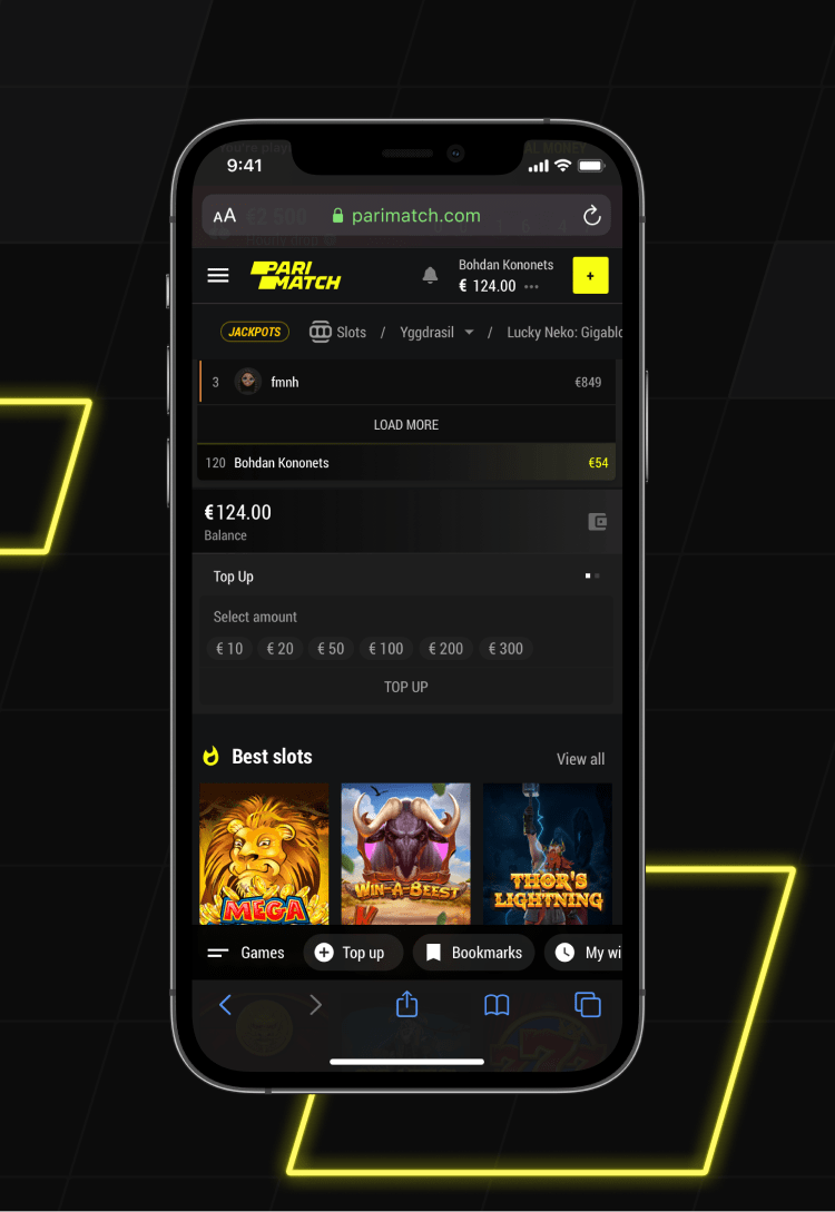
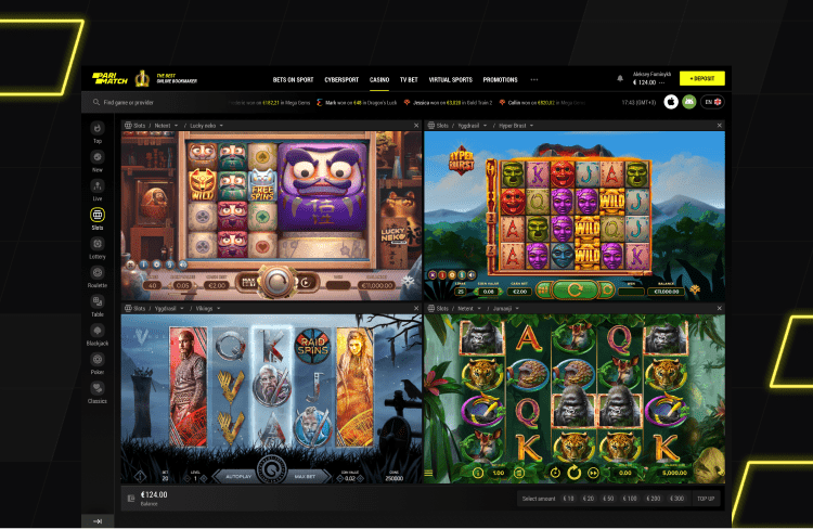
Parimatch is one of the most well-known gambling brands in Eastern Europe and is quickly expanding worldwide, gaining new markets and conquering new audiences.
Create a functionality that would be native for experienced conservative betters and digital natives, eager for more.
Research, UI/UX, Art direction, Interactions, 3D
Overview
Users can have nothing in common in terms of statistics but share a passion point. We believe that the only way to create a product that would become that passion point is to mix the best practices and spice them up with new ideas and creativity, making the product flexible and adaptive to the habits and needs of users.
-
 NEW FEATURESMade to stand outfrom the list of similar websites
 -
 HIGHER ENGAGEMENTShort cuts in user flows allows them to stay focused and involved
 -
 CLASSIC FEATURESWorks both for experienced users and newcomers
Same product, new triggers
We figured out that one of the main opportunities for development is the engagement of the new audience that is used to multiple screens, quick actions and a short time of interest without additional stimuli.
-
01 — Main features
![]()
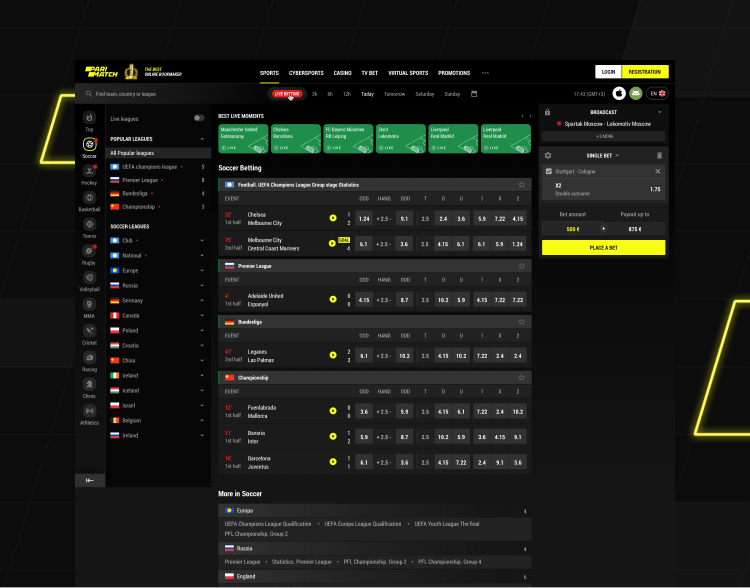
Unique functionality of the home page
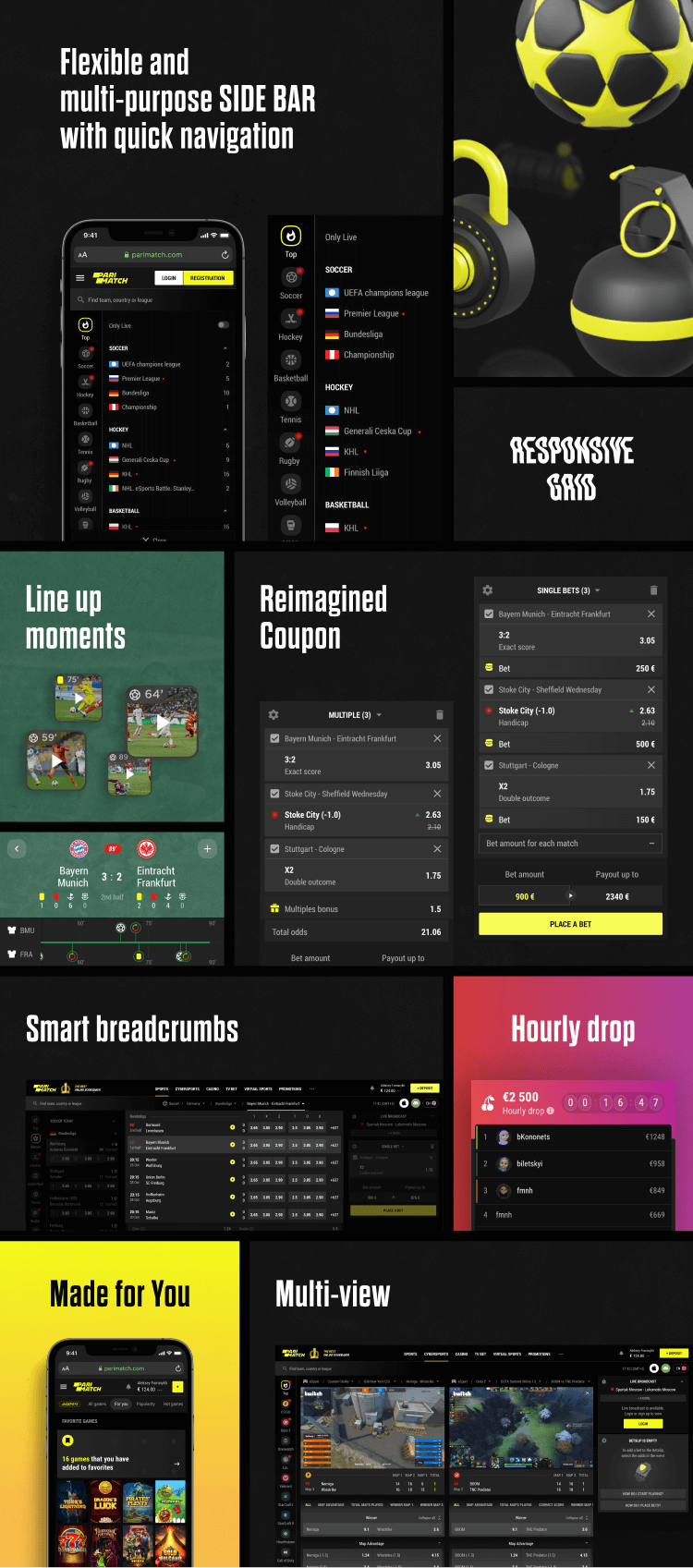
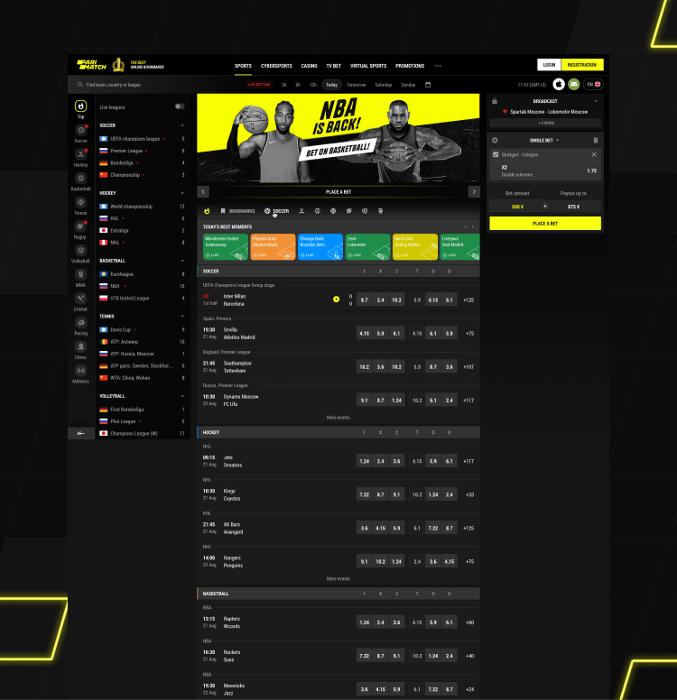
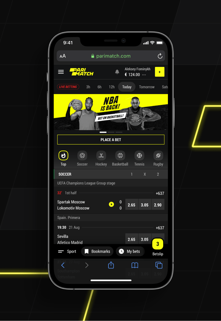
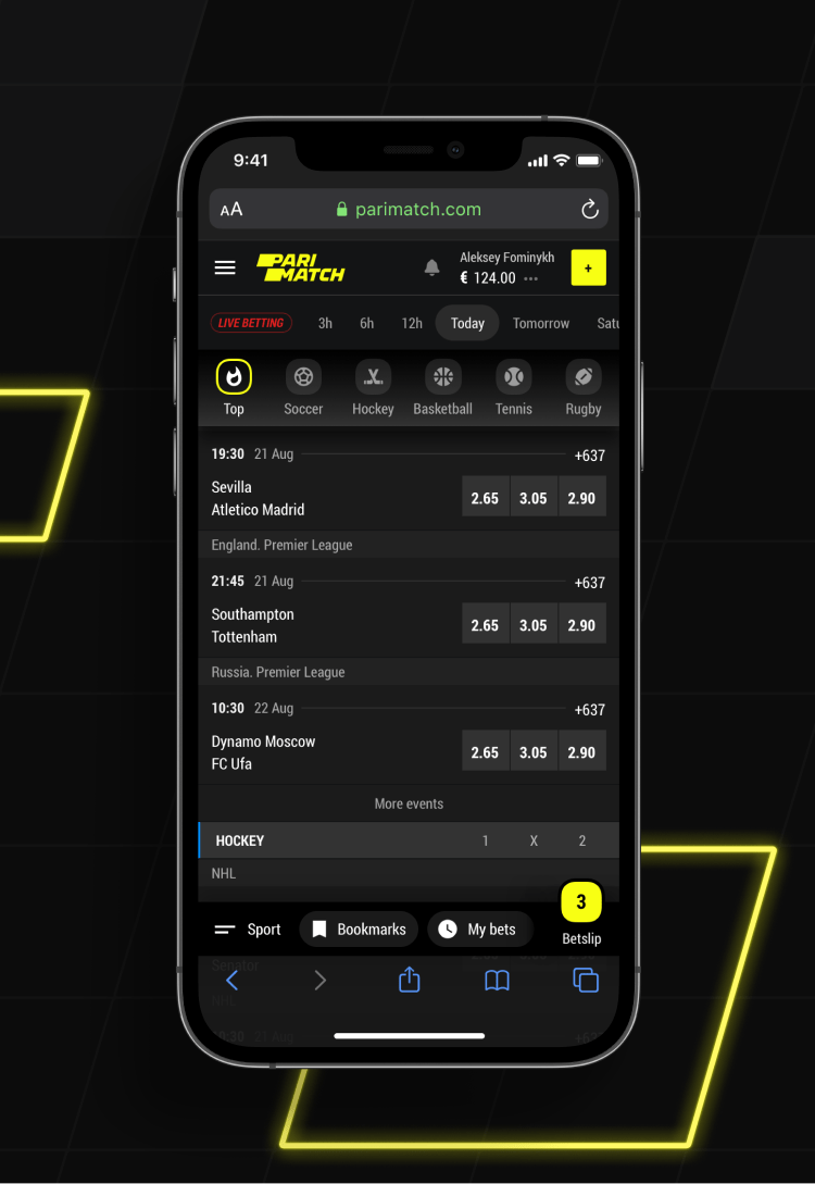
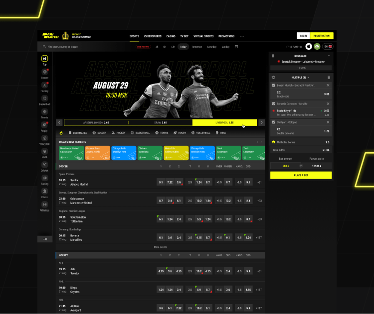
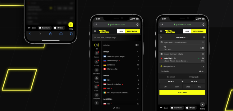
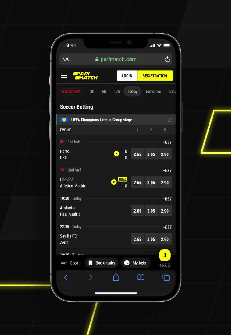
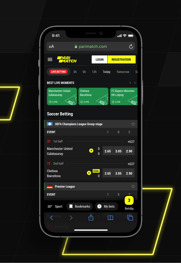
We needed a page that would look both familiar and yet standing out. That is whe we focused on navigation and deep content filtration, fully using the potential of sidebars and headers on desktop and tab bar on mobile.
-
01 — home page
![]()
-
02 — mobile
![]()
-
![]()
Full screen
The value of the right use of space cannot be overestimated in such projects. The idea, however, is not only to jam-pack everything as tight as possible but to give some flexibility – for example, users can easily collapse the left sidebar.
-
03 — home page
![]()
-
03 — home page adaptive
![]()
League & Sport page
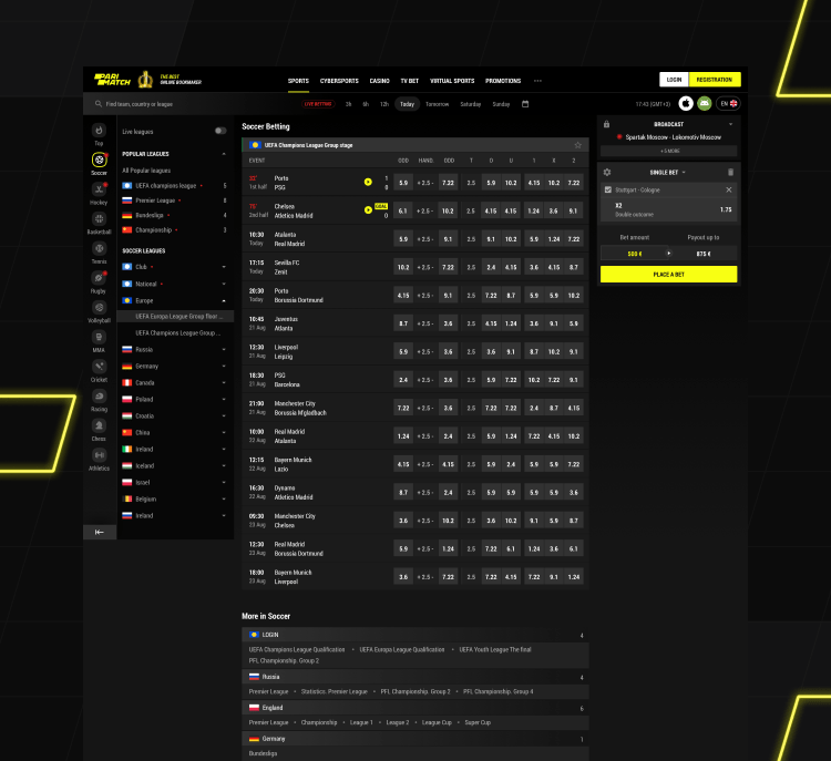
A specific page for a particular sport or league is essential both for SEO and for proper user behaviour. Besides, this gives an opportunity to customize the page for a huge remarkable events like Euro.
-
01 — League page
![]()
-
01 — Sport page
![]()
-
03 — adaptive
![]()
-
![]()
Explore sport events
Finding the right match is highly important, but what is inside it is even more – especially, if we speak about the most valuable customers who bet on secondary markets mostly. The challenge was to fit all the information and keep it readable, even on small screens.
Football matches
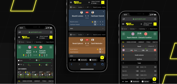
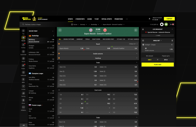
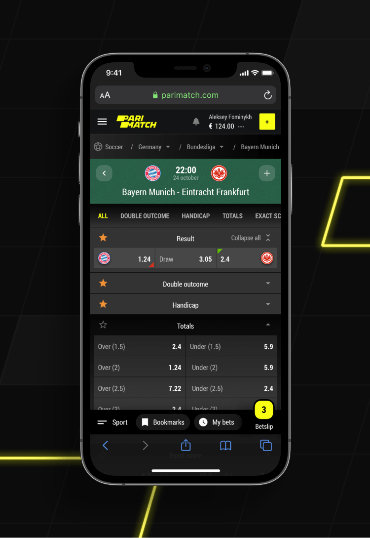
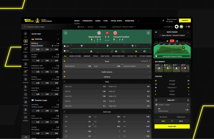
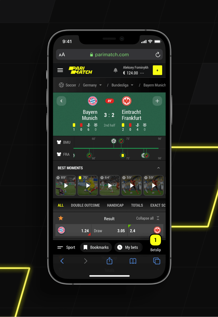
The most popular sports in the modern betting world (sorry, horse racing) deserves a proper event page in all the states – pre-match, live and result.
-
01 — Open match
![]()
-
02 — Mobile match
![]()
-
![]()
-
03 — Live match
![]()
-
04 — Mobile match
![]()
-
![]()
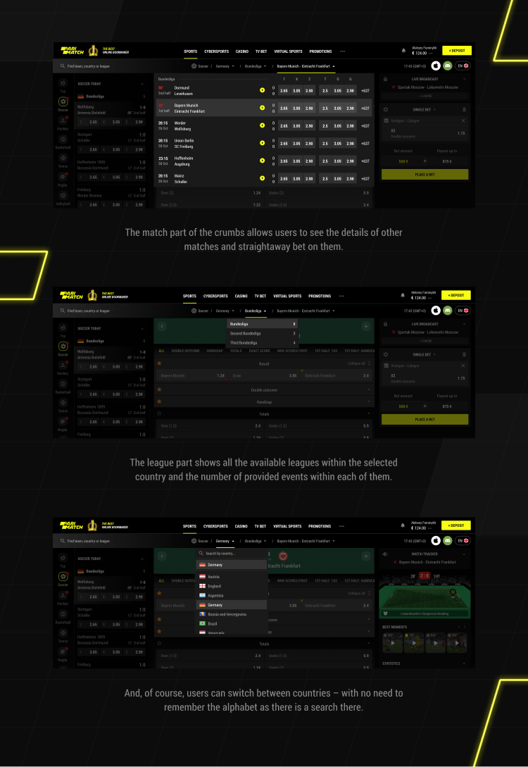
Smart breadcrumbs.
The true virtue of design involves transforming usual things into masterpieces. Why having dull and nominally functional breadcrumbs, when we can make them work as quick navigation?
-
05 — Breadcrumbs
![]()
Tennis matches
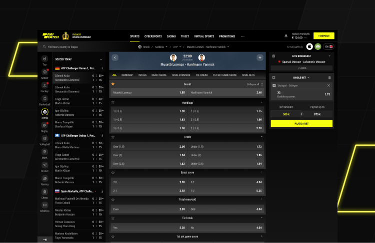
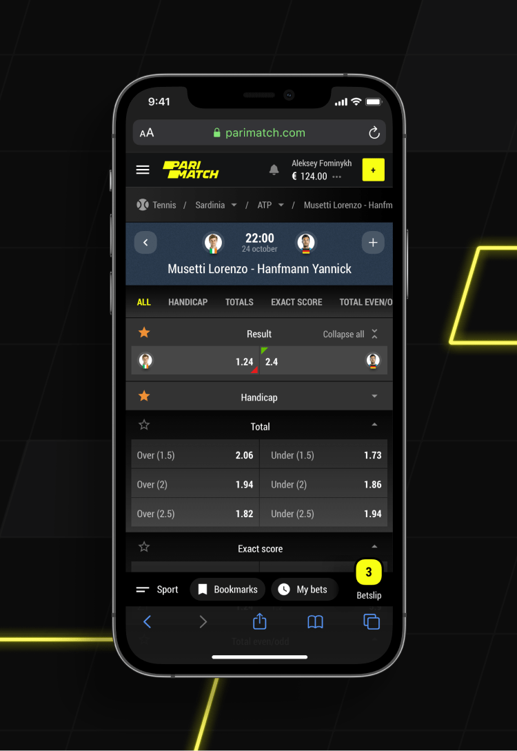
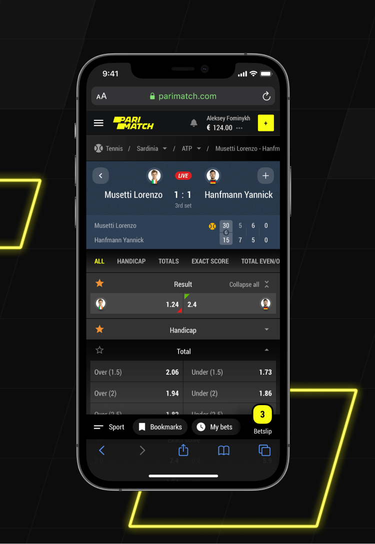
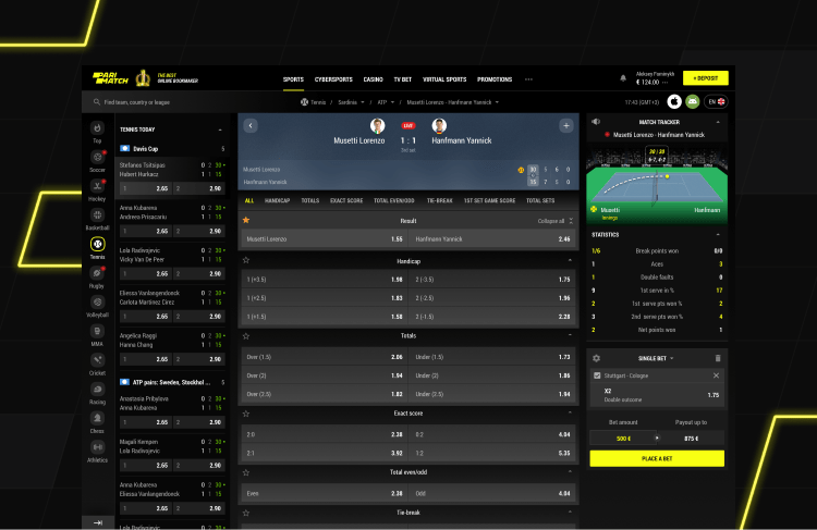
It may seem that all the event pages should be duplicate but in reality, some should vary – for instance, tennis could not be the same as football.
-
06 — Tennis match
![]()
-
06 — Mobile Tennis
![]()
-
![]()
-
07 — Live Tennis
![]()
Multi-view for multi-screeners
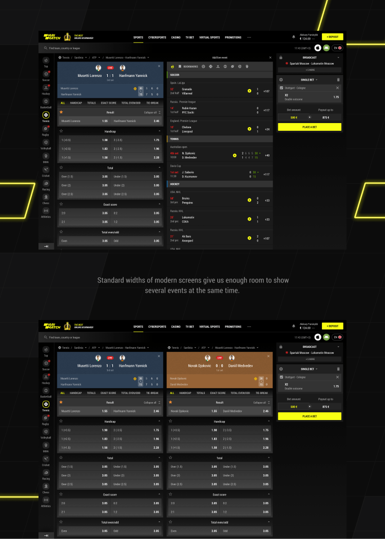
When in live, people tend to follow events and bet instantly and sometimes in parlays (multiple events within the same bet). That means they need them constantly on their screens, but is it possible?
-
08 — Multi-view
![]()
-
09 — Mobile Multi-view
![]()
-
Cybersports is the new black
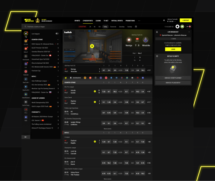
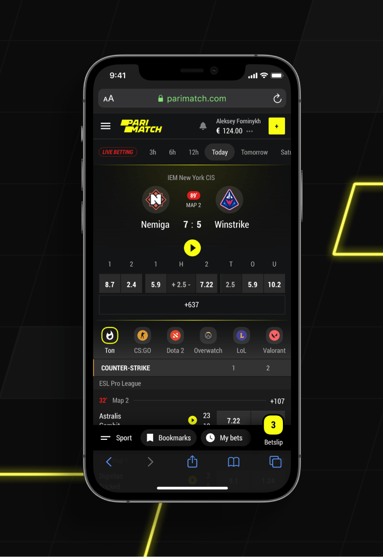
As yesterday teenagers grow into the core audience and considering the pandemic shift, cybersports gain a special role in bookmaking. Yet still, the audience of sports and eSports betting is partially different (as well as the betting process), that is why this discipline goes into a separate section.
-
01 — Cybersports home page
![]()
-
02 — Cybersports mobile
![]()
-
![]()
Cybersport events
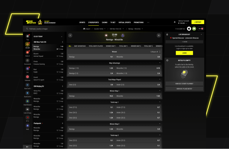
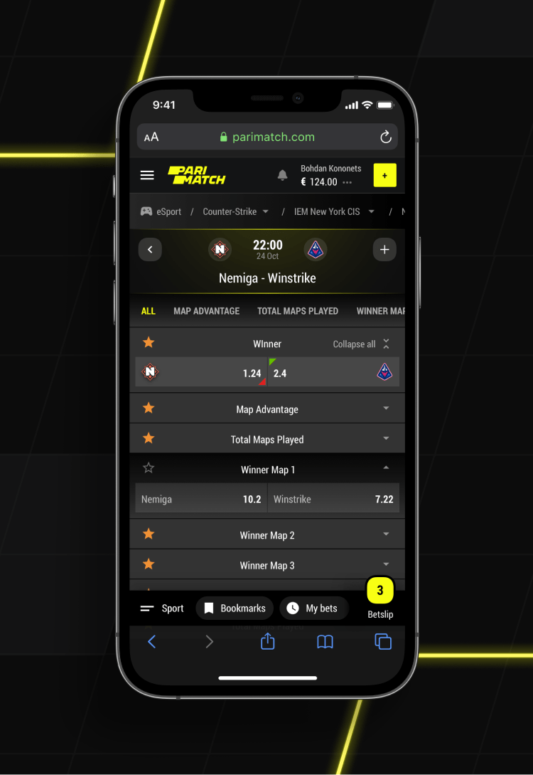
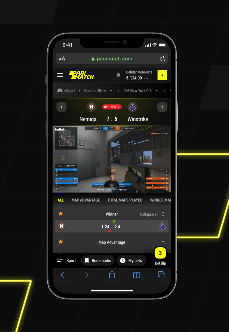
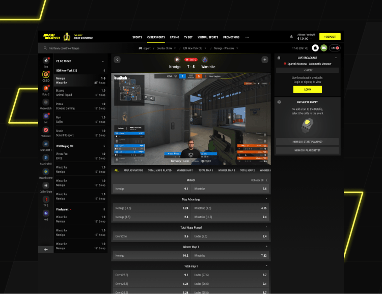
Dynamic and unpredictable as cybersport is, eGames are quite fun to bet on. Especially, when the transition from classic sports is made as smooth as possible.
-
03 — Opem match
![]()
-
03 — Prematch mobile
![]()
-
04 — Live match mobile
![]()
-
05 — Live match
![]()
The new Twitch
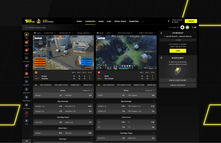
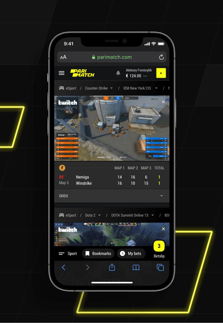
Similarly to other sports, users tend to bet simultaneously on live events, but in this case, they often need to follow both games’ livestream. Thus streaming multiple events and allowing betting on them at the same time helps Parimatch beat even Twitch.
-
06 — Multi-view
![]()
-
07 — Mobile Multi-view
![]()
-
![]()
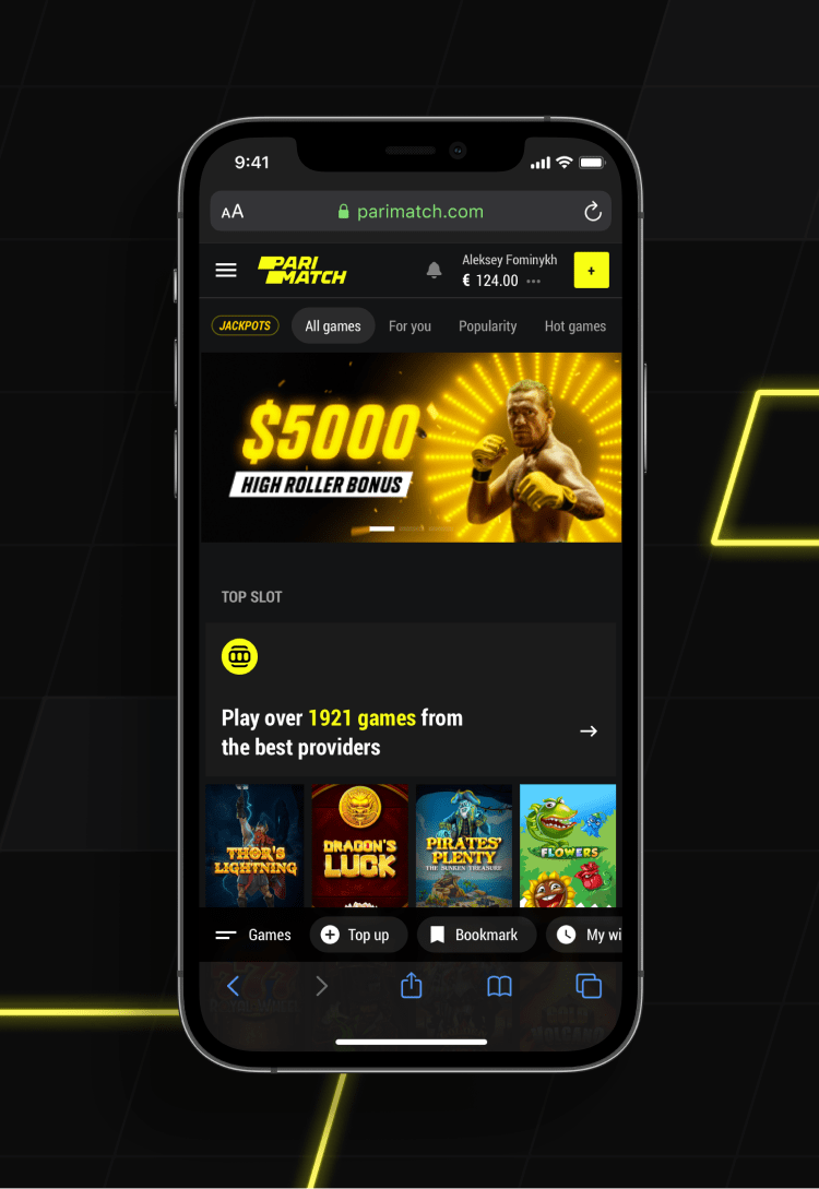
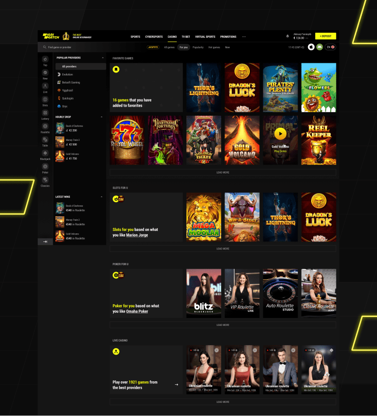
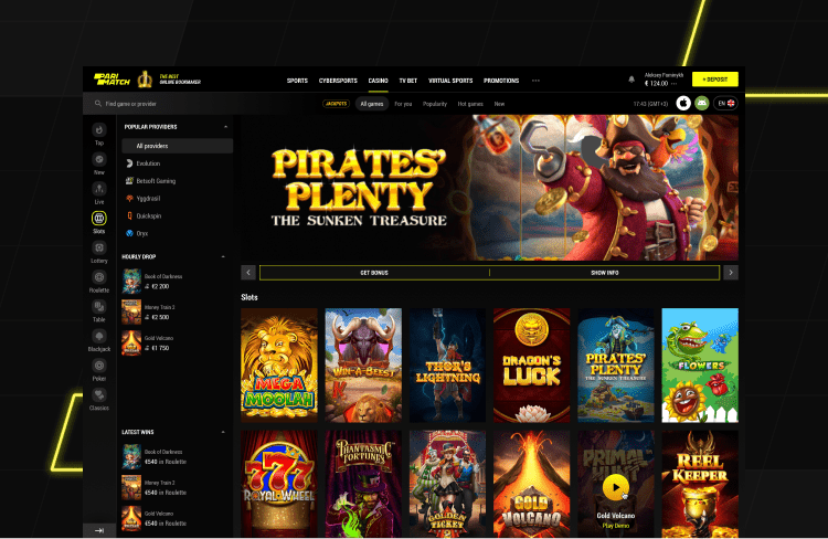
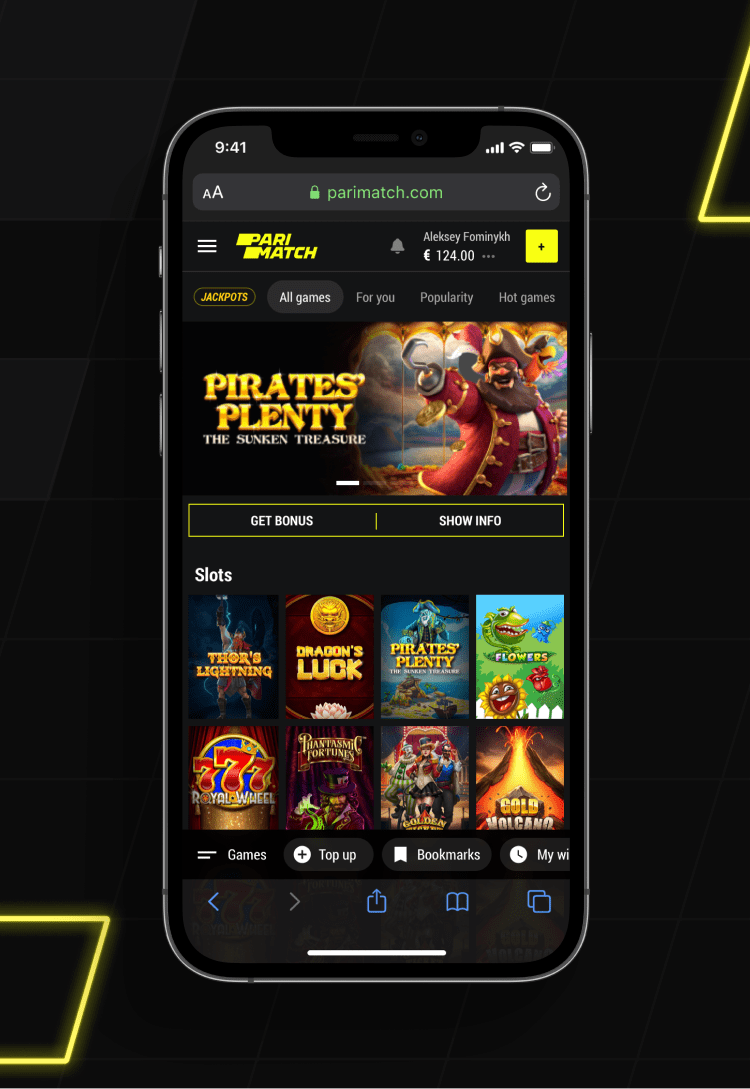
Casino. Designed to fit any taste.
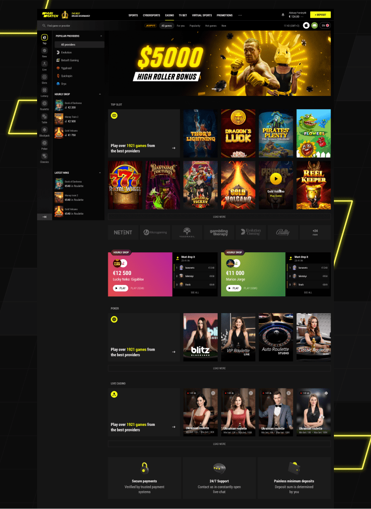
Parimatch is a strong brand that extends beyond betting. One of the other activities available for users and beloved by them is online casino. Our focus was to keep the visual and structural integrity here, yet adjusting it to the specifics of user behavior and preferences.
-
01 — Casino home page
![]()
-
02 — Casino home mobile
![]()
-
![]()
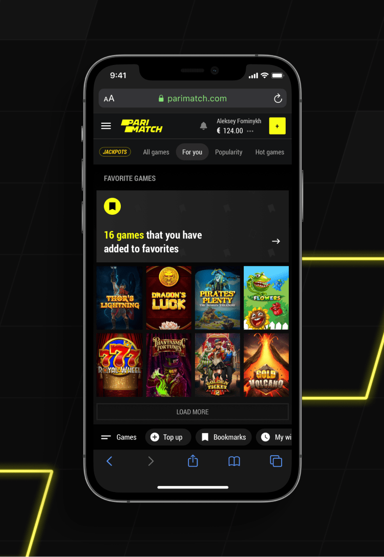
For you
True personalisation is the key to loyalty and high retention rates. That is why a selection of slots and games tailored for users is essential in any casino.
-
03 — Casino for you
![]()
-
04 — Casino for you mobile
![]()
-
![]()
Slots
While inside a game, users need to be focused on what is going on and having on the main screen the things that really matter – the gameplay and balance.
-
05 — Open category
![]()
-
06 — Open category mobile
![]()
-
![]()
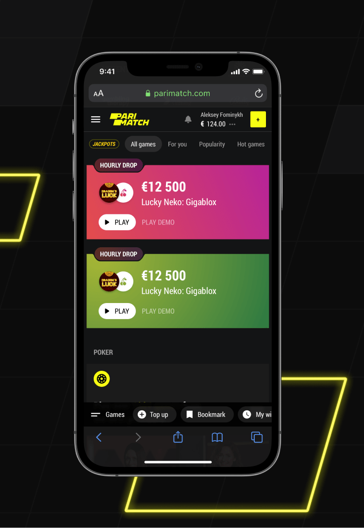
Hourly drops
Slots are fun in many ways, but not in social. Neither do they bring FOMO. To improve that, an hourly drop was added – a big prize played up at a certain time.
-
07 — Open hourly drop
![]()
-
08 — Open hourly drop mobile
![]()
-
![]()
Multi-view casino
For those who watch videos at 1,5x speed or are used to multitasking, there is a multi-view with up to 4 slots on the same screen. Because if we don’t keep our users’ attention something else will.
-
09 — Casino multi-view
![]()
Profile that feels just right
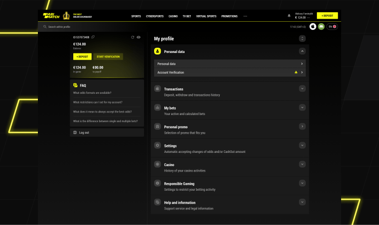
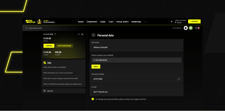
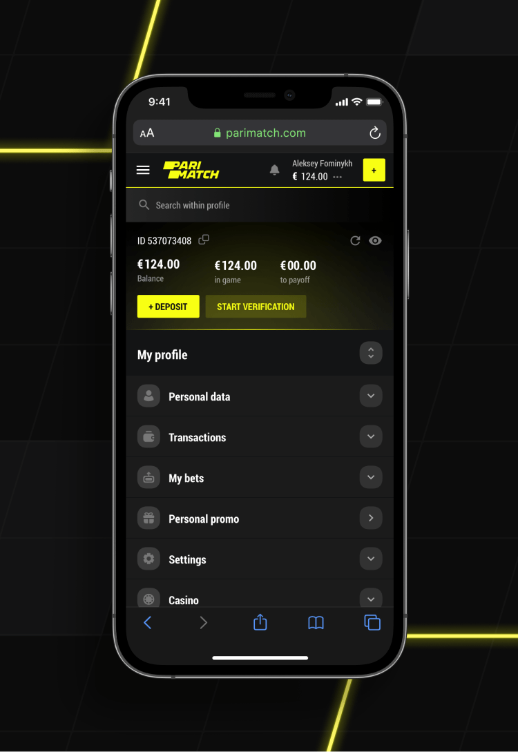
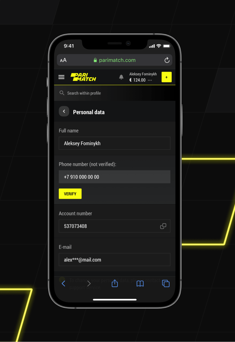
Profile says more about a product than any other part, because ultimately books are not judged by their covers. All the pages related to personal information are clean, well-structured and give immediate answers to all the questions – even the ones that did not come up yet.
-
01 — User profile
![]()
-
02 — Personal data
![]()
-
03 — User profile mobile
![]()
-
![]()
Deposit
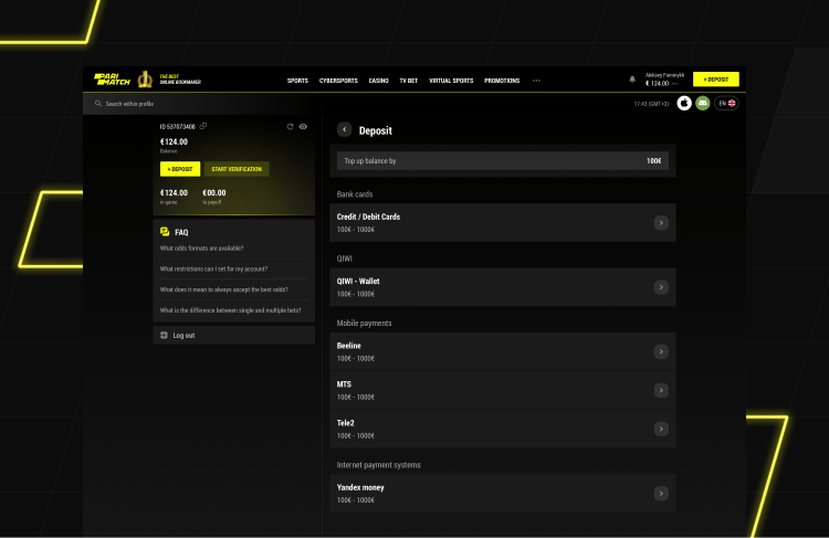
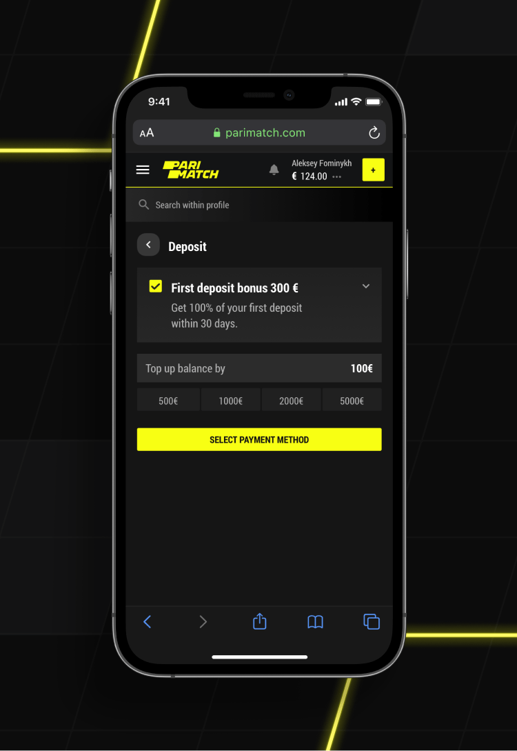
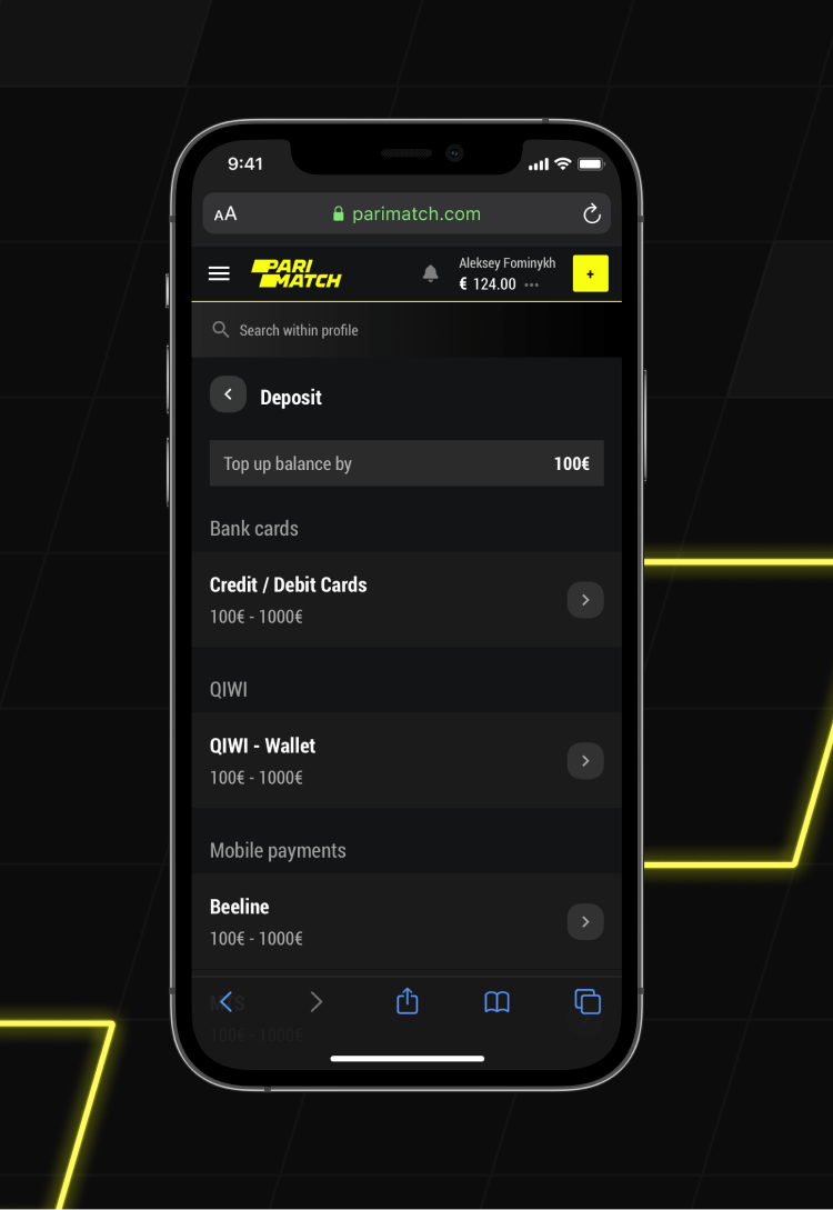
Deposit is one of the most demanding things as it has to follow the needs and requirements of three sides – user, business and legal regulator.
-
03 — Deposit page
![]()
-
04 — Deposit mobile page
![]()
-
![]()
The best promotion for the best users
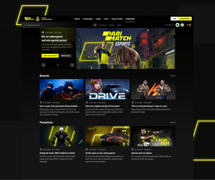
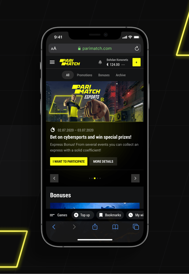
What about all those great promotions? Our idea is to highlight those opportunities Parimatch offers to its users, not hide them. That’s why, firstly, the promo has its own dedicated space – beautiful and easy to navigate, secondly, the link goes in the main header menu.
-
01 — Promo home page
![]()
-
02 — Promo home mobile page
![]()
-
![]()
Join and enjoy
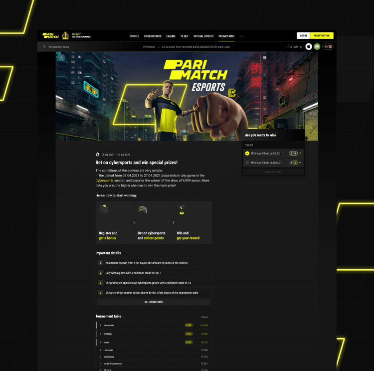
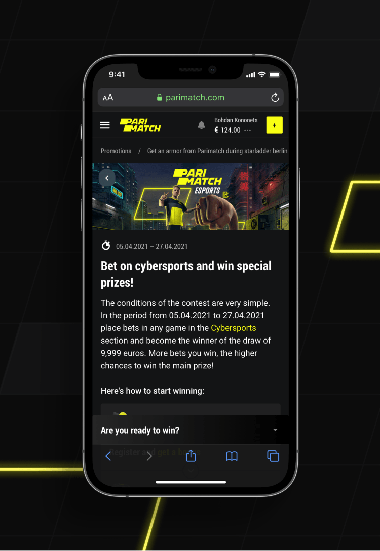
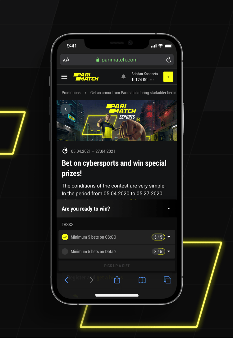
The best promo campaigns are diverse and engaging, usually combining different mechanics. Thus, their pages should be ready to include special tasks, leaderboards and clear explanations of complex rules.
-
03 — Open promo
![]()
-
04 — Open promo mobile
![]()
-
![]()
Search for anything. Anywhere
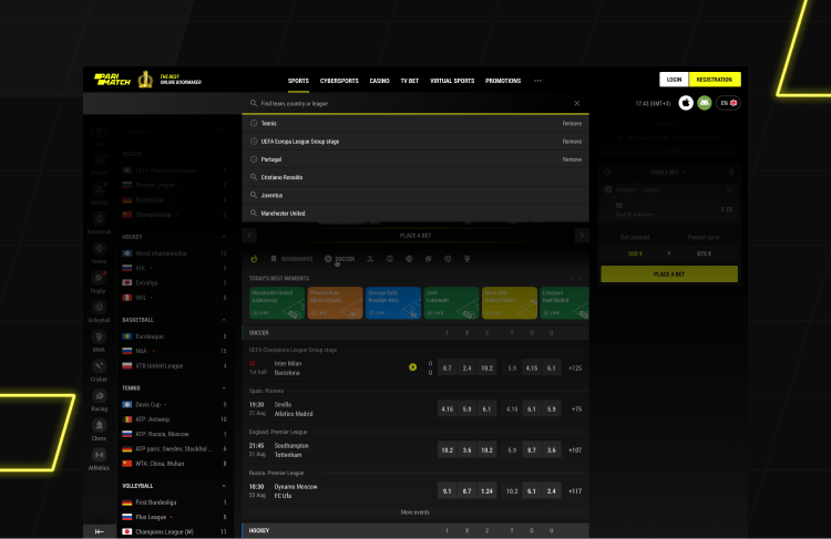
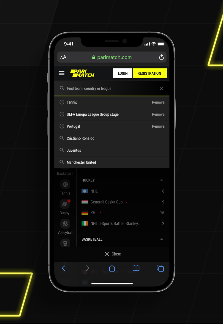
Wherever our user goes, search is always there – to make life and betting easier. It contains both search history and suggestions and adapts to a specific section from where it was requested.
-
01 — Search
![]()
-
02 — Mobile Search
![]()
-
![]()
Design language. Spoken worldwide
Complex projects often obviously lack a coherent design system. This is bad not only for the development and maintenance of projects but influences a lot of users perception. That is why once the key features were defined, our focus was to develop the integral visual language that would be recognisable and functional.
-
02 — Design language
![]()
Top-notch betslip is the key
It is essential not to break classic user flow and at the same to offer a bit more than other competitors do. In this design, several small but gold features are added – events selection, payout as an input and quick bets.
-
01 — Betslip
-
02 — Betslip
