
The concept of the Microsoft website redesign was developed as a tribute to both the Fluent design system and the famous IT company itself.
Rethinking the Microsoft top products' web presentation considering the Fluent system.
Redesign concept
Overview
Fluent is the best design system ever developed by Microsoft which still has a great potential. That is why we’ve decided to create something special for Microsoft’s top products with eyes set on this system, new grid and updated UX.
Grid system.
As Microsoft website is more like a platform fro different products landings it required some grid and style which would suite everything – from the X-box to Office 365.
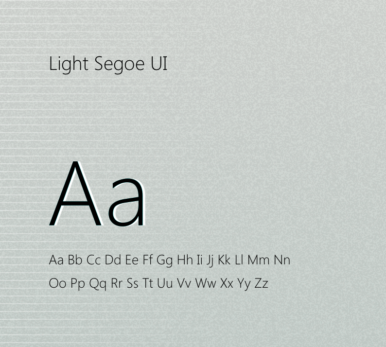
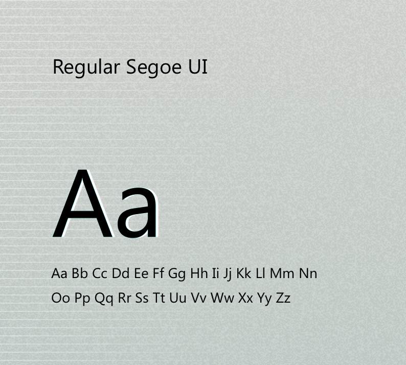
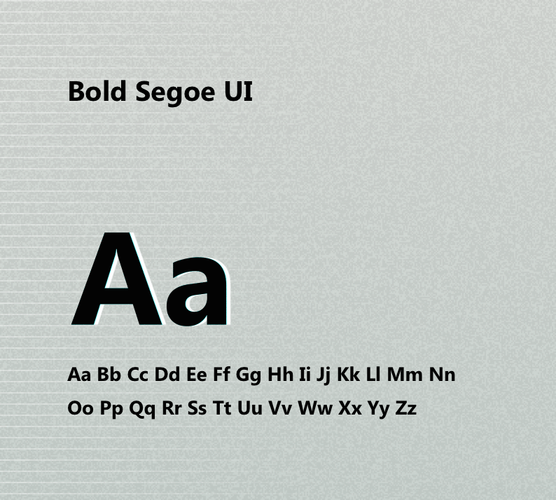
Typography.
Segoe UI is a member of the Segoe family used in Microsoft products for user interface text, as well as for some online user assistance material, intended to improve the consistency in how users see all text across all languages.
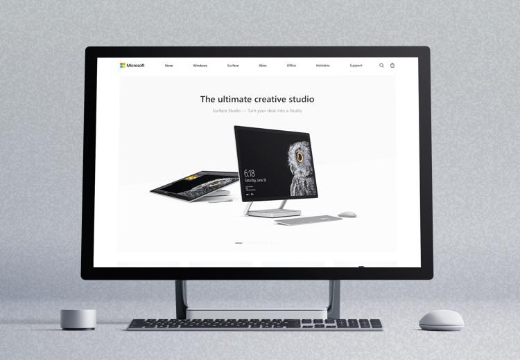
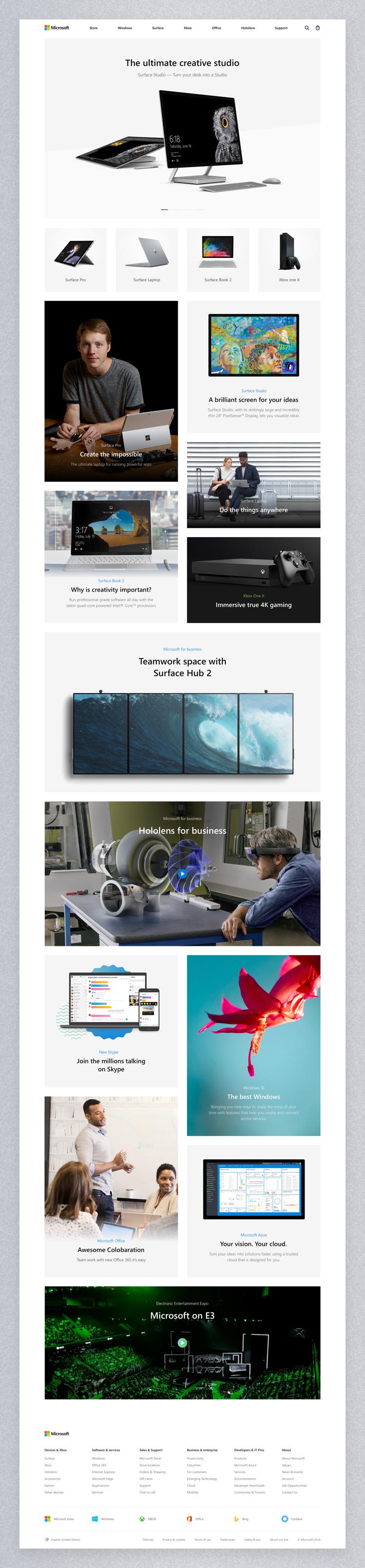
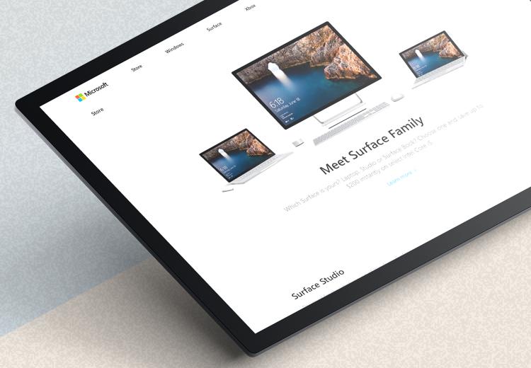
Home page.
The main page as well as all the others is designed to easily and harmoniously fit not only the Fluent design system but any environment. The grid and layout here were specially selected to exhibit top products and important company announcements.
-
01 — HOME PAGE
![]()
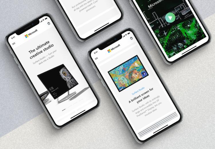
-
02 — HOME PAGE MOBILE
![]()
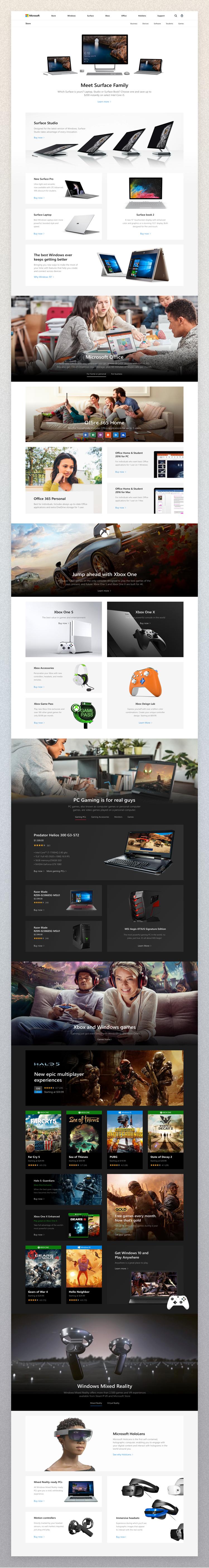
Store page.
A wide range of products must be represented through a proper page which would guide and help the user. To achieve that and make the perception quick and easy big cards and large product images were chosen
-
01 — Store page
![]()
-
02 — Store page mobile
![]()
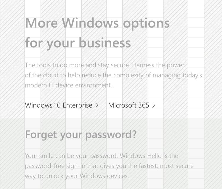
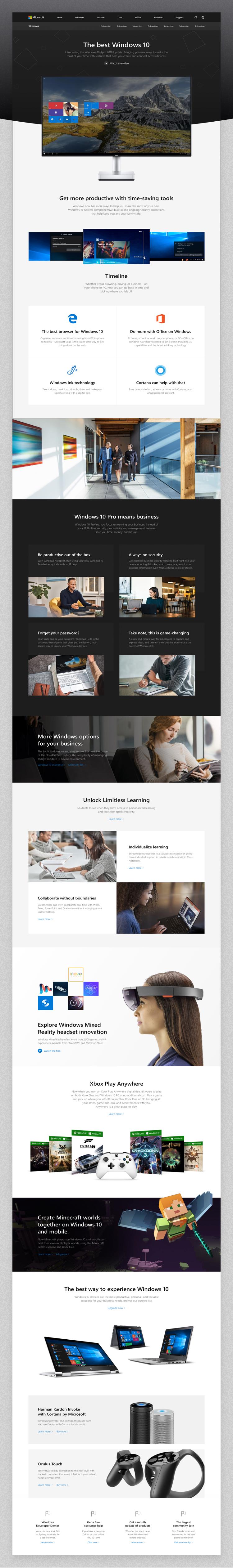
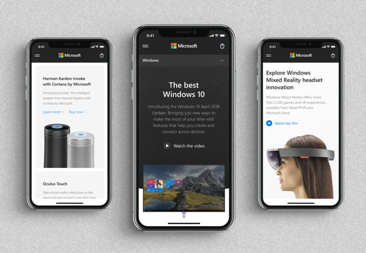
Windows page.
Windows 10 page deserved a special look which would accentuate its universal style as now this is the main OS for its whole range of Microsoft devices. The two color schemes landing shows the main features for both personal and business users.
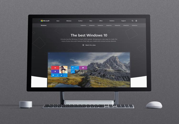
-
01 — Windows page
![]()
-
02 — Windows page mobile
![]()
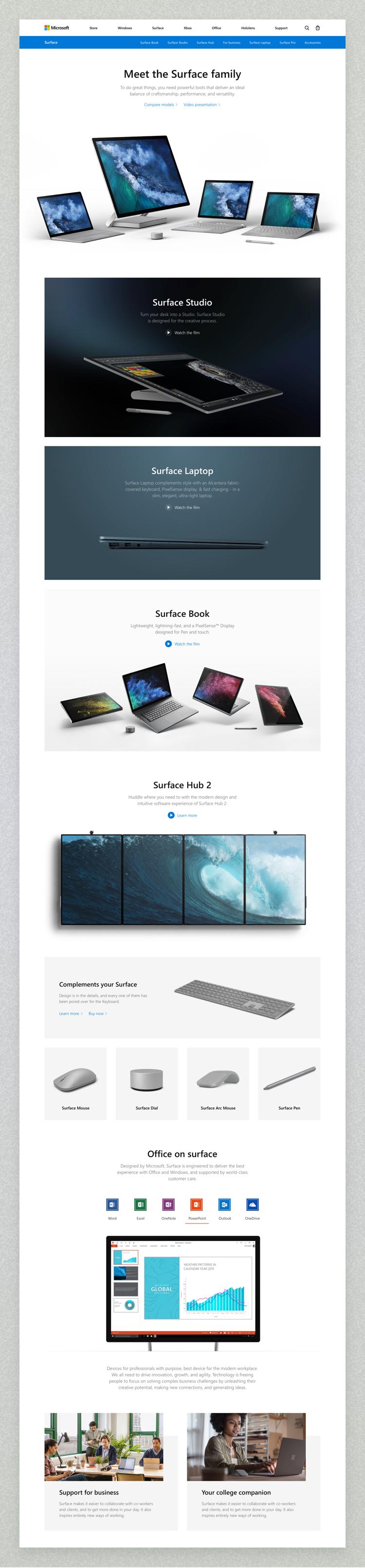
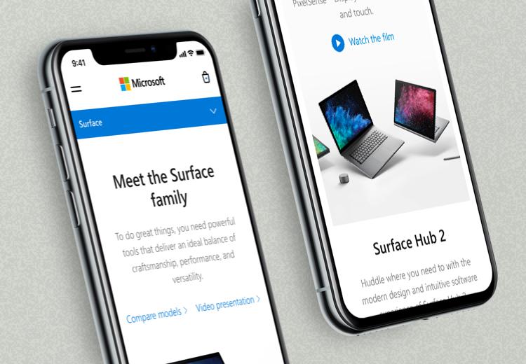
Surface family.
A special page was created to highlight the Microsoft’s most stylish series of devices. The design was meant to be minimalistic enough to accentuate every single product and accessory so for each one of them a separate block was developed.
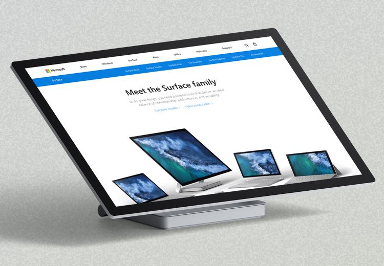
-
01 — Surface family
![]()
-
02 — Surface family mobile
![]()
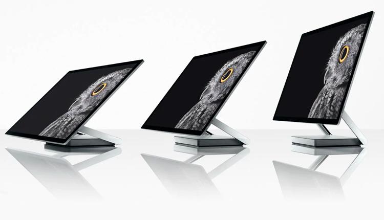
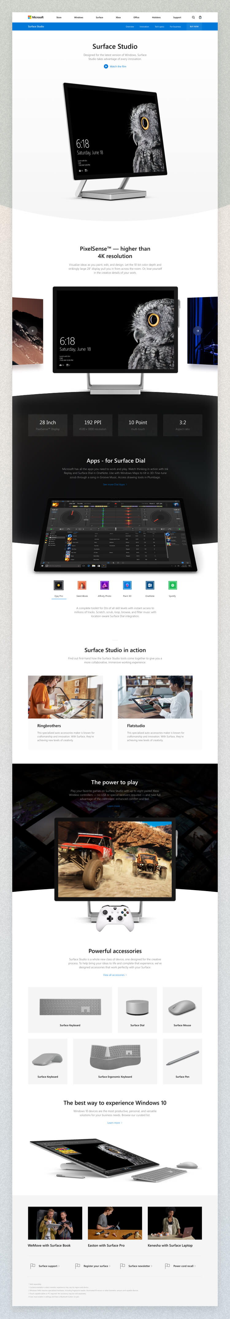
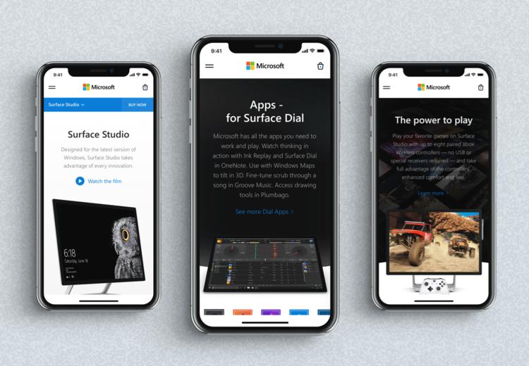
Surface Studio.
Flatstudio team believes that products like Surface Studio are the ones of the nearest future. Innovative, universal, powerful yet easy to use – this is how they are and exactly what we’ve decided show on the page.
-
03 — Surface Studio
![]()
-
04 — Surface Studio mobile
![]()
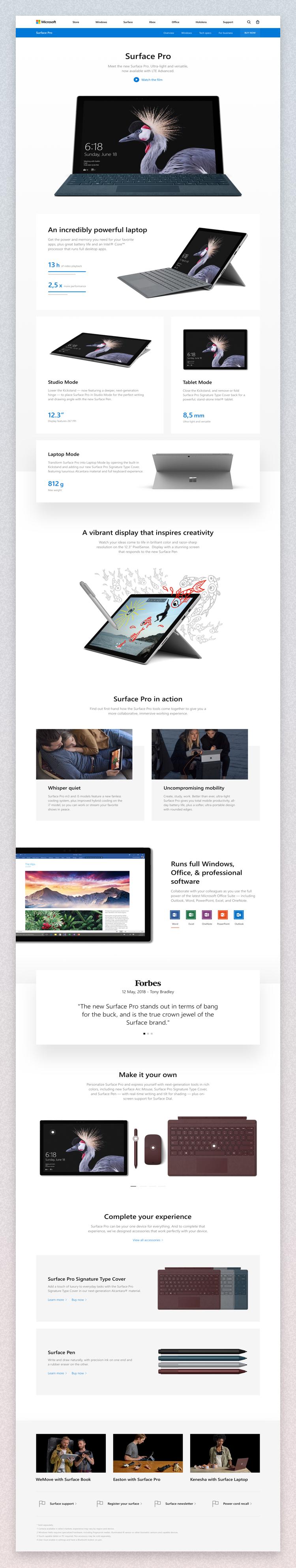
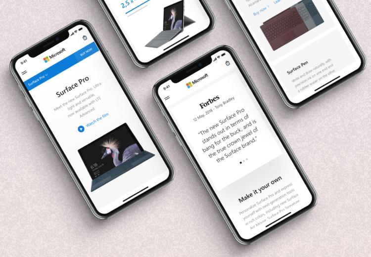
Surface Pro.
Showing off the top-notch products which serve several needs is a very special kind of task which requires a simple yet informative page.
-
05 — Surface Pro
![]()
-
06 — Surface Pro mobile
![]()
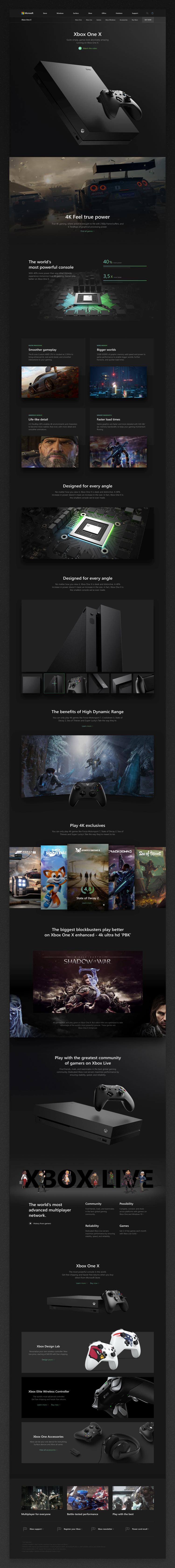
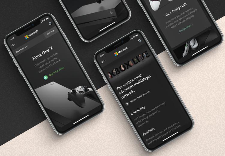
Xbox One X.
Futuristic and hi-tech products always have much info to be shown and explained. Xbox One X page is not only fancy and attractive but also instructive giving the user the whole overview of its features, related games and additional gadgets.
-
01 — Xbox One X
![]()
-
02 — Xbox One X mobile
![]()
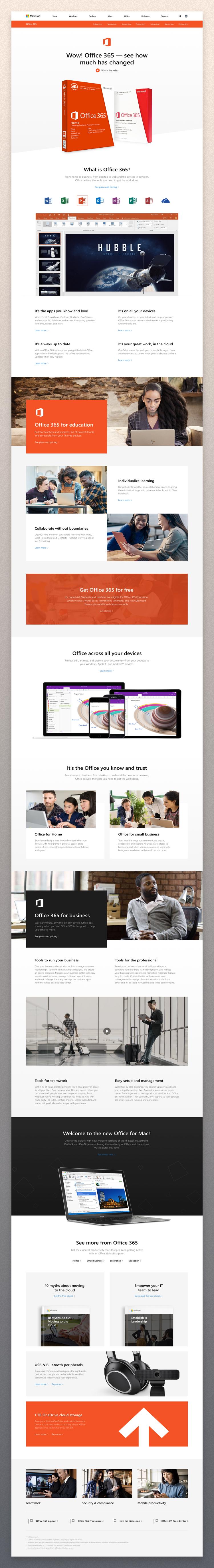
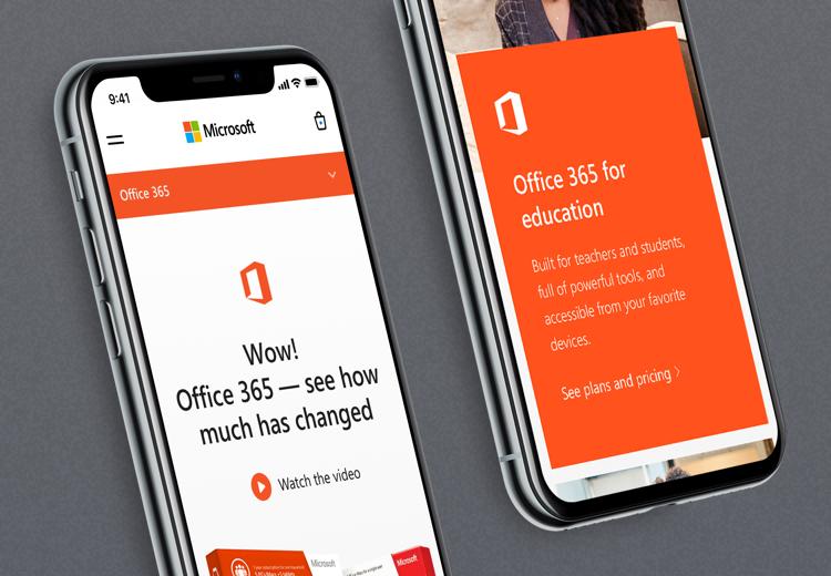
Office 365.
Office store works in two different ways – for personal and business purposes. The product homepage is meant to be clear about this and let the user follow his needs and find the necessary product. To make that work two color schemes were chosen here.
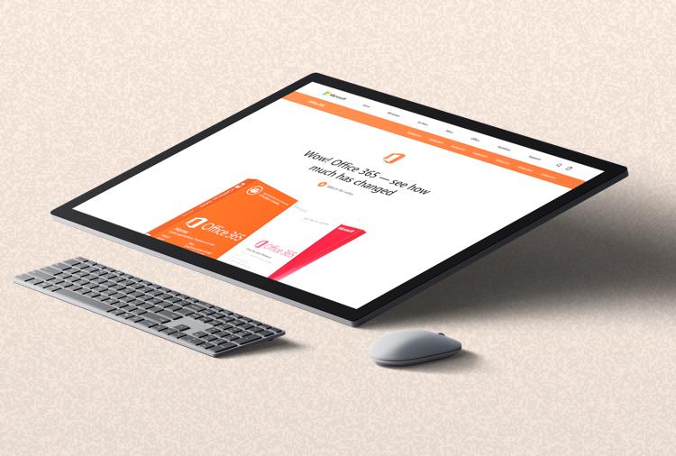
-
01 — Office 365
![]()
-
02 — Office 365 mobile
![]()
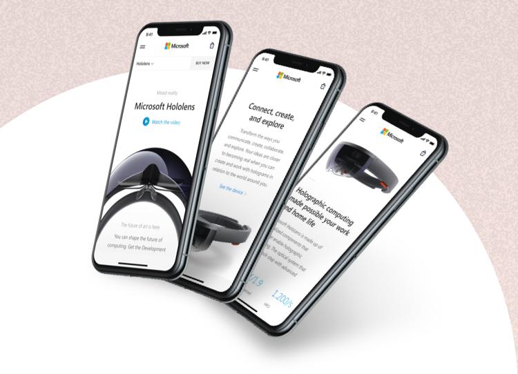
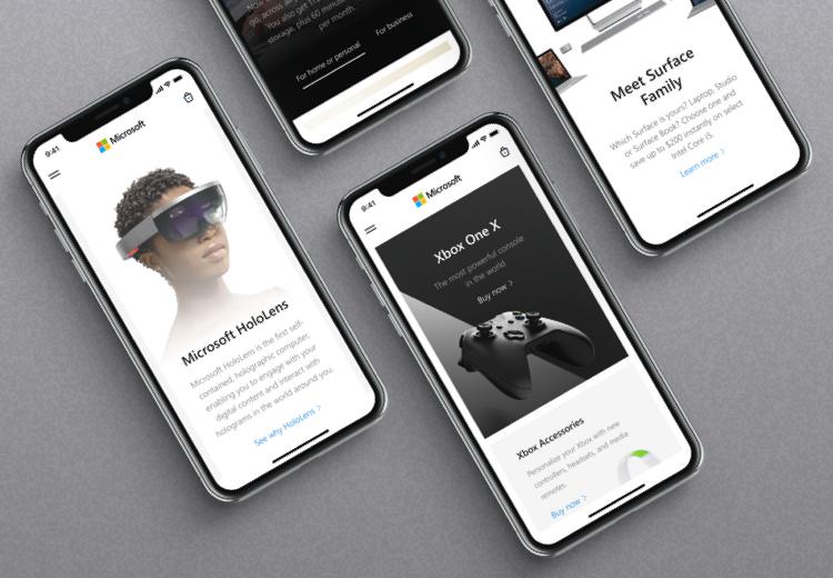
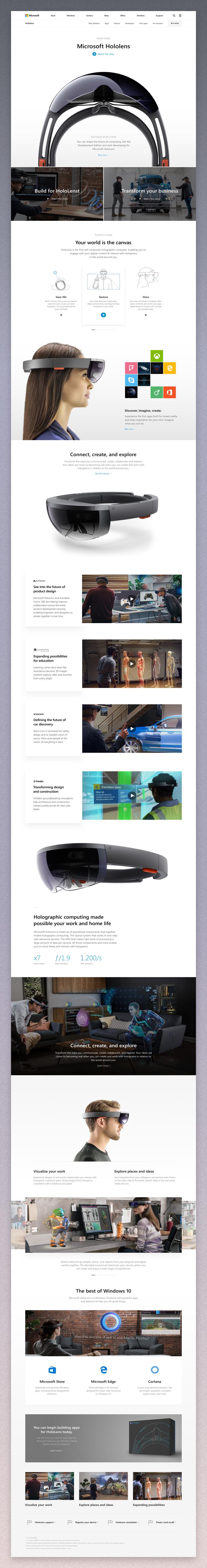
Hololens.
Fresh devices require innovative home pages to be presented on. The HoloLens product is new for customers so besides of pointing out its features the landing is a guidance to how it works and which user’s need it may serve.
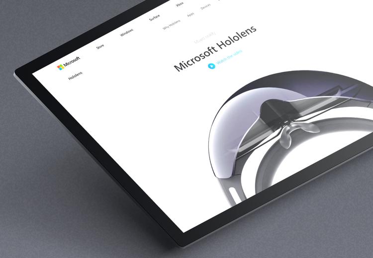
-
01 — Hololens
![]()
-
02 — Hololens mobile
![]()