
Journal is an online platform developed to provide a new and improved interface for web magazines, fully functional and different from the typical interface. It is built on a simplified and clean-cut structure to enhance the display of magazines online.
Create a new grid and visual language for the online magazine.
Concept, Interface design, Idea, Magazine grid
Overview
We really like to play around with complex interface tasks. In this one specifically we aimed at creating a smooth and intuitive web magazine design with unique news delivery. Journal stands out for being decidedly digital-first.
The new look for the web magazine.
Amazing magazine, simple logo, innovative interface grid, stylish fonts – that's what we chose to make this project unforgettable.
-
01 — International Logotype
![]()
-
02 — grid
![]()
-
![]()
-
![]()
-
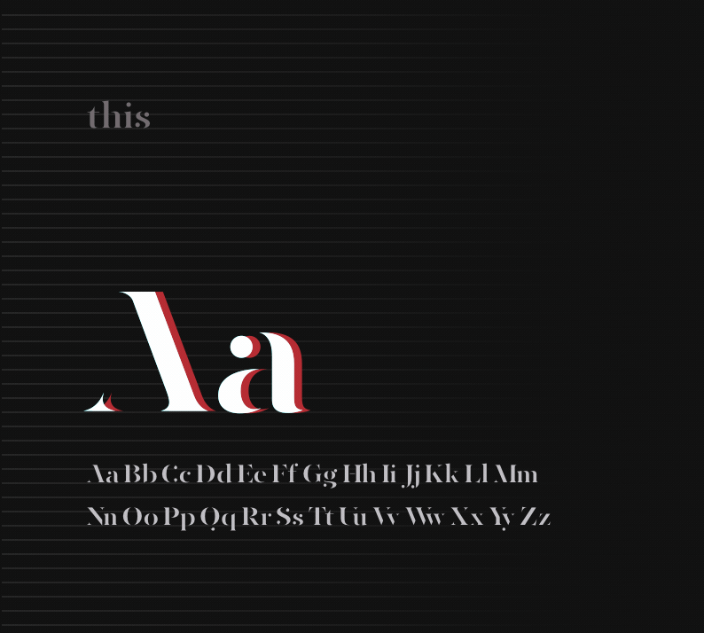
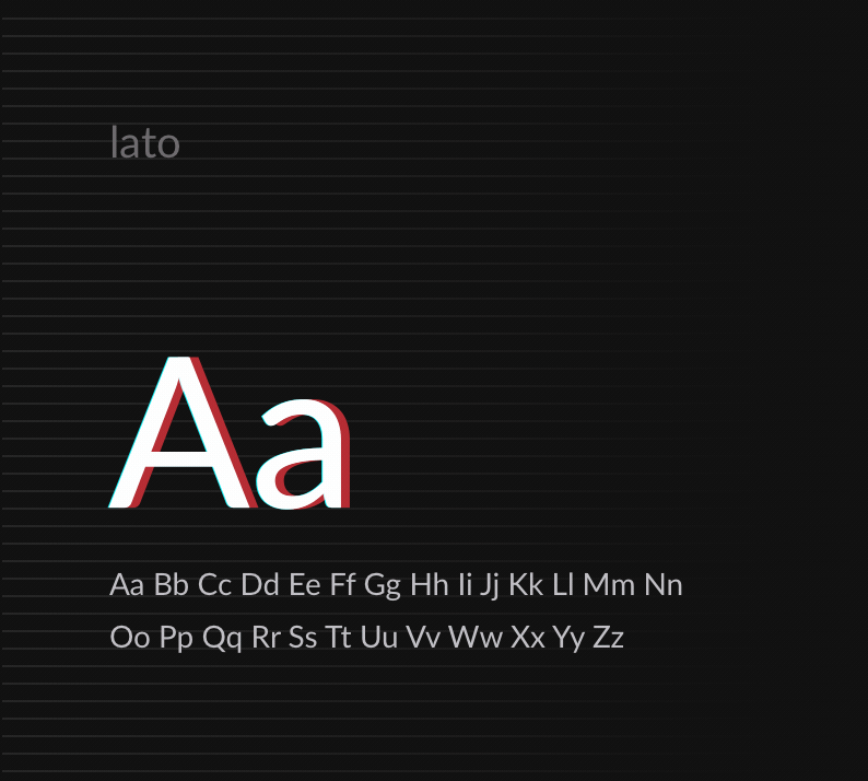
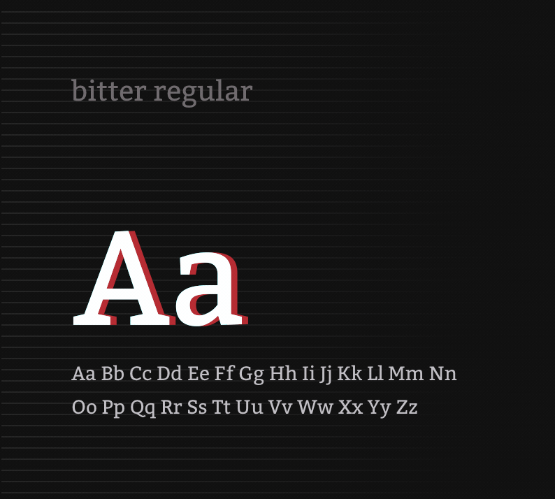
03 — Fonts
![]()
-
![]()
-
![]()
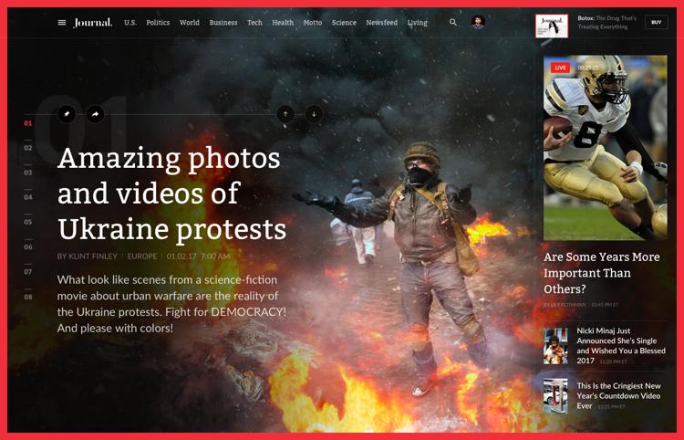
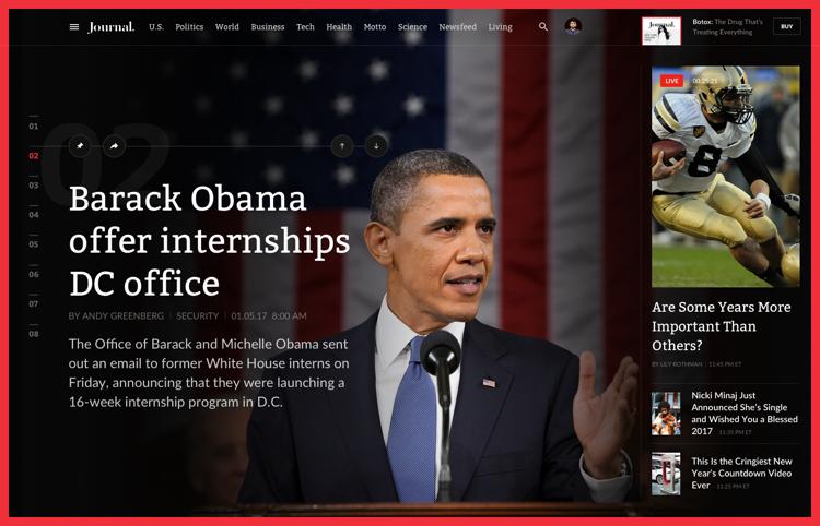
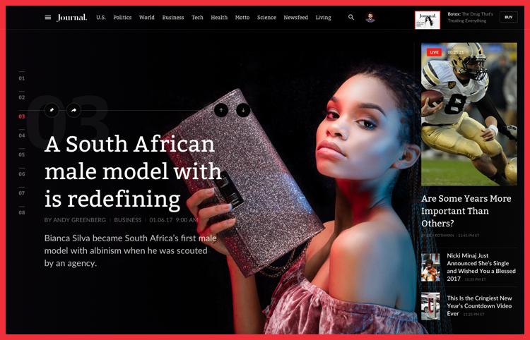
Now, the headlines.
Built to highlight several headlines with vibrant themes, which is a great plus since it's impossible to do that in a physical magazine. One picture is worth a thousand words, so take a look. Here you have several examples of the covers we developed for the main page.
-
01 — cover 01
![]()
-
02 — cover 02
![]()
-
03 — cover 03
![]()
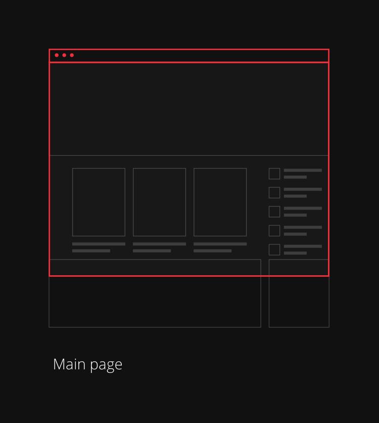
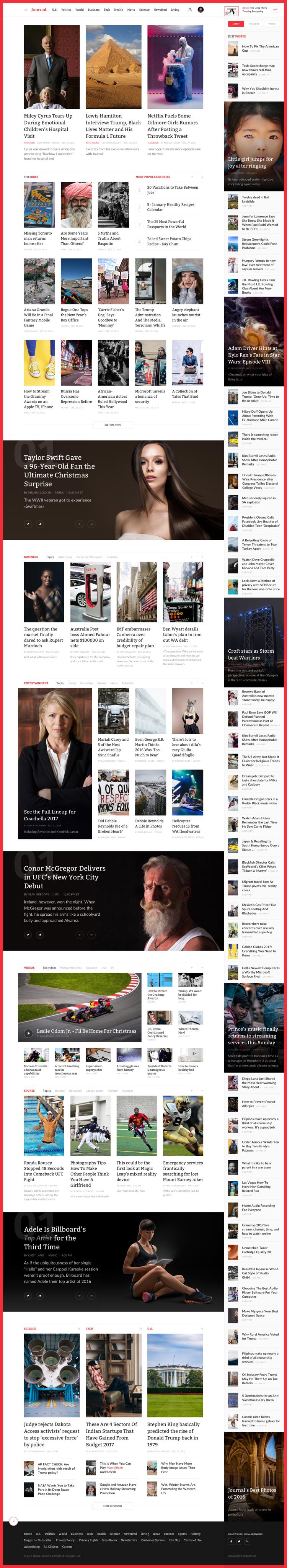
Personalized magazine grid for a website.
The main page gives a concise overview of all headlines. From the popular stories to the recently added articles to a run down of the trending topics, the main page is all encompassing. The menu provides different subject categories to make the navigation easier.
-
01 — journal main page
![]()
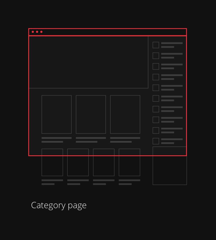
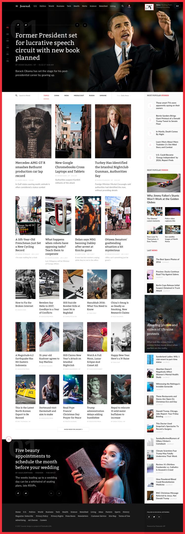
Category page.
The Category page offers a selection of different news categories that allow you to group publications under a similar subject. Everything as in a traditional news website, but more elegant and with a pinch of glossiness.
-
01 — topics category
![]()
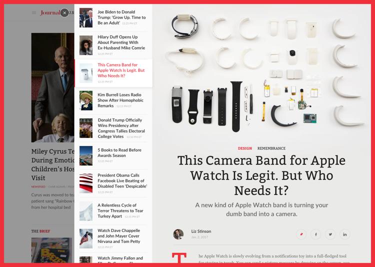
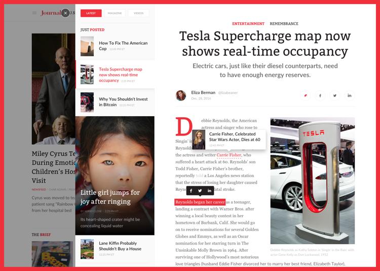
Stay updated 24/7.
In Publishing business you need to think in future tense. Editors create content for the magazine a week ahead it's release. But for an online magazine this method would result in a disaster. So we introduced News 24 feature, it’s like Twitter but your feed is made of news.
-
01 — Style 1: 24 news with branding
![]()
-
02 — Style 2: simple 24 news
![]()
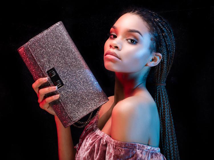
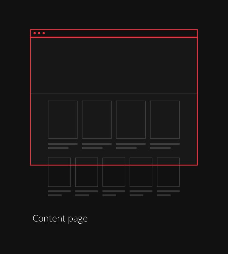
For those with reading cravings.
Articles and reviews should not be boring like on the most websites. We came up with structure grid and branding elements that the editor can use for any content, presenting it with elegant fonts, colourful and engaging images or even interactive quests and videos.
-
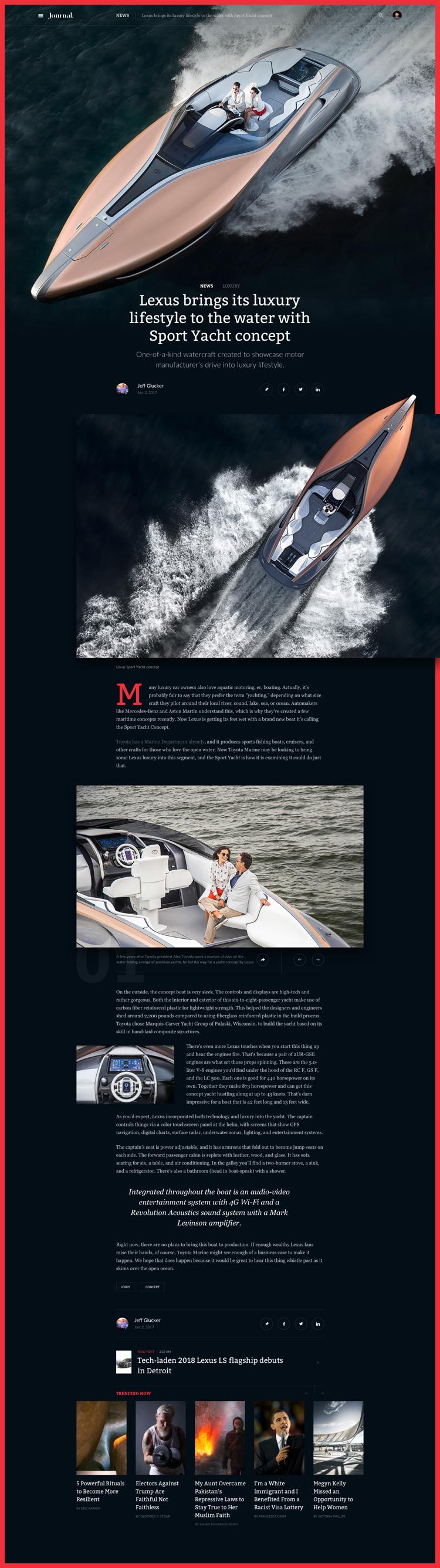
01 — yacht sport article
![]()
-
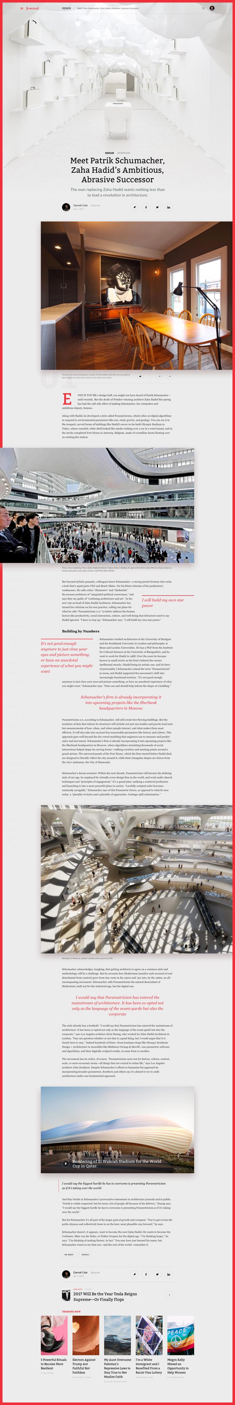
02 — patrik schumacher article
![]()
-
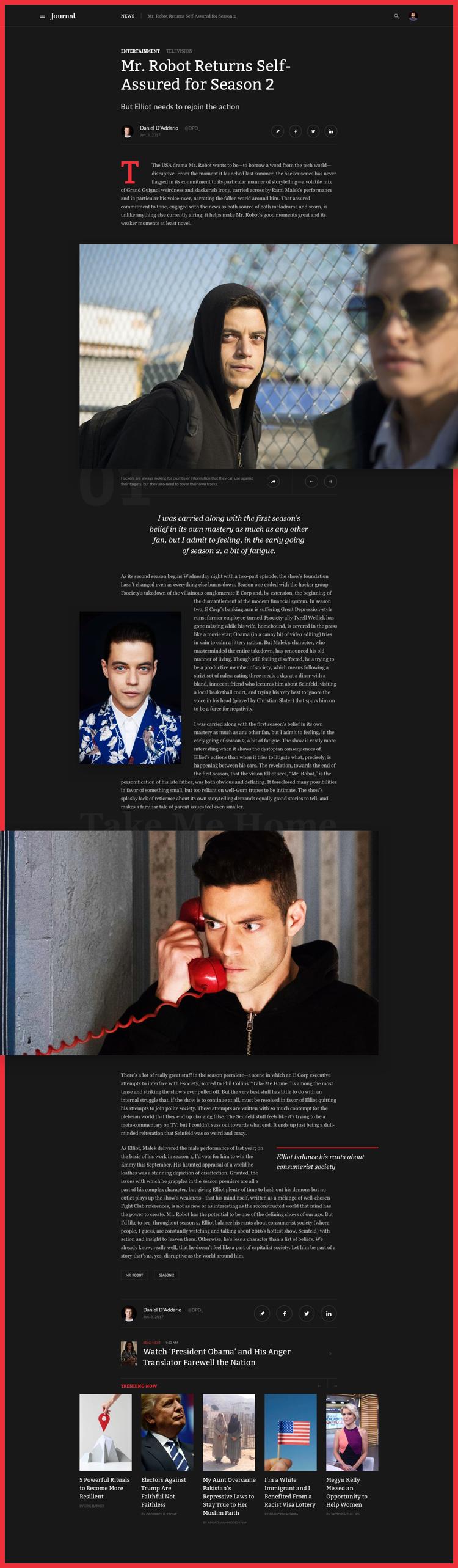
03 — Mr. Robot article
![]()
-
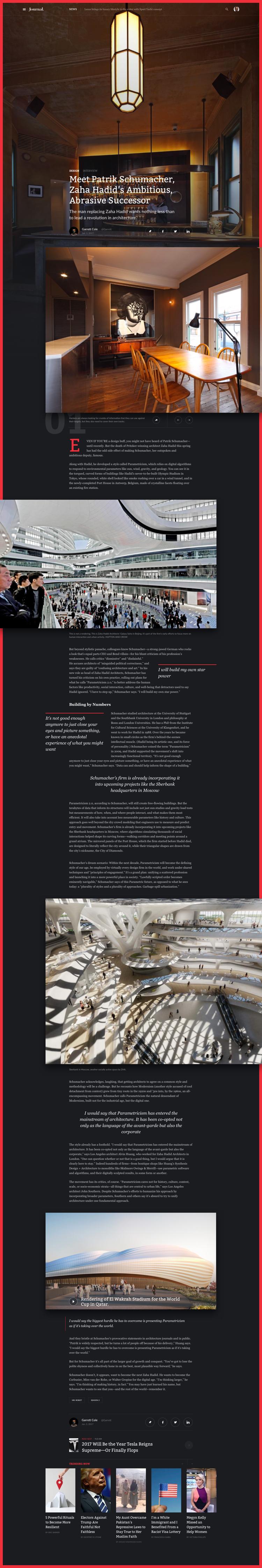
04 — patrik schumacher
![]()
Extra publicity for the news.
We made sure that sponsored content looked as elegant and dashing as the news articles.
-
05 — promo article
![]()
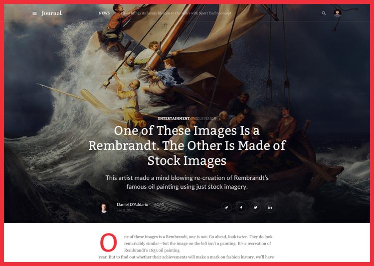
Extended major stories.
In a sea of sameness we wanted Journal news grid to stand out. The way news are presented should not make the reading monotonous. There are so many different styles and genres of the news in the world, and our design is ready for it!
-
06 — rembrandt article
![]()
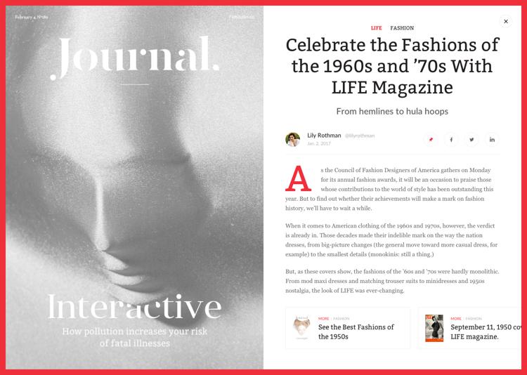
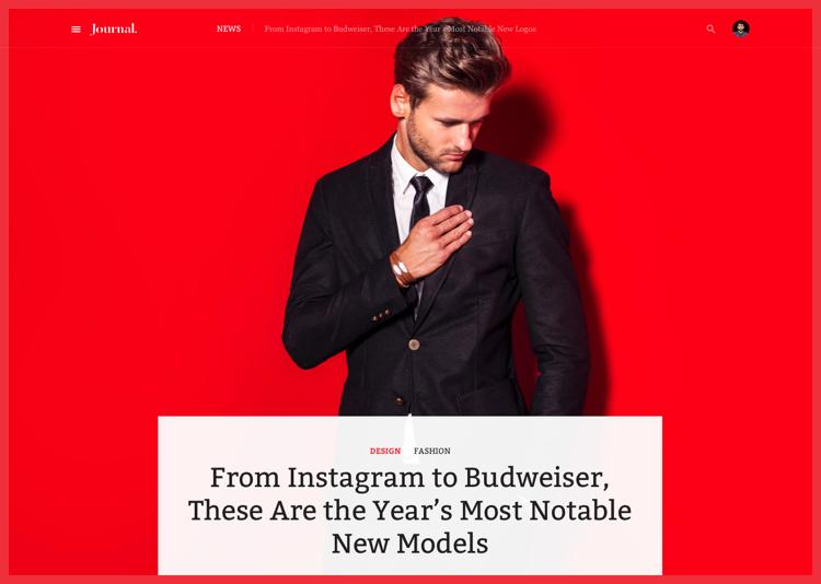
All the best reads go digital.
The best articles from the printed Journal are published on the website with display adaptation for all screen sizes. Plus you can make a magazine subscription at any time and have access to your favorite author or column in its traditional format.
-
07 — fashion article
![]()