


How we designed Bookmaker.xyz to compete with giants — without acting like one
Every technological wave comes with mythology. Web3’s mythology was inevitability: decentralization would replace banks, wallets would replace logins, smart contracts would replace trust. The infrastructure story was compelling. The product story was not.
Early decentralized applications felt like backend systems exposed to end users. It demanded tolerance for friction, for ambiguity, for cognitive overhead. That is acceptable when your audience consists of early adopters and protocol enthusiasts. It fails the moment your audience expands.
When crypto began moving beyond insiders into broader financial behavior the rules changed. At that point, the question was no longer whether the architecture was decentralized. The question was whether the experience was coherent. A protocol wins on code. A product wins on cognition. If the interface does not manage information density or reduce cognitive friction, the technology underneath becomes invisible for the wrong reasons.
This was the context in which we began shaping Bookmaker.xyz.
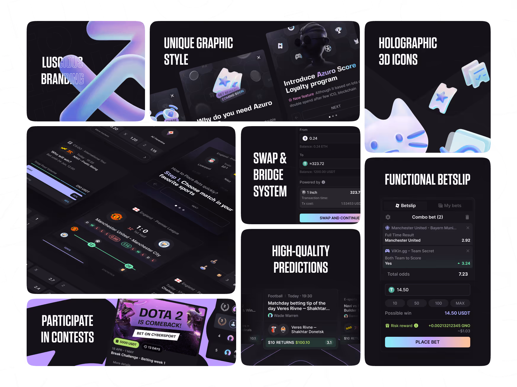
We were not brought in to polish a UI. We were responsible for designing V1, V2, and V2 Extra—brand system, UX architecture, abstraction layers, and structural coherence. The task was to turn a functional Web3 betting interface into a serious product capable of competing with established Web2 sportsbooks—without sacrificing its decentralized core.
V0: Designing Around Scarcity
When we entered the project, the platform was live and technically operational. The early audience consisted primarily of crypto-native users. The interface leaned heavily on a card-based layout, which offered flexibility and made rapid iteration possible. At this stage, speed and experimentation were more important than refinement.
The card-based layout unintentionally mitigated the lack of markets. Cards create perceived curation. This approach allowed the product to evolve without exposing its early-stage limitations too starkly. It was a practical solution for an MVP.
But it was not enough to establish long-term credibility. That required a more deliberate architecture of trust.
V1: Building Trust Without Bureaucracy
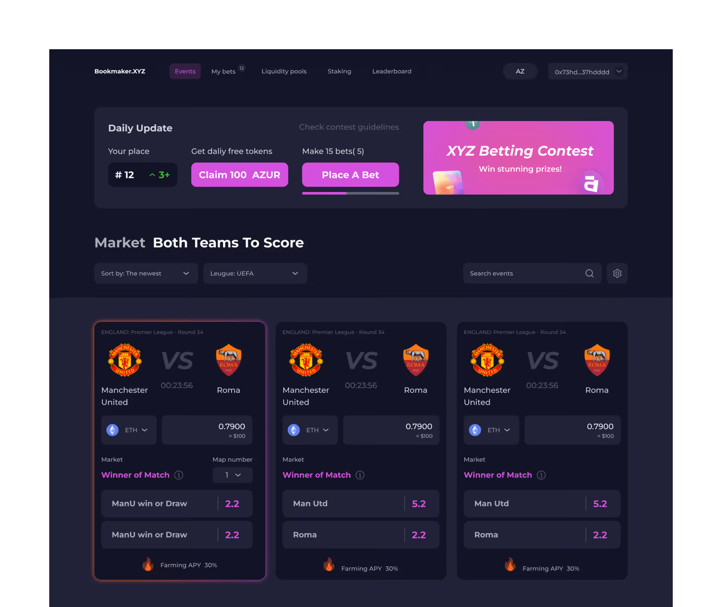
The strategic shift in V1 was clear: Bookmaker.xyz needed to serve two distinct user groups. First, traditional bettors who were leaving Web2 platforms due to regional restrictions, betting limits, or invasive KYC processes. Second, crypto-native users who already held assets in wallets and were open to new financial experiences.
Both audiences valued autonomy, but they interpreted trust differently. Traditional sportsbooks rely on regulation, licenses, and institutional branding to convey legitimacy. Bookmaker.xyz relies on structure. Funds are non-custodial. They reside in wallets or smart contracts rather than in a centralized internal ledger. That architectural difference is powerful—but only if users understand it.
One of our core design decisions in V1 was to make the logic of the system visible without overwhelming the user. Betting history was integrated directly into the platform rather than forcing users to consult external blockchain explorers. Bet states were clear and understandable.
Simultaneously, we repositioned the visual identity. Much of the Web3 ecosystem at the time leaned toward chaotic gradients and insider aesthetics. We deliberately moved in the opposite direction. The name “Bookmaker.xyz” carries a dual signal: traditional authority in “Bookmaker,” digital-native positioning in “.xyz.” We built a proprietary 3D visual system to support that balance. Without relying on stock photography or borrowed trust signals, we constructed a cohesive brand world that felt intentional and controlled. This was not about aesthetics alone; it was about establishing territory in a crowded market.
We also addressed information density. Casual users explore visually. Professional bettors analyze numerically. Instead of forcing a single interface model, we implemented dual event views: a card-based layout for browsing and a dense row-based layout for scanning odds efficiently. This allowed both cognitive styles to coexist within one coherent system. Rather than fragmenting the product, we expanded its bandwidth.
V1 was less about adding features and more about aligning perception with architecture. The platform began to feel like a serious bookmaker that happened to run on decentralized infrastructure—not a crypto experiment attempting to mimic one.
V2: Engineering Invisibility
By the time we entered V2, adoption had broadened. Users were no longer impressed by the mere presence of blockchain technology. They expected convenience. The challenge became clear: how do you preserve a decentralized backbone while removing the visible complexity that deters mainstream users?
The first major intervention was around onboarding. The seed phrase ritual is one of the most intimidating aspects of crypto UX. Experienced users could still connect externally, but newcomers could enter through familiar flows. The blockchain remained intact; the ceremony disappeared. Cognitive friction dropped significantly.
The next friction point was multi-chain liquidity. In fragmented ecosystems, users often encounter the “wrong token, wrong network” problem. Historically, they were forced to leave platforms to perform swaps or bridges manually. This may be technically empowering, but it is psychologically disruptive.
We designed a seamless integration of cross-chain aggregation directly into the product flow. This is liquidity abstraction in practice: removing the need for users to understand network mechanics without compromising capability.
Another point of tension was on-chain latency due to confirmation times. We could not eliminate that latency, so we designed around it. Clear transaction states, predictable refresh intervals, and transparent feedback loops reduced uncertainty. When users understand what is happening, waiting feels structured rather than alarming. Perception of speed often matters as much as actual speed.
As the platform expanded—live betting, express bets, casino modules, loyalty systems—the interface risked becoming overloaded. We responded by restructuring rather than layering. Betting and Casino were separated into distinct but connected units, reducing cognitive collision.Fragmented visibility undermines confidence; clarity reinforces it.
That is also true about marketing communication on the website. Creating a new banner from scratch meant chaos. The early response was to make it all very consistent which resulted in banner blindness. Our best solution was creating a scalable system instead—not a copypast but a set of templates that removed those first 30 minutes of design work and an hour of development for each new banner.
V2 was not about adding spectacle. It was about controlling complexity at scale.
V2 Extra: Extending Into Culture
Web3 products operate within community ecosystems, particularly Telegram. When mini apps gained momentum, we extended the system into that environment without compromising coherence.
The Telegram mini app simplified interaction dramatically. Social login minimized friction. The experience felt closer to a mobile game than a traditional sportsbook, yet it remained anchored to the same architectural backbone. Loyalty mechanics were enhanced through mascot-driven systems—playful, culturally fluent, but structured within a disciplined visual framework. The goal was not to chase trends but to translate the core product logic into a different behavioral context.
Consistency across environments reinforced brand integrity.
Design as Decision-Making Infrastructure
The evolution of Bookmaker.xyz can be summarized in three stages. V0 managed scarcity. V1 engineered trust. V2 abstracted complexity and structured scale. Across all phases, the guiding principle remained constant: design is not decoration. It is decision-making infrastructure.
It determines what users see and what remains invisible. It governs how much Information Density a moment can tolerate. It identifies where Cognitive Friction turns into churn. It reframes On-chain Latency so it feels predictable rather than unstable. It transforms Liquidity Abstraction from a technical feature into a seamless experience.
The blockchain never disappeared from Bookmaker.xyz. It simply stopped being the protagonist.
In emerging technological spaces, that distinction is critical. Users do not adopt infrastructure; they adopt clarity. Products that win are not the ones that showcase complexity, but the ones that choreograph it.


.png)
