


STS-Hydro: The Website That Has to Pass a Background Check, Not Close a Deal.


We design products where the interface has to handle real pressure — sports platforms processing millions of predictions during live matches, fintech dashboards where a misread state costs money. When a company that installs post-tensioning systems at nuclear facilities asked us to redesign their website, the domain was new. The underlying design problem was familiar.
STS Hydro works on post-tensioning systems for bridges, tanks, industrial structures, and nuclear facilities. The challenge was not how to make that sound impressive — it already was. The challenge was how to make that credibility legible in under a minute, to someone who hadn't heard of them before and was deciding whether to keep reading.
Nobody signs a contract for prestressed reinforced concrete after clicking a button. The website was never going to close a deal — designing it like it might would have been the worst thing we could do. What it had to do was something harder: survive a 90-second background check from a procurement director at an infrastructure developer, the kind of person who found the company name in a tender document, opened a new tab, and needed to feel — before reading a word — that these people are serious enough to put on a shortlist.
That's a different design problem entirely.
Does an engineering firm really need a product design agency?
Yes — because specialist agencies build the 41st version of the same website.
The conventional argument for hiring a niche agency is domain knowledge. They know the vocabulary, the competitors, the things procurement clients care about. They also know exactly what every other site in the sector looks like, and they'll build you one that fits right in.
This is the curse-of-knowledge problem. Once you know a domain deeply, you sometimes lose the ability to see it as an outsider does. A team that has spent years in prestressed concrete engineering cannot reliably design for the person who encounters "post-tensioning" for the first time and needs to assess, in seconds, whether this company can handle a job worth millions.
We'd never worked in heavy construction before STS Hydro. That was the asset. The thinking we brought — how to structure dense information for users under time pressure, how to establish credibility before a word is read — transfers from high-stakes product design. It doesn't come from knowing the industry. It comes from knowing how people make trust decisions quickly.
Who actually uses this site, and for what?
Usually not one person, and rarely in a linear path.
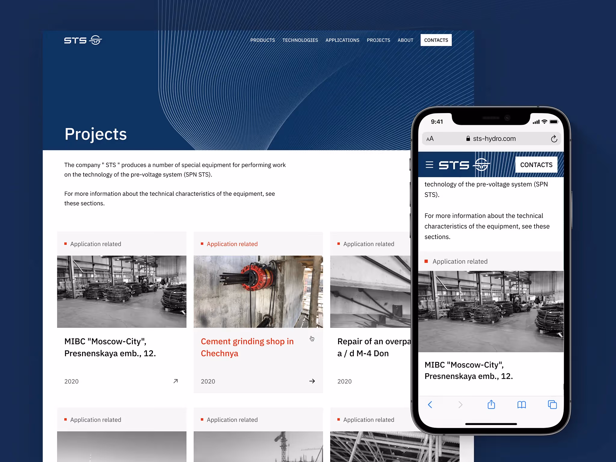
STS Hydro is a vertically integrated specialist subcontractor with 30 years of operation, 700+ completed projects, and 53 patents. The people who land on their site arrive in different states and want different things. A procurement director sanity-checks whether the company is credible enough to include in a conversation. A structural engineer returns for technical documentation or to pull CAD files for an active design. Someone in legal or finance checks project references to confirm the company has handled work at the required scale before attaching their name to it.
None of these are purchase decisions. All of them are trust decisions. And trust here doesn't mean emotional warmth — it means evidence of competence. Is this company real? Are they technically serious? Have they worked at the right scale? Can I verify that quickly, without having to call anyone?
That's the design target.
What does "credential, not funnel" actually look like in practice?
It means optimizing for doubt reduction, not conversion.
A website built to convert visitors optimizes for clarity of offer and friction reduction toward a CTA. A website built to pass scrutiny optimizes for something else — the sense, before any conscious analysis, that the people who built this are rigorous. That feeling is established by visual register before content. (The average visitor won't notice the decisions that create that feeling. That's the point.)
When these sites fail, they rarely fail dramatically. They fail quietly. The company still looks legitimate — just less precise than it is. Less proven. Less easy to shortlist. In industries where procurement cycles are long and decision-makers are scanning multiple suppliers, that slight drop in perceived credibility is enough to push you out of consideration before anyone fills in a contact form. No dramatic failure. Just the wrong outcome, at a moment nobody can pinpoint.
We were not trying to maximize lead-gen mechanics, force demo-style product storytelling, or turn a technical firm into a fake SaaS company. That would have made the interface louder and the company less believable.
How do you apply SaaS thinking to a hydraulic jack?
You borrow the information architecture, not the aesthetics.
SaaS products survive on their ability to manage information density without losing users — showing exactly the depth needed at the moment it's needed, and no more.
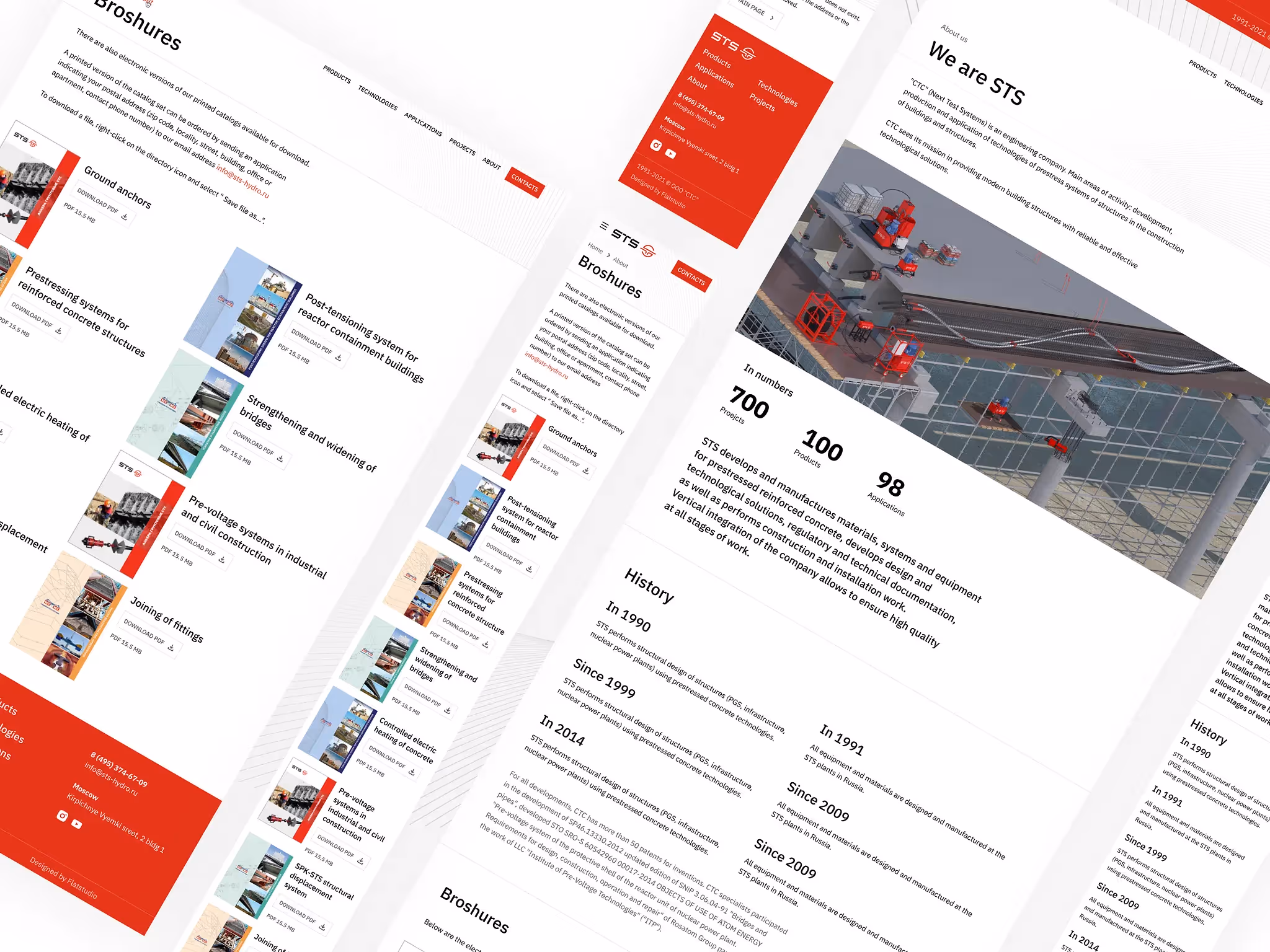
STS Hydro's site has 700+ projects, multiple product categories, a technology section, applications, research, and a gated CAD library. The naive solution is a large navigation menu and many subpages. The right solution is a hierarchy that feels light at the surface and rewards depth without punishing users who don't need it.
The real architecture challenge wasn't "how do we show a lot of content." It was how to let three different users confirm three different things quickly — without making the site feel like an archive dump. A project reference, a technical drawing, and a product category page may all support the same buying decision, but not for the same person and not in the same sequence. We designed for that. Most industrial web agencies design a sitemap and call it information architecture.
Because STS Hydro's technologies and products are entirely developed and patented in-house, the Products and Technologies pages were also built with dedicated SEO structure — not as an afterthought, but as a core part of the architecture. Someone searching for "incremental launching bridge contractor" or "post-tensioning stay cables specialist" should land on a page that answers that query precisely. Both pages were coded from scratch on WordPress, with content hierarchy and metadata built around how engineers and procurement teams actually search. We also prepared video tutorials for the client's team so they could manage and update the CMS without needing a developer for every content change.
The technologies STS Hydro has developed span seven distinct structural disciplines, each with its own search audience and technical context:
- Post-tensioning — reinforcing concrete structures using pre-stressed tendons, allowing load-bearing capacity with less material volume. Applied across bridges, tanks, and high-rise frames.
- Stay cables — tensioned cable systems for bridges and large-span roof structures, where conventional reinforcement can't carry the load geometry.
- Heavy lifting — hydraulic systems for relocating or repositioning structures and heavy loads during construction or repair without disassembly.
- Geotechnical — ground anchoring, soil nailing, and foundation reinforcement using prestressed elements for retaining walls, slopes, and deep excavations.
- Structural strengthening — retrofitting and reinforcing existing structures — bridges, industrial buildings, heritage facades — using external post-tensioning and carbon fiber systems.
- Precast onsite — mobile precast factories that produce prestressed concrete girders directly on the construction site, regardless of weather conditions.
- Incremental launching — a method of advancing a bridge deck section by section from one bank, used for projects with limited access or space beneath the structure.
On the product side, STS manufactures the equipment that makes these technologies work in the field: hydraulic jacks and cylinders for tensioning; lifting systems for structural relocation; launching systems for incremental bridge construction; tensioning systems for strand and bar post-tensioning; grouting equipment for duct filling after tensioning; load cells for force measurement and monitoring; rebar couplers for mechanical splicing of reinforcement bars; and power units that drive the hydraulic systems on site.
The gated CAD library is worth noting separately. A site that contains tools serious users return to for active work — not just for credibility checks — stops being a brochure. That changes the site's job. It's not just a credibility check anymore — it's also a tool people return to. Designing only for the first visit misses half the audience.
Projects like this are also often slowed down by an internal instinct to make everything visible at once — because every department believes its layer proves credibility. Usually the opposite is true. Restraint is harder to argue for internally than comprehensiveness. It's also more effective.
Why does the header change color on an engineering website?
Because monotony is its own trust failure — especially when every competitor looks identical.
Every major player in this space — VSL, Freyssinet, Dywidag, BBR — builds websites that follow the same visual grammar. Functional, reliable, indistinguishable. When a procurement director has seen three of them in a row, the fourth one that looks different gets a longer look.
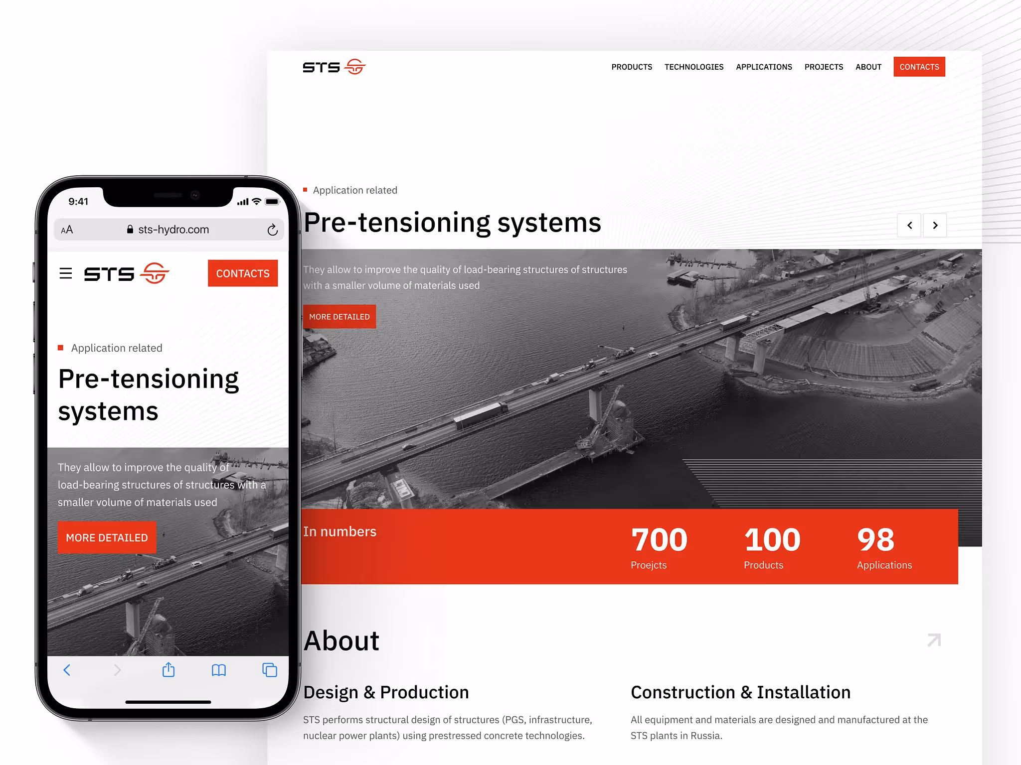
The STS Hydro header changes color by section: white on the homepage, deep red on Products, teal on Technologies. Each section has its own visual identity, drawn from a single coherent palette. It's a pattern from mobile product design, where contextual theming helps users orient within deep information hierarchies without needing explicit breadcrumbs. In an engineering context, it signals something the navigation alone can't: that the people who built this care about details. Precision in the interface implies precision in the work.
Anton Sitnikov, STS Hydro's CEO, describes their technology this way:
"If you build a bridge from Lego, it falls. Wrap it in a rubber band, and it holds enormous weight."
The interface follows the same logic. Nothing decorative, nothing redundant.
The staged launch, and what it proved about the credibility layer
We had a hard deadline: a construction and engineering exhibition in the UAE, opening September 12, 2021. STS Hydro needed the site live before that date — in front of procurement directors pulling up supplier websites between booth conversations.
When the website's job is first-impression credibility, a staged rollout does something a full simultaneous launch can't: it lets you test whether the credibility layer is actually landing before everything else goes out behind it. We shipped the homepage and the product and technology pages first — precisely the sections a procurement director reaches in the first 90 seconds. Everything else followed in subsequent releases.
What the constraint forced us to do well: prioritize ruthlessly. Every decision on those pages had to carry real weight, because they were the entire first impression. There was no second chance buried in a subpage.
What it also revealed: we launched exactly the pages that mattered most for first impressions — and got real-context feedback before the rest of the site went out. A full simultaneous release would have buried that signal in the noise of everything shipping at once. Staged launches, when they're planned rather than panicked, are a useful diagnostic — especially when the stakes are the first minute of someone's impression of a company.
Is this only true for engineering firms?
No. The same logic applies to any company selling complex capability rather than software seats.
Infrastructure, manufacturing, specialist B2B systems, technical consulting, industrial services — if buyers are checking for seriousness before they're checking for charm, the website's job is to reduce doubt fast. The design question is the same: how do you make the right person feel, in under a minute, that this company belongs in the conversation?
For complex B2B companies, the website is not a sales machine. It is a filter against doubt. If it makes your company look harder to understand than it really is, it is not neutral — it is actively costing you credibility, in moments you'll never be able to trace back.
Most companies in this sector are still hiring for domain knowledge and getting websites that look exactly like each other. That's a choice. It's also an opening.

.png)
