


How a 15° Tilt Defined the Entire Brand: BoxBet Identity Design


This article is part of the Flatstudio × BoxBet case study. BoxBet is a crypto iGaming platform: casino, sports betting, and its own BXBT token. For founders and product teams building or rethinking a digital product's brand. Main article of the series — here.
The client came in with a brief that had exactly one sentence: "we want it to feel like a McLaren W1." Can you imagine? No explanation, no references, no direction. Just the name of a car — and nothing else. The car looks great and it absolutely carries the McLaren spirit, but a car as a reference point for a website?
Not the worst start. But definitely not the simplest — and no one had ever given us a brief quite like this before.
A Brief You Can't Read Literally
After going through images and the McLaren W1 site, we landed on one conclusion: this isn't about luxury. It's about precision. Aerodynamics. Materials with no unnecessary weight. Form justified by every millimeter — a combination of sharp edges and smooth curves, a dark interior with bright accents.
We were looking for the answer to one question: why does the McLaren W1 look the way it does.
The answer: every decision there is driven by function. No decoration for decoration's sake. (Well, maybe a little — only on the interior, designers will be designers.)
That became our reference point.
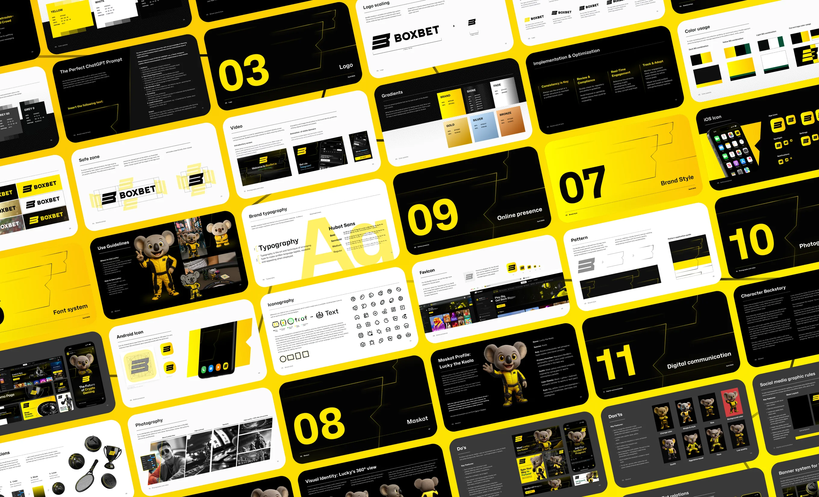
Five Stylescapes Before the First Pixel
Before drawing anything specific, we put together moodboards and presented the client with five stylescapes. The stylescape process is our approach — something we've packaged into our Brand Identity & Strategy service. It's designed to surface what the client actually feels and thinks, not just what they say. Each stylescape set a different emotional register: from technological coldness to aggressive energy.
The client chose a direction built on restraint and confidence without excessive noise. Dark palette. Hard forms. Color as signal, not as clutter. Typography on the edge between technical and stylish.
The 15° Tilt
The logo was designed by Mariia Solovieva. The key decision didn't come from sketches — it came from a question: what makes a shape feel alive?
A static logo for an iGaming platform is a contradiction in terms. The platform is about dynamics, risk, movement. The logo had to communicate that even when standing still.
The solution: a 15° tilt. Not 10° — too little, the shape doesn't "move." Not 20° — too much, it starts to feel unstable. Exactly 15° gave us what we needed: the logo stands, but looks ready to leap — to fly toward its championship.
That angle became systemic. It carried over into graphic elements, icons, marketing material layouts, typography, and compositional decisions across the entire brand.
The Typeface That Didn't Exist
None of the available typefaces worked for BoxBet — Inter, Roboto, system fonts — none of them were right for this brand. We needed typography that could support the angle and character of the logo while remaining legible in interface conditions: small text, dark backgrounds, high information density.
We took Hubot Sans as a base and reworked individual letterforms from scratch. Not "found something close" — actually reworked. New shapes for several key characters, adjusted proportions.
The result reads as a coherent object with a sporting edge.
Pantone 102 C
The yellow for BoxBet isn't "a little brighter." It's Pantone 102 C, HEX #FFE600. A specific shade with a specific rationale.
It's saturated enough to read on a dark background without an additional outline. Neutral enough in temperature not to clash with white text alongside it. And distinctive enough to become the single color the platform needs for identification. It also frames photos and graphics in marketing materials — the same way the orange diffusers, hood, and bodywork frame the McLaren W1.
The entire rest of the palette was built around it.
A System, Not a Set of Rules
(Banner color variants 🎆)
The BoxBet banner system works on one principle: a dark interface always gets a yellow banner, a light one gets black. The banner must be readable immediately, regardless of placement context. One rule — and it always holds.
The logo lives in its own grid. Optimal height — 24 pixels for digital use. Minimum for the full logo — 130 pixels or 46mm in print. Below that — only the mark, from 16 pixels or 6mm. Below those values, the logo isn't used at all. All of these rules are specified in the brandbook.
When the Site Is 70% Done — and Everything's Wrong
Here's something worth saying honestly: the website development started before the logo, the brandbook, or the mascot existed. The client had a working Telegram product and a development team that wasn't waiting — while we were working on the identity, the site was being built in parallel.
The first version of the brandbook (v1.0) was ready four weeks after the start — we began on October 8, 2024, and by mid-November the document existed. But by that point the site was already 70% built without it. It became clear: the colors didn't match the brand rules. Some UI elements contradicted the system.
We had to go back and redo it.
It's expensive — in time and resources. But it was worth it: brandbook v3.0 launched in April 2025 as a complete system with full rules, application examples, and development specifications.
What v3.0 Actually Is
Between the first version and the third — six months of work. In that time, the brand didn't change conceptually. It became more precise. Emotion and character showed up.
Every rule got an explanation, not just a declaration. Every element got a usage context. The brandbook transformed from "a document for designers" into "a document for the whole team" — including developers, marketers, and partners.
That's the difference between v1.0 and v3.0.
Brand Is a System of Decisions
The 15° tilt, Pantone 102 C, Hubot Sans with reworked letterforms, the banner logic — none of these decisions exist on their own. They form a system where each element reinforces the others.
That's why the BoxBet identity doesn't read as "another iGaming brand with yellow in it." It has the character of the McLaren W1 — and that character can be explained.
How that character got a face — in Article 2: how we designed the mascot Lucky. How the system held up under the load of the promo mechanics — in Article 3. The design system that holds it all together — in Article 4.
.png)
