/STS-Hydro
Work
88
Solutions
Industries
Blog
About
Contact
Industries
SaaS Product Agency
Sports & Betting Agency
MedTech Design Agency
Fintech & Web3 Agency
GovTech Agency
All Industries
Solutions
Product Audit & Redesign
Fundraising & Concept
Post-MVP Evolution
Rebuild. Rebrand. Reignite.
Dedicated Product Team
All services
Home
Work
Solutions
About
Blog
FAQ
Testimonials
Full-service Agency from Portugal, Ukraine & World
Talk to us
Let's talk
View more
Text Link
Menu
Read Case Study
Corporate
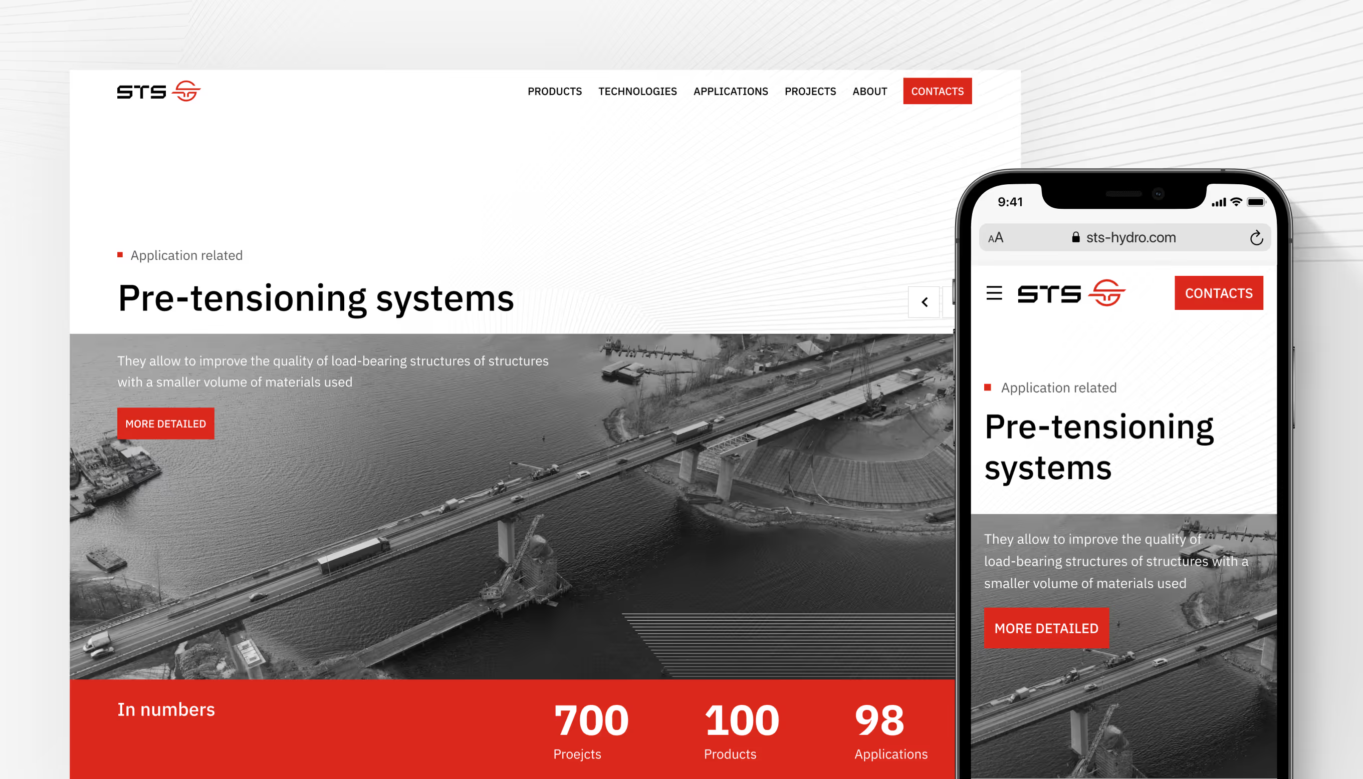
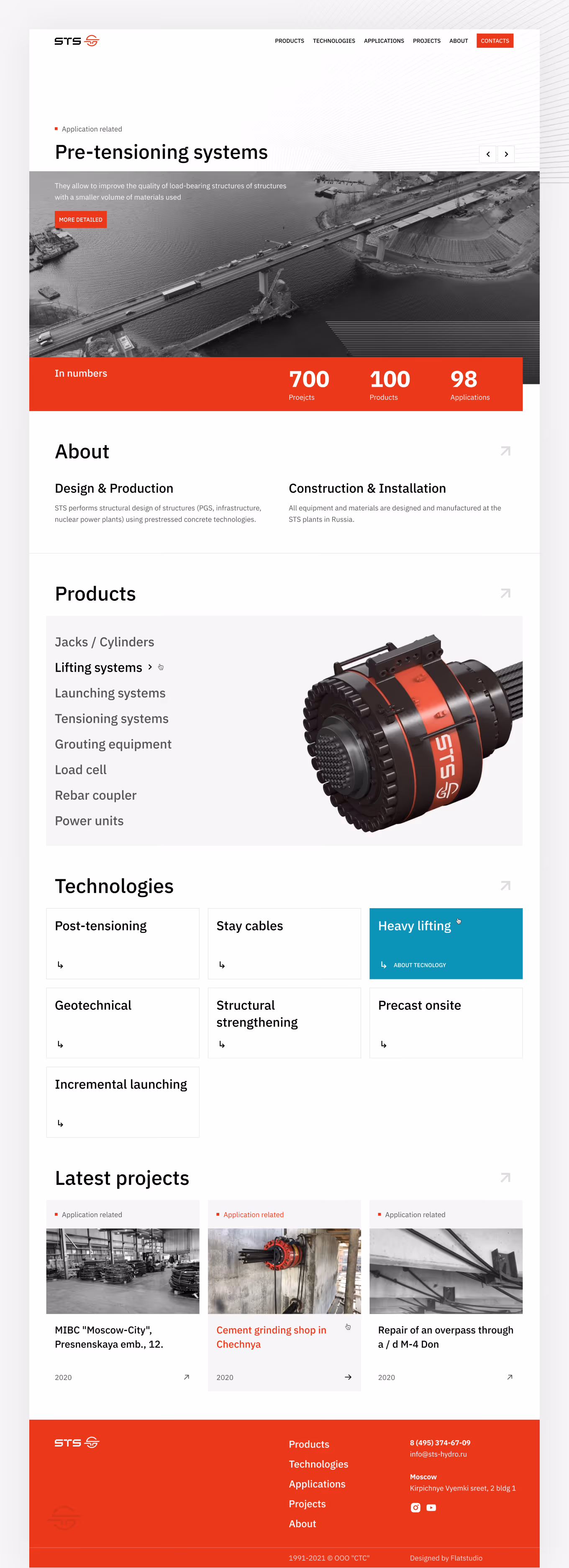
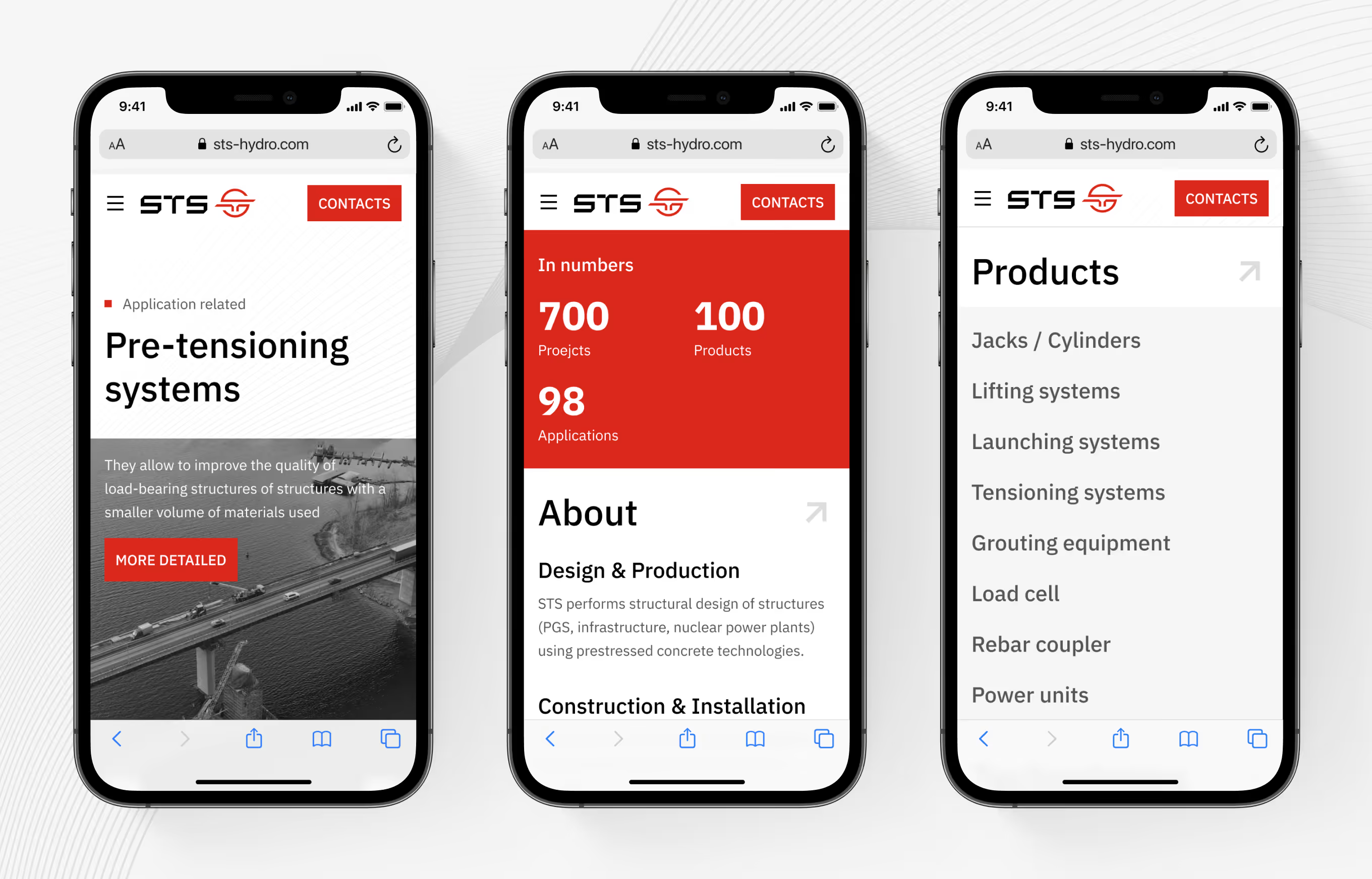
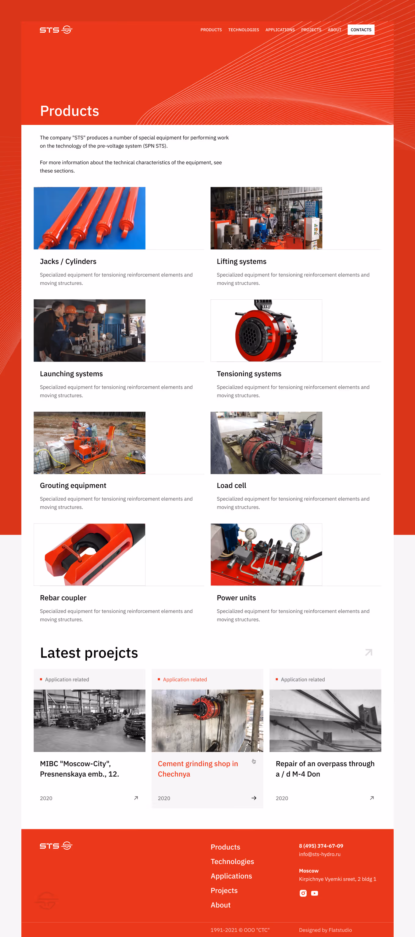
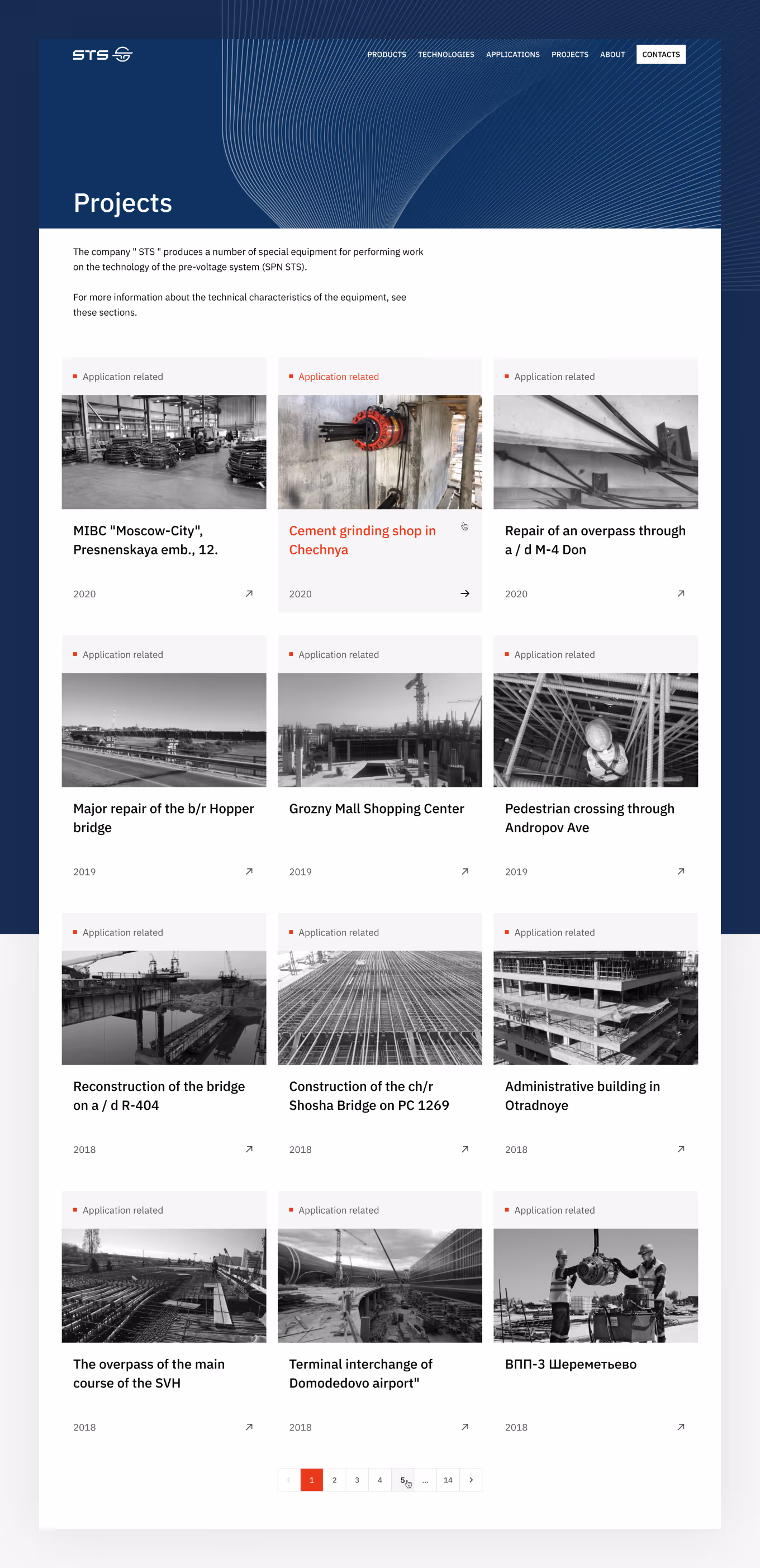
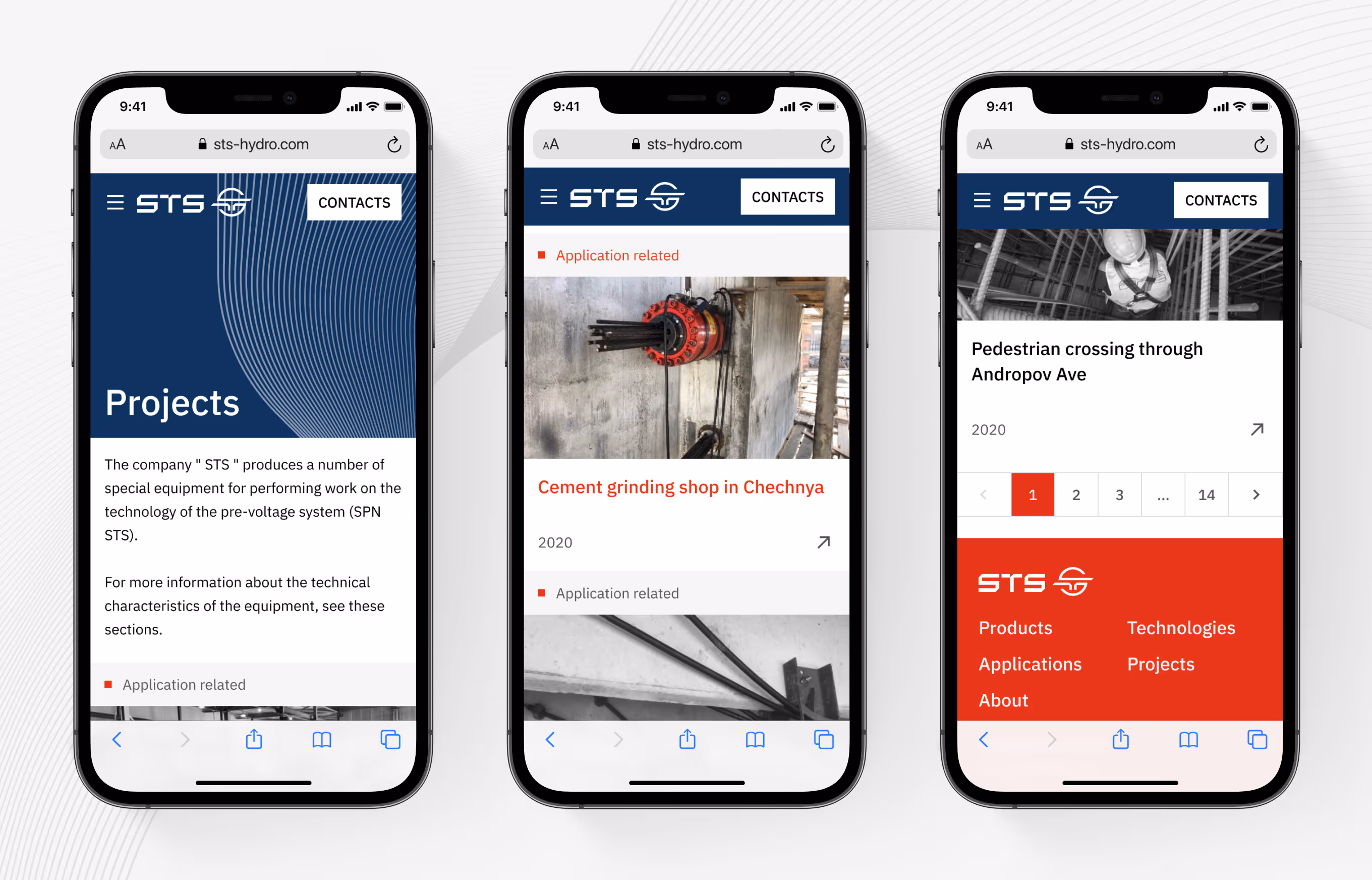
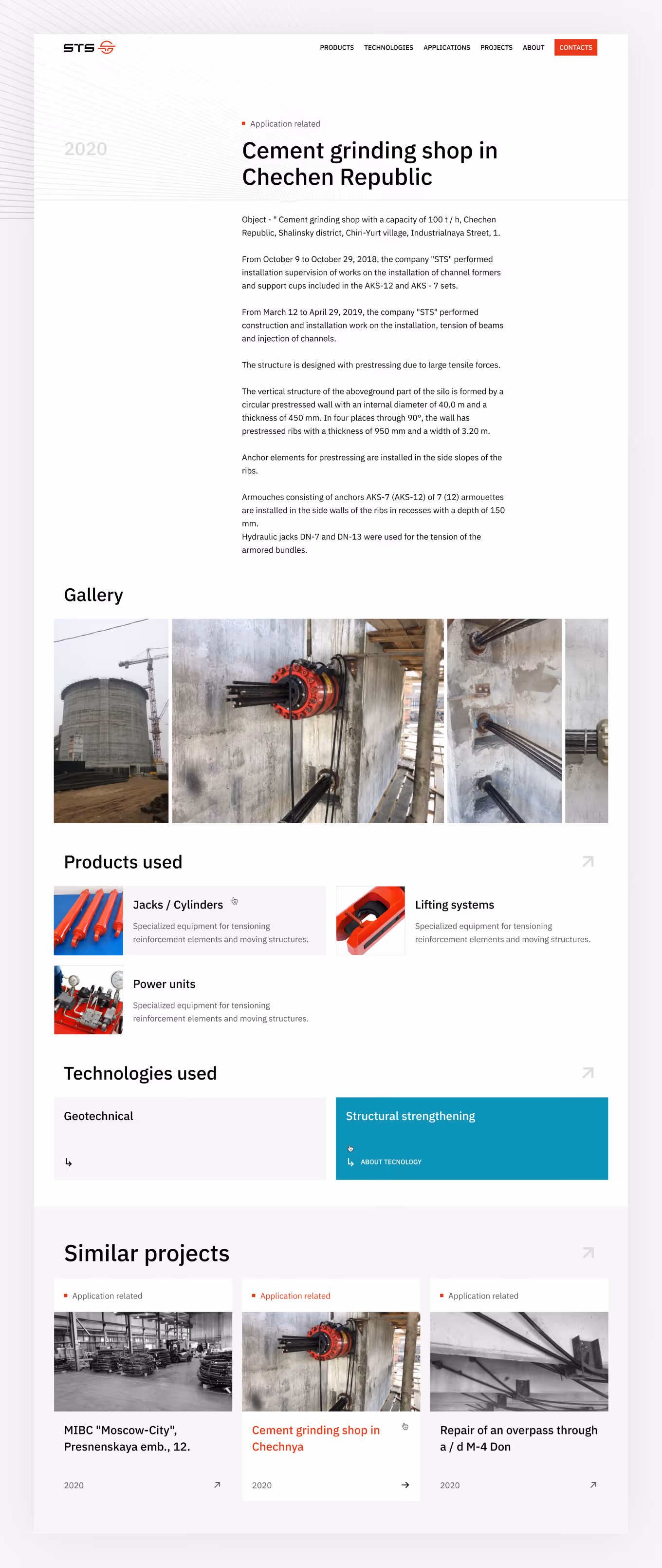
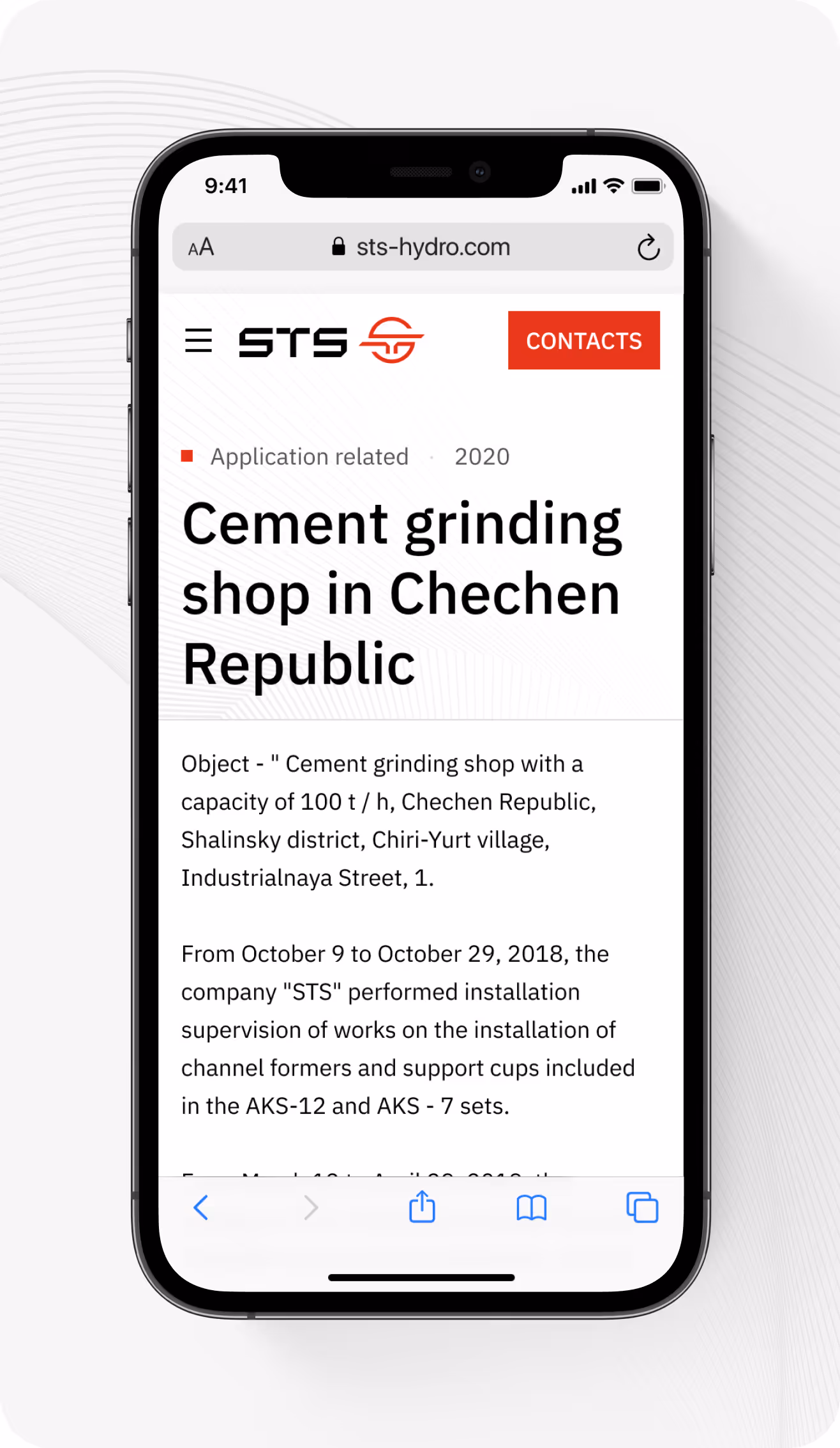
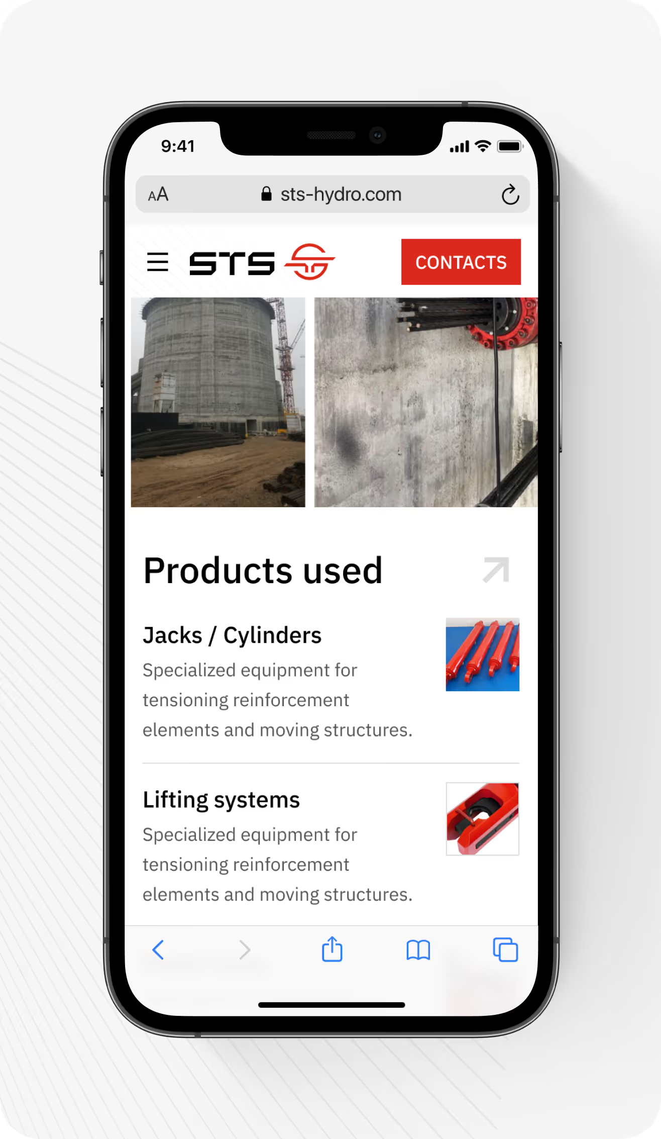
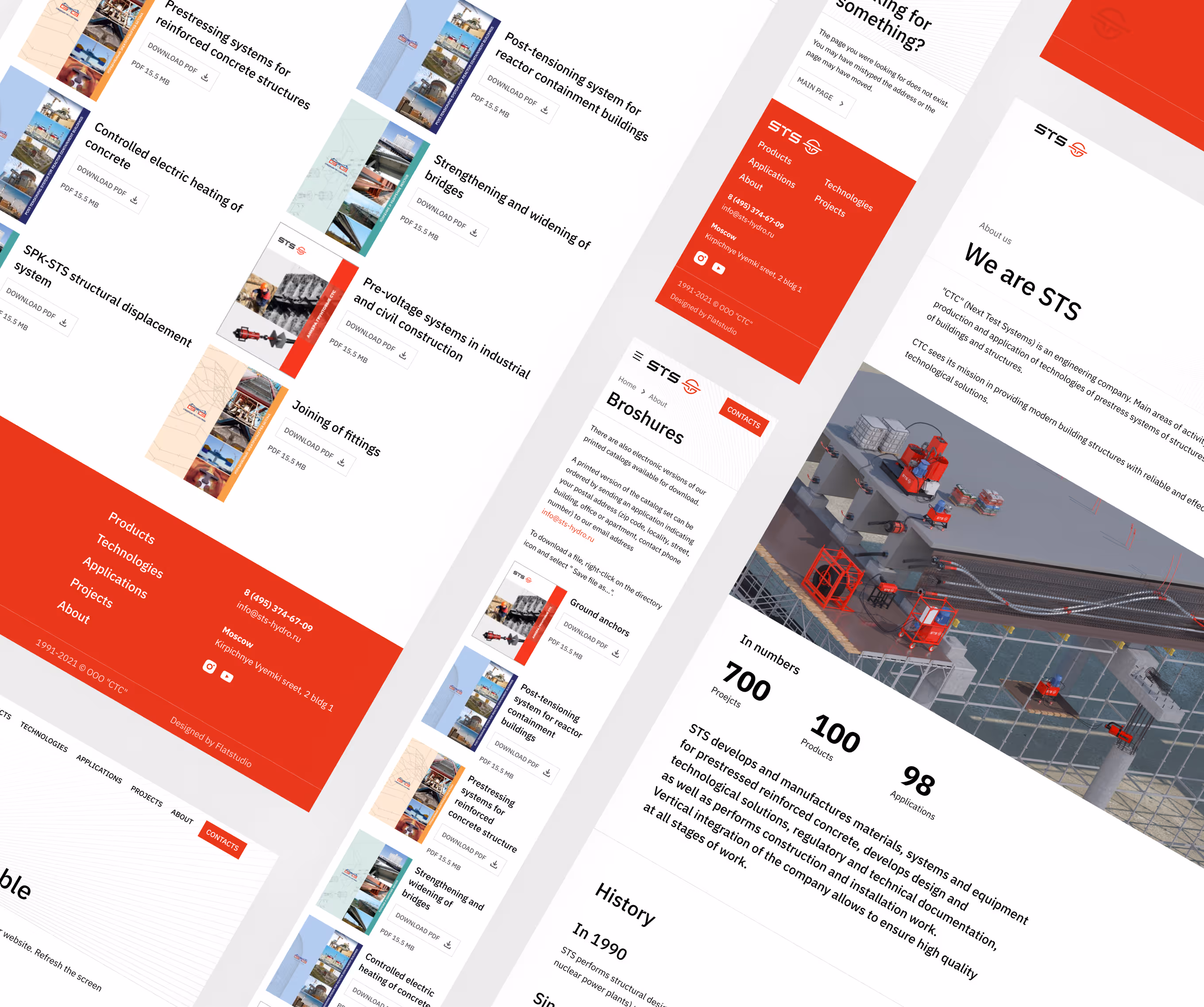
STS-Hydro. Engineer the construction.
UI/UX, Graphics, Development
Header about section, like
Header about section, like
Header about section, like
Header about section, like
Header about section, like
Header about section, like
Next
Cases
View
more


.png)